R-EDA1 release notes. I'm versioning it on GitHub https://github.com/ecodata22/R-EDA1 , so I've included updates there as well, but it's in English and I can do more than what's changed in the code. I think many people are interested in what has changed, so I am making this page as well.
The function of Directed Information Analysis (DIA) is added.
First, quantitative variables are converted to qualitative variables.
Next, compute the mutual information to extract the combinations of variables with high mutual information. (Mutual Informationn Analysis : MIA)
Finally, for combinations of variables with high mutual information, compare the average information content to determine the direction of the arrows.
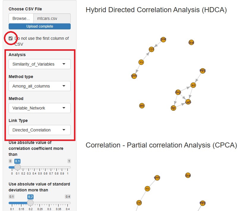
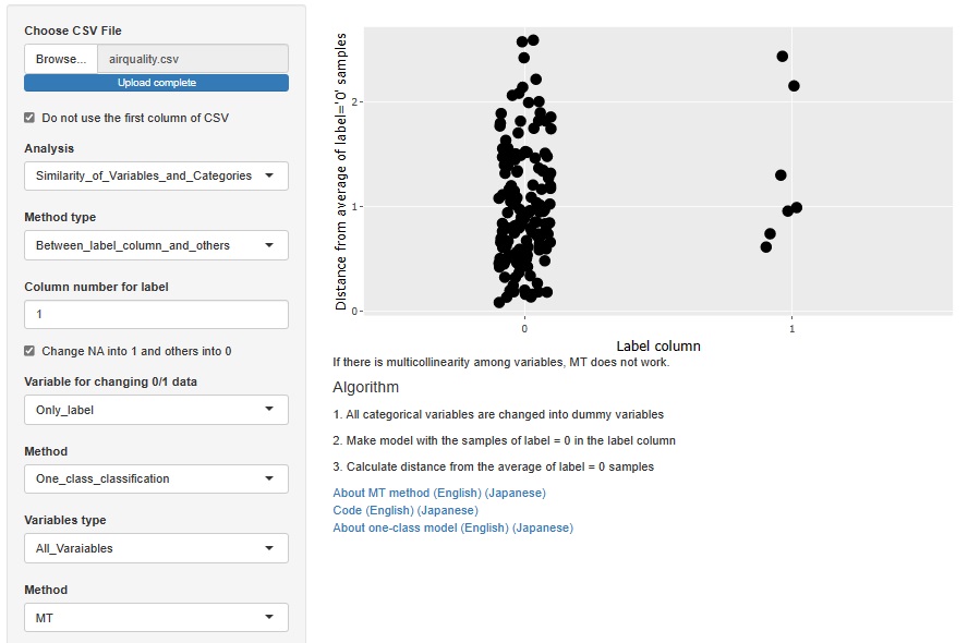
Hybrid Directed Correlation Analysis (HDCA) is added.
First, the correlation and partial correlation coefficients identify the edges at which we want to consider the direction of the arrow. Next, it extracts an orientation that can be determined by conditional independence alone. Finally, for orientations that cannot be determined by conditional independence, it uses normalization and standard variables to determine orientation.
By using conditional independence as much as possible, we will be able to handle data that cannot be handled by LiNGAM as much as possible. In addition, by using normalization and standard deviation, we can accommodate patterns that are not determined by conditional independence (Bayesian networks) alone.
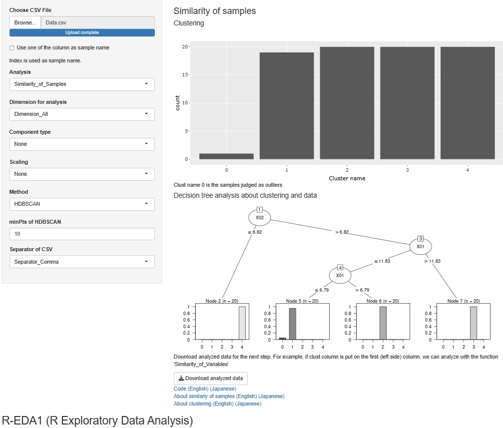
For cluster analysis of all variables, there were hierarchical, DBSCAN, and HDBSCAN, but a mixed distribution method was added to this.
In addition, when cluster analysis is performed for all variables, it was only possible to output the data by adding the clustering result to the original data in a CSV file, but now it is possible to perform decision tree analysis using clusters as the target variable. You can analyze the cause of clustering.
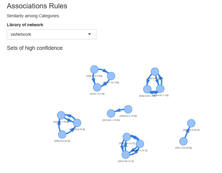
Association rules and correspondence analysis are indepened as the part of analysis of categories.
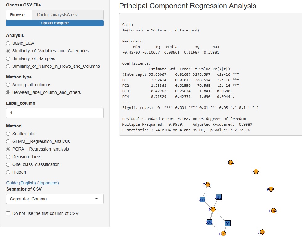
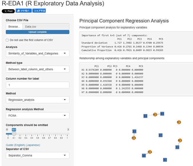
Added the Principal Component Regression Analysis to the Analysis of the Contribution of Individual Factors. It is now possible to analyze using four types of contribution rates.
I used to use two library for Dummy Variable, "dummies" and "fastDummies", but I unified them all into "fastDummies".
The reason is that "dummies" has been removed from CRAN and can no longer be used.
Both libraries are convenient because they transform only qualitative variables when quantitative and qualitative variables are mixed.
However, "fastDummies" has the weakness that "everything is quantitative variables, and if there is no conversion target, an error will occur". Therefore, before conversion, I checked all the variables and did not use this library if there was no conversion target. As a result, the number of lines has increased from one line to five.
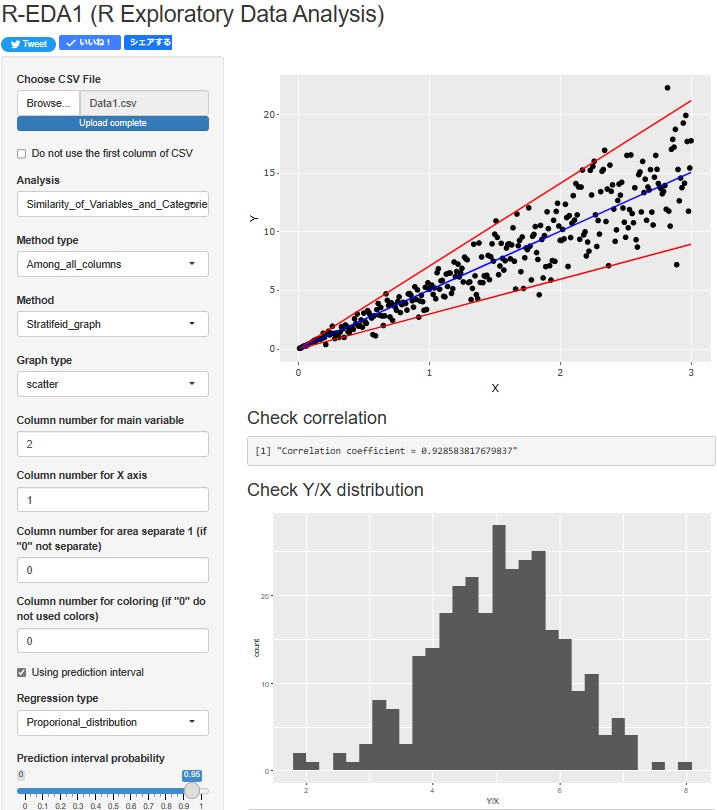
Regression analysis of Proportional variance is now possible. The upper scatterplot shows the Prediction interval of Proportional variance. In addition, the lower histogram shows the distribution of "Y/X", which is the basis of the Proportional variance.
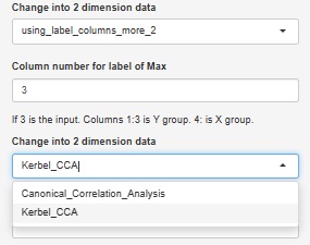
Added the function of Visualization by compressing high dimensions into two dimensions with Canonical Correlation Analysis .
Canonical Correlation Analysis by R also has nonlinear canonical correlation analysis by kernel method, which is also available.
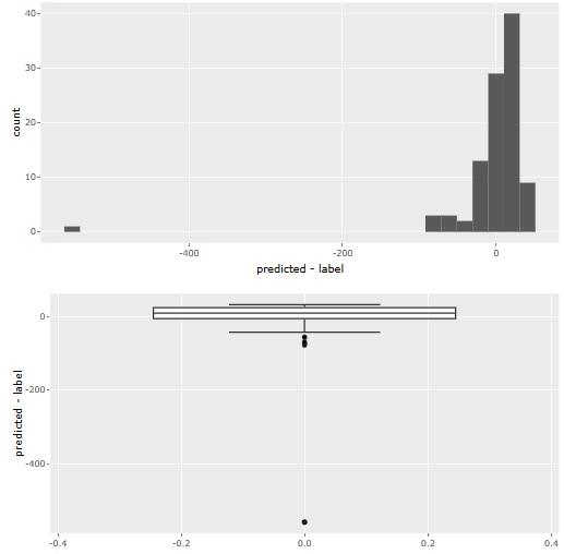
Visualization by compressing high dimensions into two dimensions with regression analysis and Residual Outliers analysis function is adde.
3 methods can be used
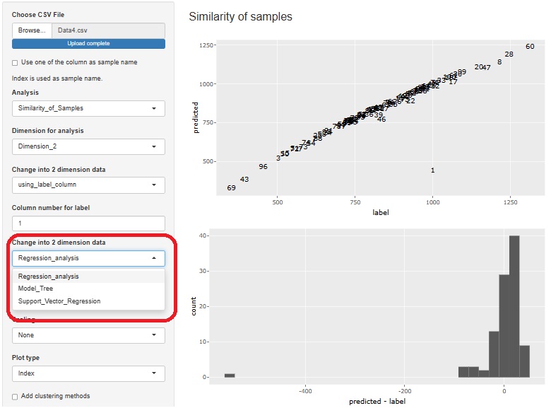
Residual analysis provides both histograms and boxplots. Histograms make it difficult to see outliers when the number of samples becomes very large, so boxplots are better in such cases.
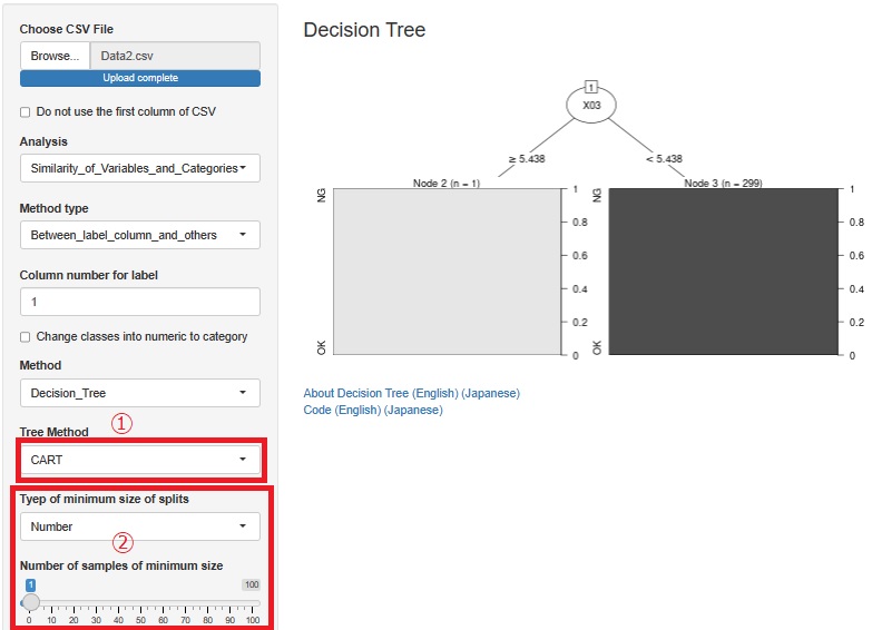
Added CART for decision trees. It is at (5) in the figure. Since there is C0.5, I thought that CART was unnecessary, but in C0.<>, it did not branch out as I expected, and CART sometimes became what I expected.
We also made it possible to adjust the minimum number of samples so that you can use the Causal inference for individual samples page with R. Until now, only the minimum sample ratio could be adjusted, but now you can specify a specific number of samples. It is at (2) in the figure.
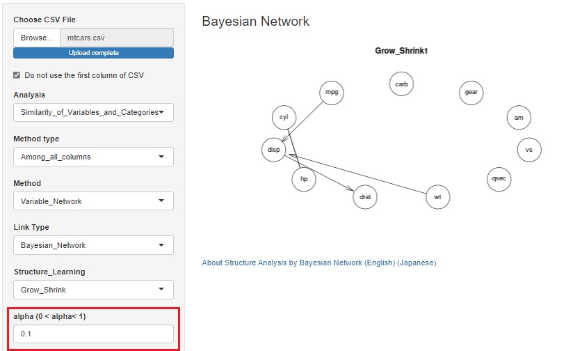
As is also in the Bayesian Network by R, some algorithms in the Bayesian network use alpha to determine whether a variable is related.
Until now, the default value (0.05) could only be used, but it is changed possible to change.
When we have a large number of samples, it is easier to find meaningful information by reducing it.
LiNGAM is added as one of the ways to see the correlation of variables in a network graph .
When the error is other than the normal distribution and the variable has the structure at the time of Path analysis , the structure can be exposed.
There is pcalg in the R library that can use LiNGAM, but since pcalg cannot be used due to an error on the shiny server, I am using my own code. The code is in LiNGAM by R.
There is a function that allows you to divide a graph into strata when performing stratified analysis. At the time of this graph, until now, the range of the axis was different so that the plot could be seen for each graph.
At the time of analysis such as data mining , it was good for the purpose of magnifying what is happening in a small area, but it became difficult to understand when I wanted to see the overall position.
Therefore, I have made it possible to choose whether or not to match the range of the axes.
In the Structure Analysis by Bayesian Network , it is now possible to select whether to treat integer variables as qualitative variables or quantitative variables.
For general quantitative variables, when treating them as qualitative variables, the method of separating them by intervals is used, but when treating integers as qualitative variables with this function, for example, three integers such as "1, 2, 5" If there is, each of these three is treated as a qualitative variable.
When a variable represented by an integer is a causal variable, the Bayesian network puts the qualitative variable at the base of the arrow, so it is easy to get the arrow you want.
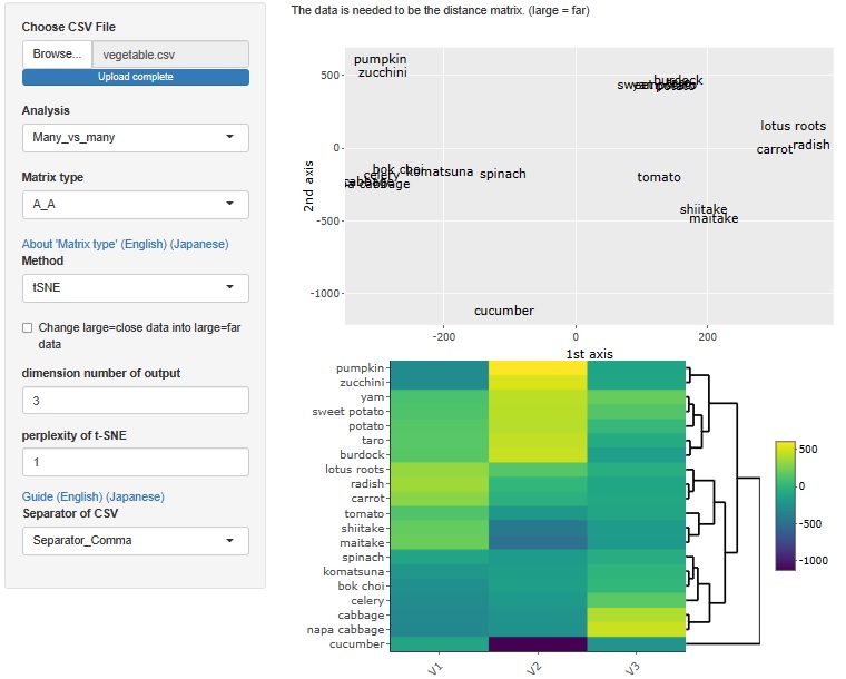
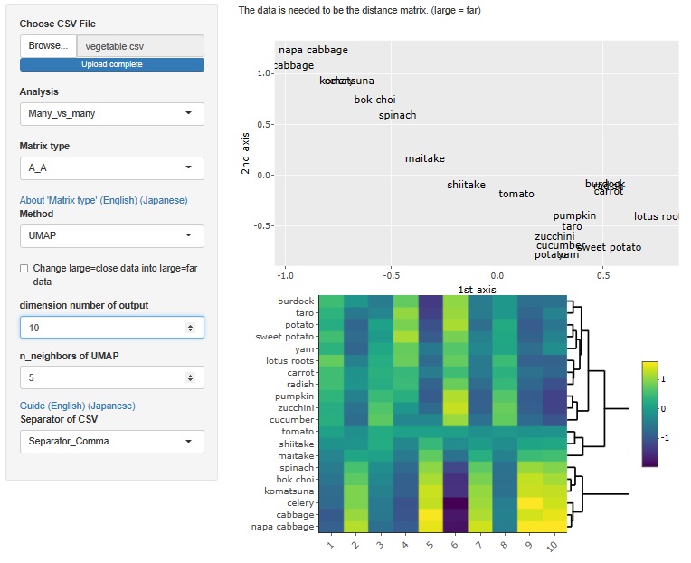
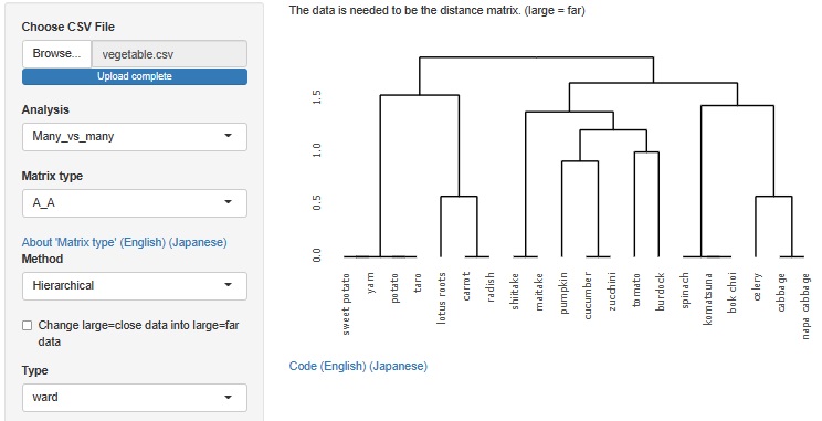
Analysis of the effective dimensions number is an example, but there is an analysis method that starts with a distance matrix.
This method allowed R-EDA1 to use only multidimensional scaling , but now it can also be used for t-SNE, UMAP, and hierarchical cluster analysis.
t-SNE
The case of t-SNE, the maximum number of dimensions is 3.
UMAP
The maximum number of dimensions is the number of samples. However, as software, it is possible to analyze even a large number of dimensions, but the physical consideration of the result cannot be done as in the case of multidimensional scaling, and I do not know how to use it.
Hierarchical cluster analysis
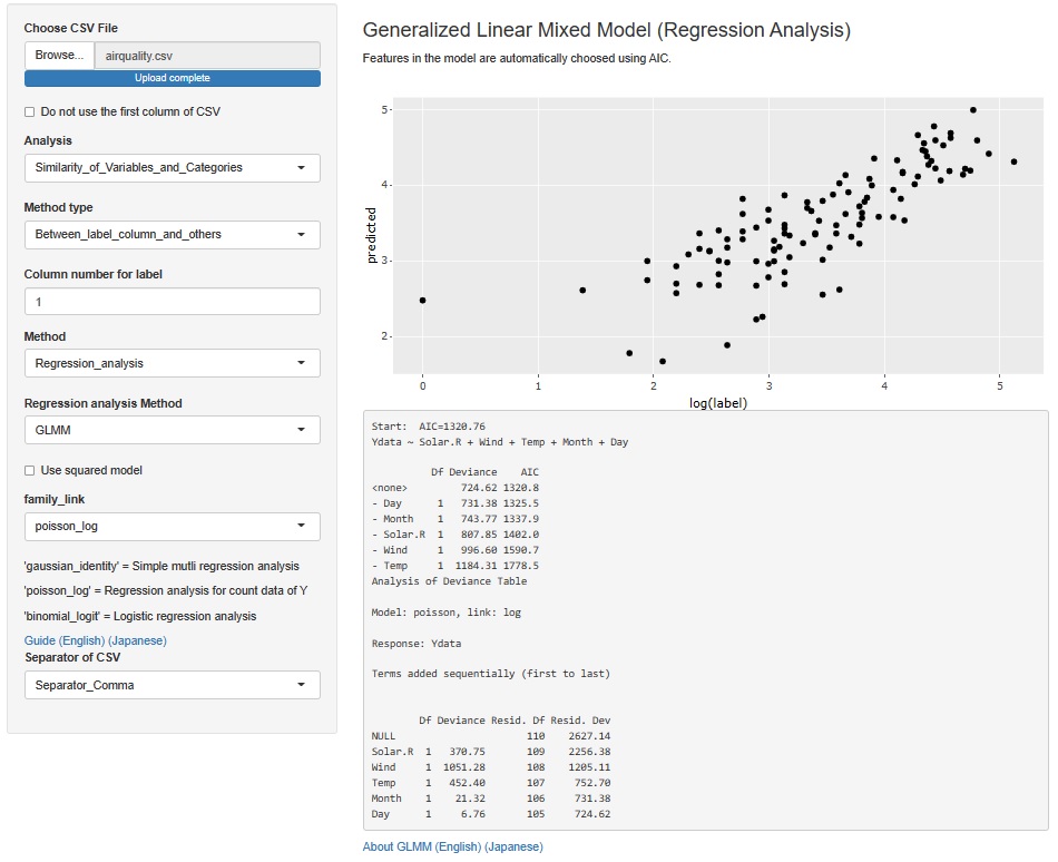
The result of the Generalized Linear Mixed Model was only text, but I also output a graph with the predicted value of the label on the Y axis and the measured value on the X axis. It is easier to understand the performance of the model than looking at indicators such as R2 and AIC.
The Generalized Linear Mixed Models (GLMM) are in two places, both of which add this functionality.
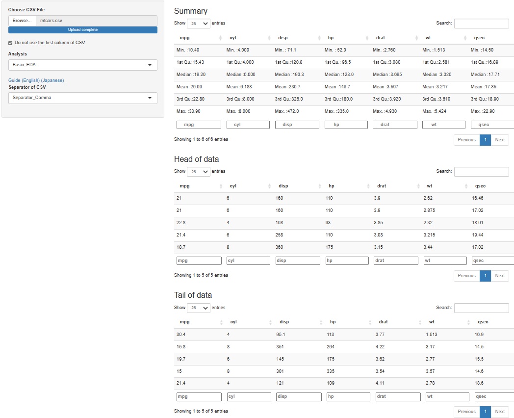
It's hard to understand if you make a graph or make a calculation, but when you analyze data, it may be good to check what the specific values ??of the raw data (data to be analyzed) are. Even if you don't use any theory, you may find that "this is strange" just by looking at the data.
Since it is difficult to add a function to see all, for the time being, I made it possible to check 5 lines each at the top (Head) and the bottom (Tail).
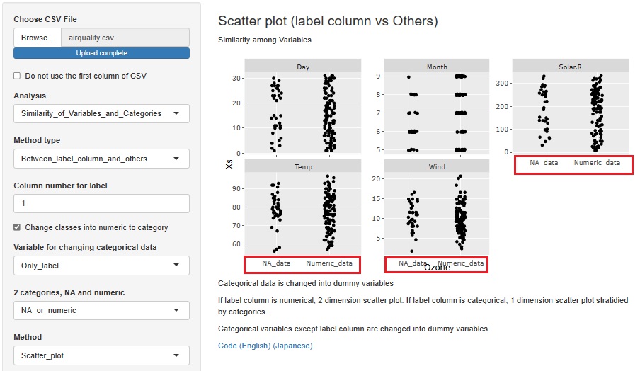
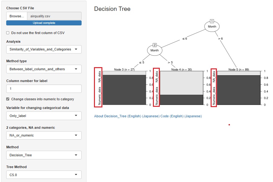
I added the function to convert a missing value to a qualitative variable named "NA_data" and a non-missing value to a qualitative variable named "Numeric_data" when a quantitative variable containing missing values is selected as the objective variable.
You can find out why a missing value is missing in relation to other variables. You can also consider that "deficiencies occur randomly" if they seem to have nothing to do with other variables.
First, an example of creating a stratified one-dimensional scatter plot with the horizontal axis as the objective variable and the vertical axis as all other variables.
This is an example of a Decision Tree .
This is an example of the MT method . In the case of the MT method, the sample does not lack the unit space. "0" is a sample that is not a missing value, and "1" is a sample that is a missing value.
If there are various reasons for the loss, the MT method is better than the decision tree.
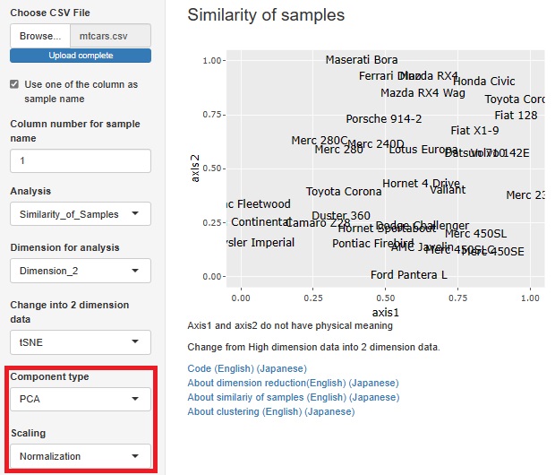
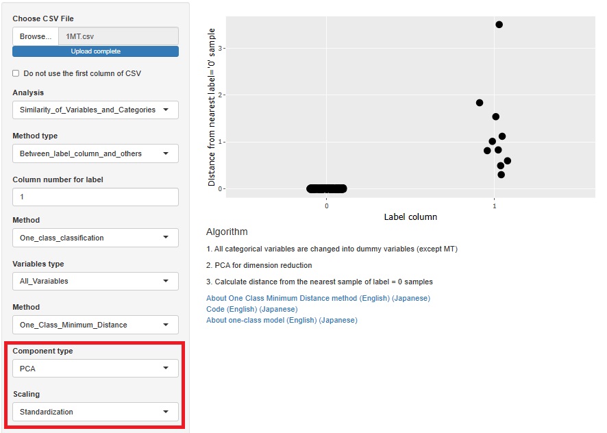
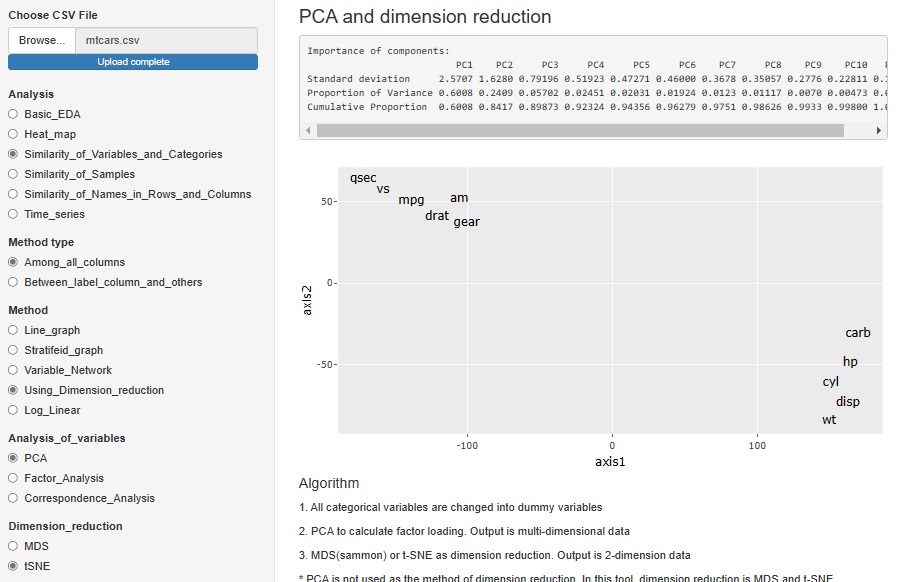
Standardization and Normalization with PCA is available.
Visualization by compressing high dimensions into two dimensions
One-Class Minimum distance method
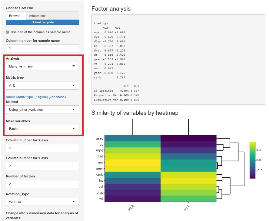
Factor analysis is moved from sample similarity analysis to many-to-many analysis. The method of analyzing sample similarity basically doesn't look at the relationship between the variable and the sample, but this doesn't fit with the other methods i've placed here, so i've moved to a better place.
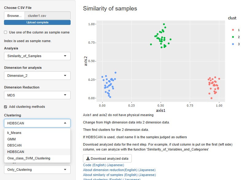
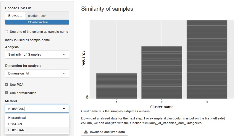
HDBSCAN is added. It is similar to DBSCAN.
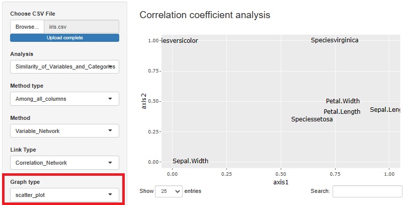
I included a way to see the correlation coefficient, graphical lasso, and the number of associations in Kramer on a network graph, but I also made the graph a scatter plot.
The view is similar to the network graph, and variables that are close to each other have high coefficients.
In the case of a network graph, "A and B are close. A and C are close. B and C are very far." It can be easily expressed by the presence or absence of a link, but in a scatter plot, "B and C are. It cannot be expressed as "very far". Although there are such weaknesses, scatter plots are better than network graphs because the graphs are lighter.
With or without normalization and with or without PCA, you can make four combinations for analysis. You can choose what kind of multidimensional data you want to see and how you want to see it.
There are two type of methods as 1 class. They are separated.
 Å@
Å@
Radio buttons are changed into select boxes.
Screen scrolling is not zero, but it has been considerably improved.
In previous version, normalization is done. In new version, we can select using normalization or not in cluster analysis.
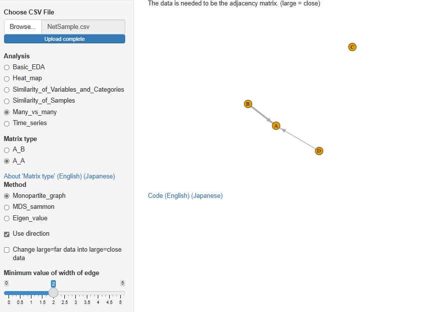
In Analysis of Many vs Many, AB type analysis included in Analysis of similarity between items in rows and columns was included in R-EDA1. This time, I added AA type analysis.
Analysis by network graph using adjacency matrix, analysis by multidimensional scaling (MDS) using distance matrix, eigenvalues analysis using correlation matrix and paired evaluation data are available.
It seems that cluster analysis of row and column items is often used as a method of recommending and analyzing text data. SVD (Singular Value Decomposition) is one of them, but I added it to R-EDA1.
The red letters in the graph below are the names of each column (variable names), and the blue letters are the names of each row (sample names). This kind of analysis cannot be performed with data that has different physical meanings for each variable, such as when there are "temperature" and "humidity" in the variables. However, this method can be used when all variables have the same physical meaning, such as count data (number obtained by counting, frequency, etc.) or points.
SVD and correspondence analysis can be used properly. SVD can handle negative values, but correspondence analysis can only handle positive values.
The data generated by SVD and correspondence analysis is multidimensional, but it is made visible in a two-dimensional scatter plot using MDS (Multidimensional Scaling) and t-SNE. Since you can choose one of "Correspondence Analysis / SVD" and one of "MDS / t-SNE", 2 x 2 = 4 combinations are possible.
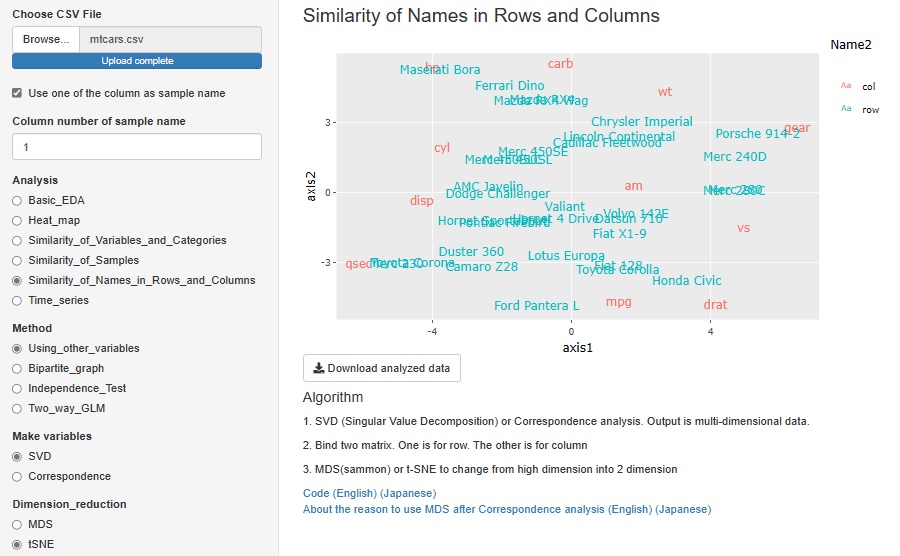
This feature was originally a combination of correspondence analysis and MDS. This time, by increasing SVD and t-SNE, four methods have become possible.
In PCA (principal component analysis), Factor analysis (factor analysis), and Correspondence analysis (correspondence analysis), only MDS was adopted as a method for viewing multidimensional in two dimensions. However, I made it possible with t-SNE.
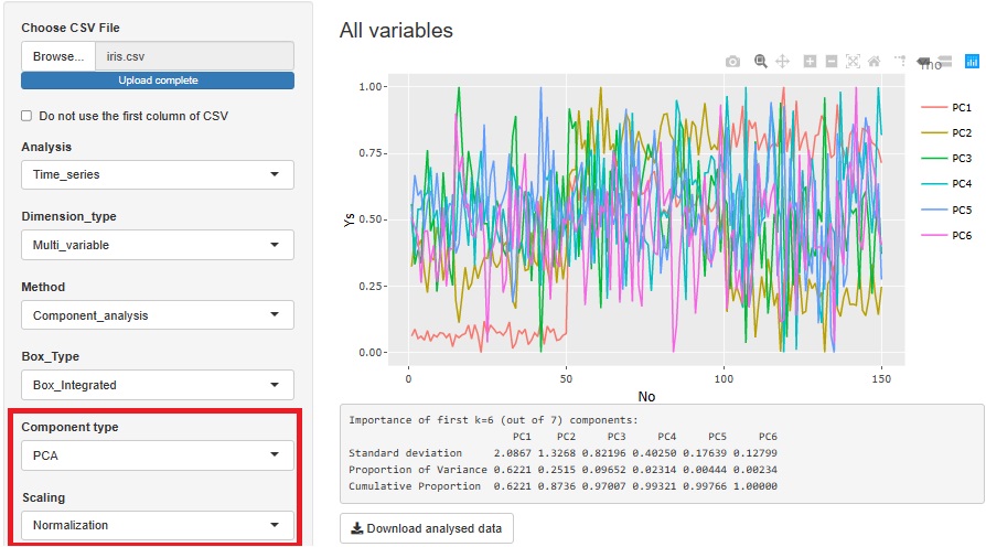
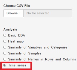
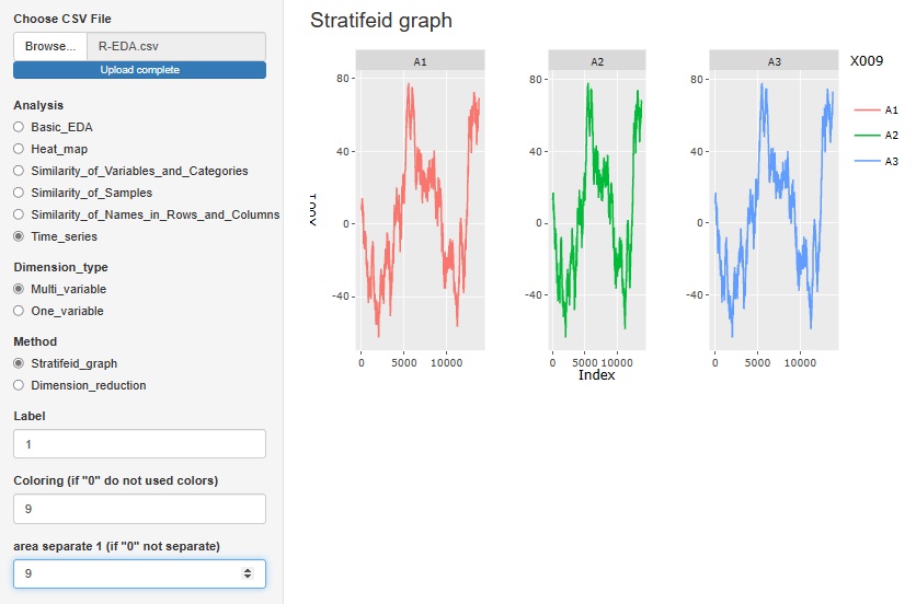
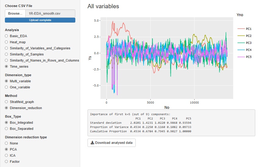
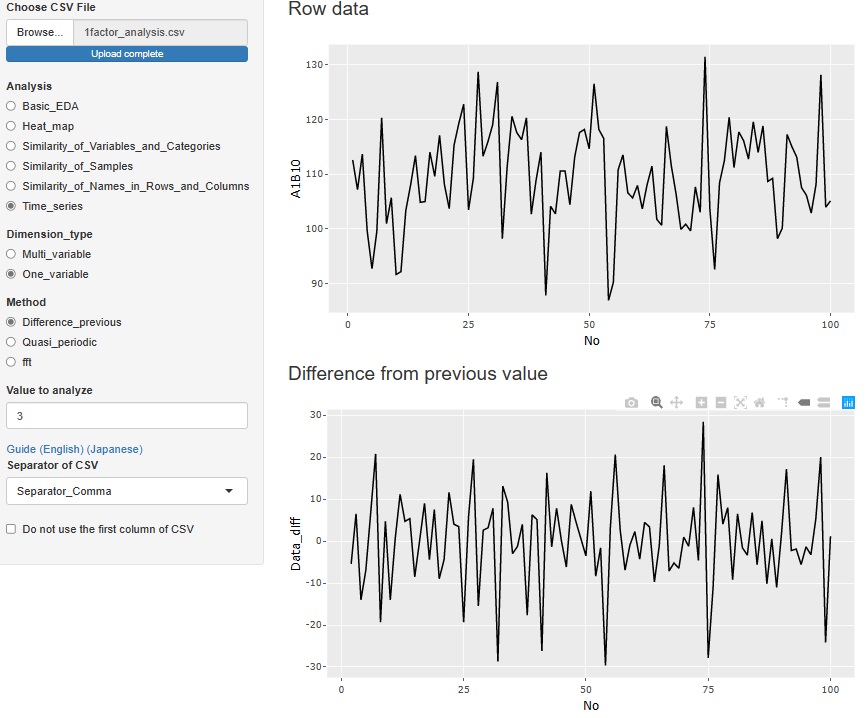
"Time series" has been added to "Analysis". Until now, when trying to do time series analysis, there were only heat maps and line graphs, but the number has increased considerably.
As a whole, we do not use time data such as "2021/10/19 13:30". This is because time data has various notations and it is not possible to create a tool that supports all of them. Instead, it is assumed that the data was collected at regular intervals such as "every minute", so we are making it possible to analyze "time" by the number of data. For 1 minute intervals, "n = 12" is "12 minutes".
"Stratifeid_graph" in "Multi_variable" is a line graph of the variable you want to pay attention to. You can use other variables to color code and split the graph.
"Dimension_reduction" in "Multi_variable" is a graph to see all the variables converted by the dimension reduction method. The figure below shows the case where "PCA (Principal Component Analysis)" is selected. You can also do it with "ICA (Independent Component Analysis)" or "Factor (Factor Analysis)". Select "None" to get a graph that looks at all the original multivariates together.
"Difference_previous" in "One_variable" is an analysis of the difference (difference) from the previous data. The top graph is the original data, and below that is a graph of the differences. If there is no tendency for the difference and it is random, it is considered to be a random walk model , so when predicting, the value immediately before is the most probable predicted value.
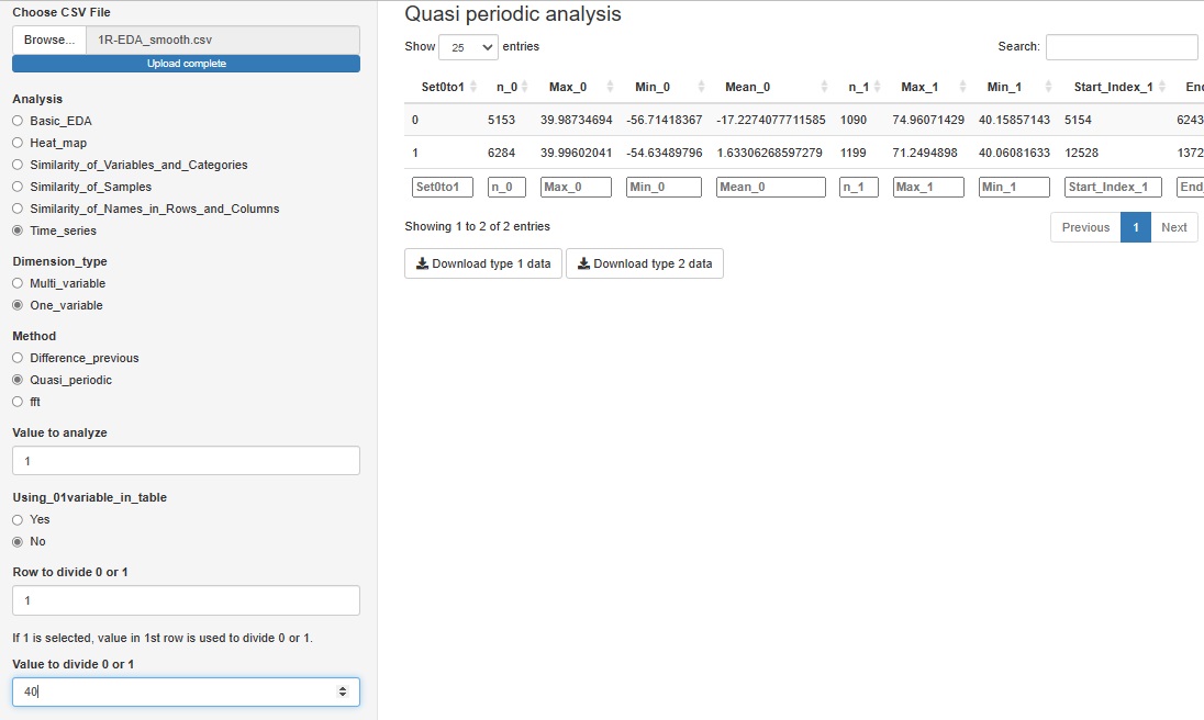
"Quasi_periodic" in "One_variable" is a tool for analyzing data that has repetition but does not have a constant period length, such as factory sensor data. This function does not output a graph, and data for Analysis of Type 1.5 and Analysis of Type 2 (Feature Data) can be downloaded.
We expect to use this data for further analysis as needed.
If you have a variable whose quasiperiodicity is represented by the numbers 1 and 0, you can use it. If you don't have these variables, you can create them for a particular variable by saying "1 if the first column is greater than 40, 0 if it is less than 40".
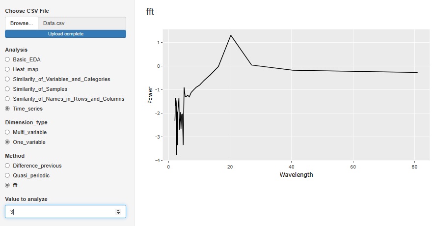
"Fft (Fast Fourier Transform)" in "One_variable" is a tool for Spectrum Analysis . It is an analysis method when there is accurate periodicity. The horizontal axis is Wavelength. In the case of the figure below, there is a peak at the wavelength of 20, so you can see that the data has periodicity every 20 rows.
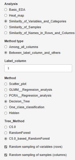
C5.0_based_RandomForest (random forest using C5.0)" was added to "Decision_Tree".
In "C5.0", you can have one tree, but this is made using all variables and all samples.
C5.0_based_RandomForest creates multiple trees by selecting multiple combinations for a part of a variable or sample. This will give you an idea of ??the diversity of your data and the variables that give similar results.
Random sampling is the method of selecting part of the data. I try to choose the number of square roots of the number of rows and columns. For example, for 10000 rows of data, 100 rows will be selected.
If you check "Random sampling of samples (columns)" and uncheck "Random sampling of variables (rows)", you can make multiple trees using one copy of the sample and all the variables. increase. This is a technique called "bagging".
Conversely, if you uncheck "Random sampling of samples (columns)" and check "Random sampling of variables (rows)", multiple trees will use one copy of variables and all samples. To make. This method makes it easier to reach what you want to know when the sample size is small or when analyzing causality.
 Å@
Å@
 Å@
Å@
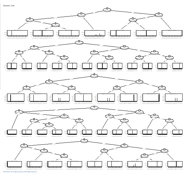
The fineness of the tree when making a decision tree was left to the default, but it can become a huge tree (a tree with fine branches). In the analysis of causality, it is important what happens to the third branch, and huge trees are often unnecessary. Also, if you accept a huge tree, the calculation time can be very long. In addition, huge trees can be called overfitting and are not robust and therefore difficult to use.
Therefore, we have made it possible to set the minimum size of the branch destination. If you check "Use minimum size of splits", you can set it. If you uncheck it, it will be left to the default. For example, if "Ratio of the number of minimum size" is set to "0.1", the minimum branching will be 0.1 for the whole. With 1000 rows of data, it can never be less than 100.
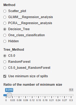
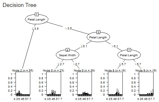
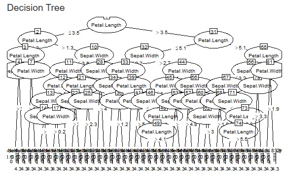
The two figures below are examples when the set values ??are changed for the same data.
 Å@
Å@
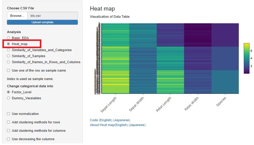
Previously, we used heatmaps to visualize the entire table of data in each of "Similarity_of_Variables_and_Categories" and "Similarity_of_Names_in_Rows_and_Columns". I put the method. Each had a slightly different function.
A way to visualize the entire table of data was also useful in "Similarity_of_Samples", but it wasn't included.
The method of visualizing the entire table of data is the basis of EDA, and the method of analyzing all three types of Similarity is different from other methods, so "Heat_map" is 3 It has been put together independently of the analysis of the types of Similarity.
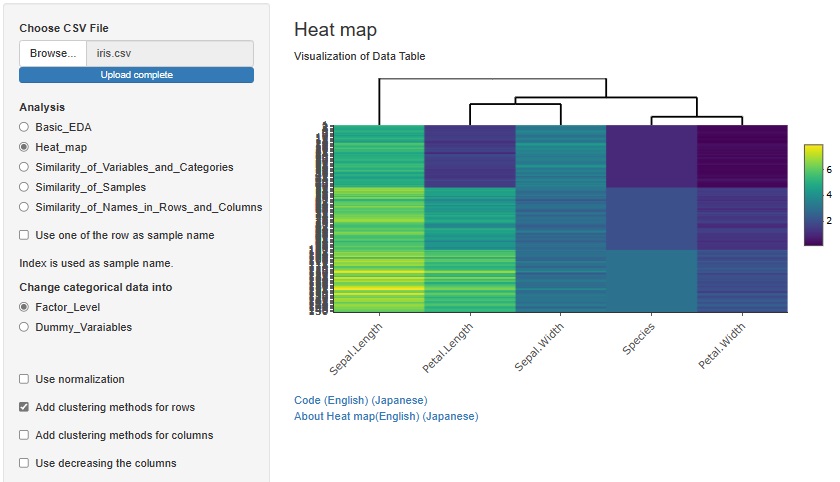
If you check "Add clustering methods for rows", similar variables will be sorted so that they are close to each other. You can also bring similar samples closer by checking "Add clustering methods for columns".
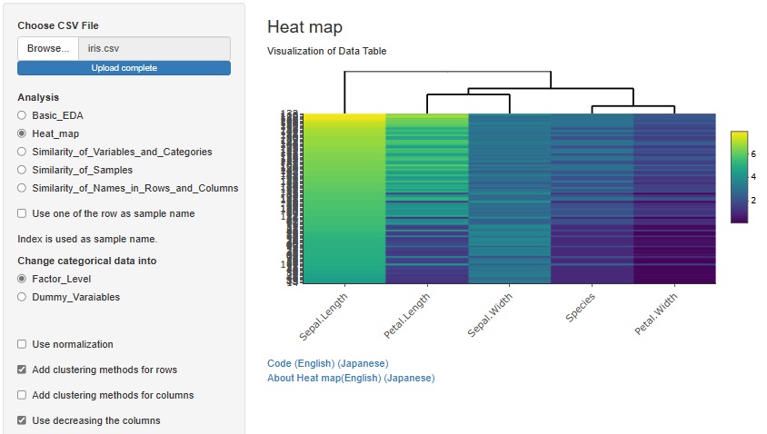
There is another way to bring similar samples closer. If you check "Use decreasing the columns", any variables will be sorted in descending order.
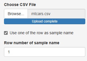
Up to now, the three analysis functions of "Heat_map", "Similarity_of_Samples", and "Similarity_of_Names_in_Rows_and_Columns" have been "Sample names in the data". There was a premise that "there must be a column for" and "the column for the sample name must be the first column".
This time, these two assumptions are no longer necessary.
If you uncheck "Use one of the row as sample name", you can analyze the row number instead of the sample name if there is no sample name column.
The number column in "Row number of sample name" is treated as the sample name.
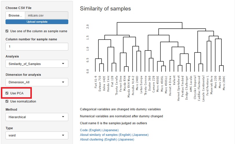
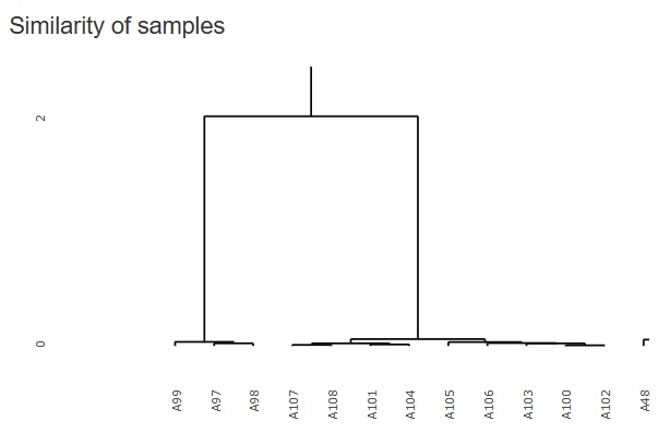
Cluster analysis using a hierarchical method is good when there are few sample types, but when there are a certain number of samples, the characters will overlap the graph and become undecipherable.
Therefore, I did not put it in R-EDA1, but I added it because it will not be undecipherable if it is an interactive type graph.
It will be "hclust" in
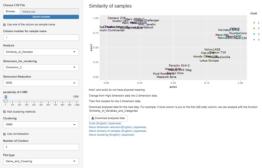
"Similarity_of_Samples"
-->
"Dimension_All"
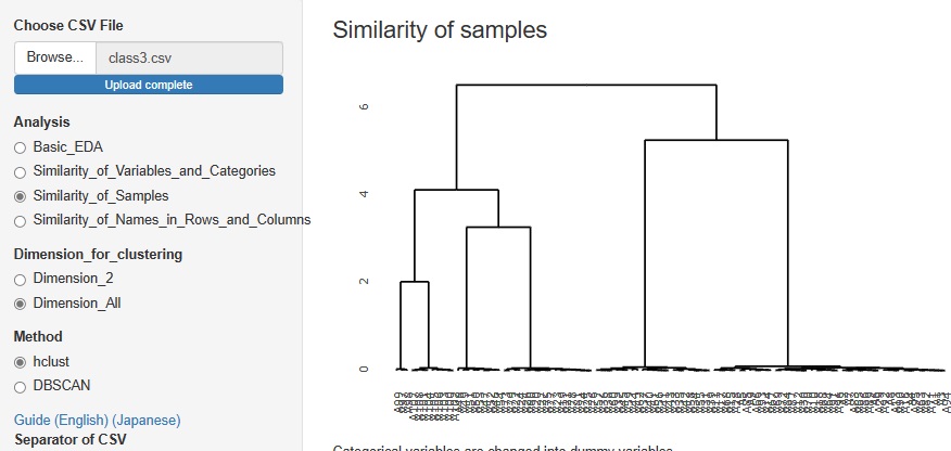
The figure below is a partial enlargement using the interactive function.
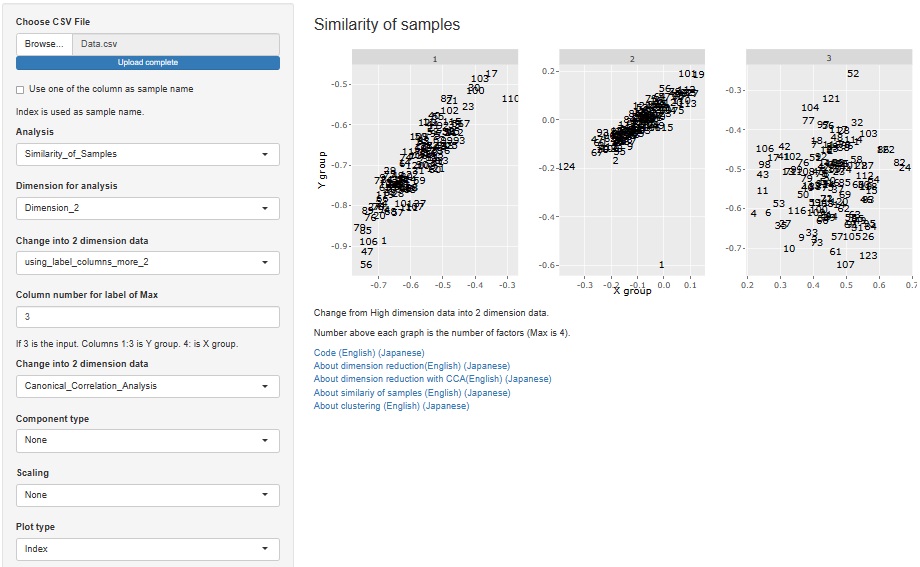
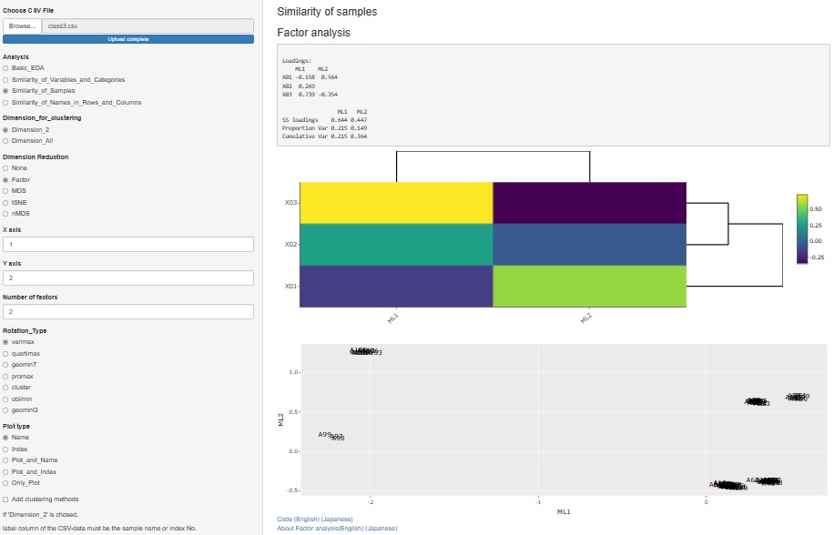
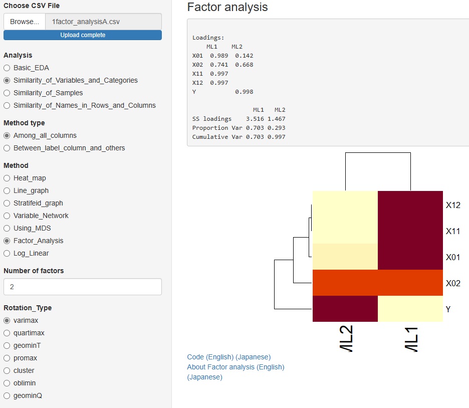
I released factor analysis on 2021/09/25, but I made it as a function to analyze the relationship of variables. Therefore, it was included in "Similarity_of_Variables_and_Categories".
Factor analysis is also used when you want to investigate the similarity of samples, including the relationship with factors, so we also created a function for that purpose.
" Factor" has been added to the type of dimension reduction in
"Similarity_of_Samples"
-->
"Dimension_2"
Almost all graphs have changed to interactive types. Even if they look the same, you can magnify only the place you want to see, or you can check the information of each plot with the mouse. For network graphs, you can pinch the graph and move it around.
Scatter plots and histograms: plotly with ggplotly
Heatmap: change to heatmaply
Network graphs: network3D for undirected graphs, visnetwork for directed graphs
" None" has been added to the type of dimension reduction in
"Similarity_of_Samples"-
--> "Dimension_2"
.
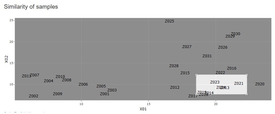
You can create a scatter plot of sample names for any two variables.
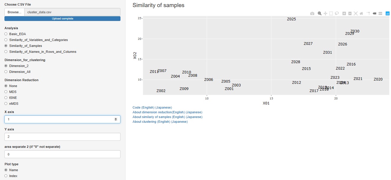
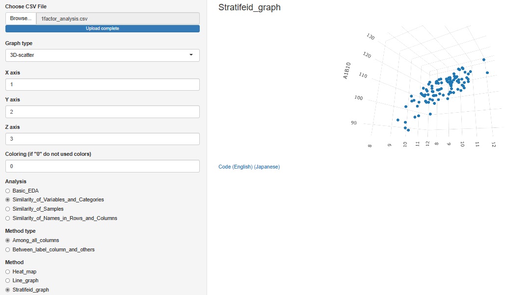
"Similarity_of_Samples"
--> "Among_all_columns"
--> "Stratifeid_graph"
"3D-scatter " is added to the graph type
Other than the 3D axis, only colors can be stratified. The graph cannot be divided like the 2D scatter plot.
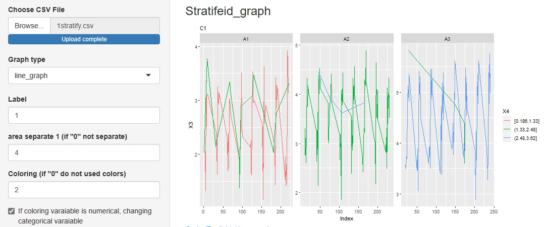
"Similarity_of_Variables_and_Categories"
->"Among_all_columns"
->"Stratifeid_graph"
Added "line_graph" to the graph type in the progress bottom.
You can see how the categories of other variables are included in the change of variables on the label.
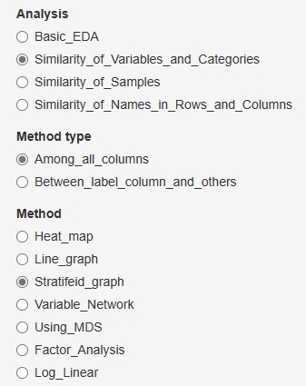
"Similarity_of_Variables_and_Categories"
->"Among_all_columns"
to some in advanced and Method (method), "Factor_Analysis."
You can assume a common factor behind the variables that are visible as data and see how they relate to the data.
You can choose from 7 types of rotation.
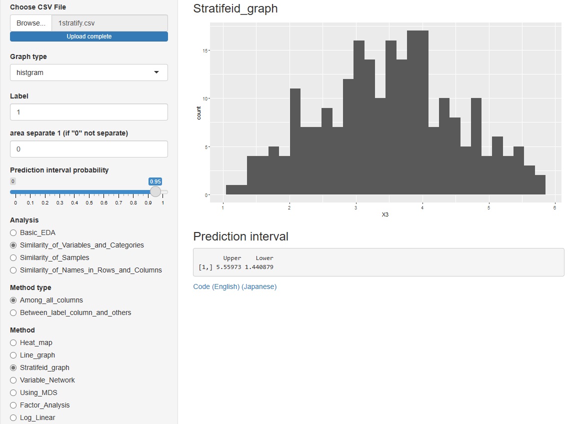
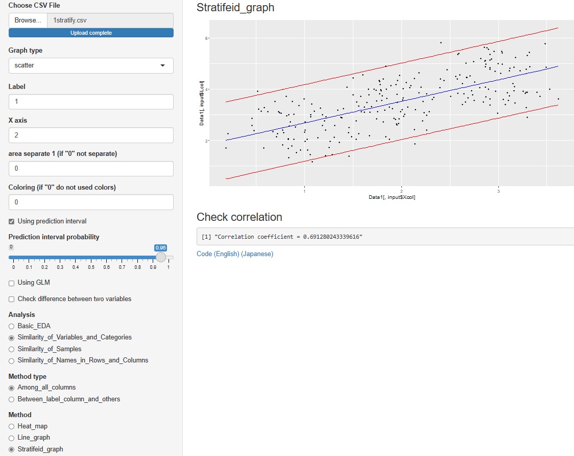
"Similarity_of_Variables_and_Categories"
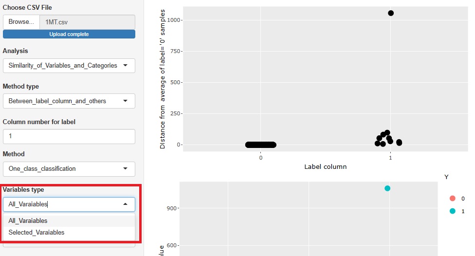
->"Between_label_column_and_others"
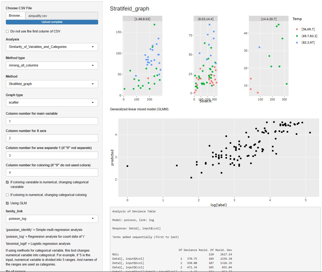
->"Stratifeid_graph"
"histgram" and "scatter" I tried to put out the prediction interval for each of . However, none of them are calculated when the graph is stratified.
However, none of them are calculated when the graph is stratified.
In the histogram, the intervals are displayed numerically. The scatter plot is displayed as a red line on the graph.
"Similarity_of_Variables_and_Categories"
->"Between_label_column_and_others"
tto the Method, which is in advanced and (way), "PCRA__Regression_analysis (Åiprincipal component regression analysis Åj".
The correlation between the explanatory variables and the principal components can be confirmed on the network graph.