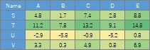
In the code example, the leftmost column is used as the sample name.
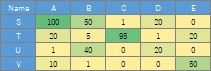
An analysis method when the values ??in the table of data represent the relationship between the individual items in the row and column.
The values ??in the table represent the frequency and strength of the relationship, and the larger the value, the stronger the relationship. Suppose 0 is the smallest value, which means "irrelevant". In the case of the data below, it is assumed that B and T represent the strongest relationship.
In the code example, the leftmost column is used as the sample name.
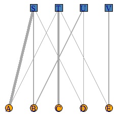
It is a bipartite graph .
library(igraph)#
setwd("C:/Rtest")#
DM <- read.csv("Data.csv", header=T, row.names=1)#
DM.mat = as.matrix(DM)/max(DM)*5#
DM.mat[DM.mat<1] <- 0#
DM.g<-graph_from_incidence_matrix(DM.mat,weighted=T)#
V(DM.g)$color <- c("steel blue", "orange")[V(DM.g)$type+1]#
V(DM.g)$shape <- c("square", "circle")[V(DM.g)$type+1] #
plot(DM.g, edge.width=E(DM.g)$weight, layout = layout_as_bipartite)#
This method can be used when the data is an integer greater than or equal to 0. For example, it can be used when the frequency is high.
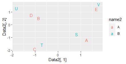
This is a method of processing the output of correspondence analysis by multidimensional scaling to create a multidimensional simultaneous attachment diagram .
If the results of the correspondence analysis are multidimensional, this method is useful because ordinary simultaneous attachments can make mistakes in the analysis.
library(MASS)#
setwd("C:/Rtest")#
Data <- read.csv("Data.csv", header=T, row.names=1) #
pc <- corresp(Data,nf=min(ncol(Data),nrow(Data)))#
pc1 <- pc$cscore #
pc1 <- transform(pc1 ,name1 = rownames(pc1), name2 = "A")#
pc2 <- pc$rscore#
pc2 <- transform(pc2 ,name1 = rownames(pc2), name2 = "B")#
Data1 <- rbind(pc1,pc2)#
round(pc$cor^2/sum(pc$cor^2),2)#

# From the above results, it was found that the eigenvalues ??up to the third have a high contribution rate, so we will include them in the subsequent analysis.
# By the way, if you put a part with a low contribution rate, it seems to be noise and it will not be separated cleanly.
MaxN = 3#
Data11 <- Data1[,1:MaxN]#
Data11_dist <- dist(Data11)#
sn <- sammon(Data11_dist) #
output <- sn$points#
Data2 <- cbind(output, Data1)#
library(ggplot2)#
ggplot(Data2, aes(x=Data2[,1], y=Data2[,2],label=name1)) + geom_text(aes(colour=name2)) #
A method of mathematically expressing the relationship between numbers and items using log-linear analysis .
library(tidyr)#
library(MASS) #
setwd("C:/Rtest") #
Data <- read.csv("Data.csv", header=T) #
Data1 <- tidyr::gather(Data, key="Name2", value = Val, -Name) #
summary(step(glm(Val~.^2, data=Data1,family=poisson))) #
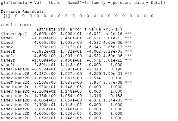
this example, "(Name + Name2) ^ 2" is finally left as the right side of the model expression, so the row and column items are simple. You can see that the value is determined by factors other than the addition.
Depending on the data, for example, "Name2" may remain at the end. In this case, the value is fixed regardless of the item in the row.
Suppose the values ??in the table are quantitative data and are numbers that represent the relationships between items, but the magnitude of the values ??does not represent the strength of the relationships.
It's basically the same as the method for visualizing the entire data with R , except that you enter the leftmost column as the column name .
Of course, the method using a heat map can also be used when "the value representing the relationship is quantitative data, and the larger the value, the stronger the relationship".
library(heatmaply) #
setwd("C:/Rtest")#
Data <- read.csv("Data.csv", header=T, row.names=1)#
heatmaply(Data, Colv = NA, Rowv = NA)#
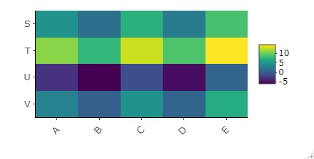
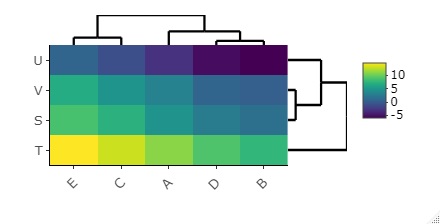
The default function for creating heatmaps is for some reason cluster analysis with the ability to sort rows and columns in a similar way. Use this.
library(heatmaply) #
setwd("C:/Rtest")#
Data <- read.csv("Data.csv", header=T, row.names=1)#
heatmaply(Data)#
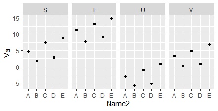
It is a method to make a systematic graph using a one-dimensional scatter plot for each layer .
library(tidyr)#
library(ggplot2)#
setwd("C:/Rtest") #
Data <- read.csv("Data.csv", header=T)#
Data1 <- tidyr::gather(Data, key="Name2", value = Val, -Name)#
ggplot(Data1, aes(x=Name, y=Val)) + geom_point() +facet_grid(.~Name2) #
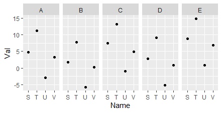
If you swap Name and Name2, the way the graph is divided will be swapped.
ggplot(Data1, aes(x=Name2, y=Val)) + geom_point() +facet_grid(.~Name)#
This is a method of expressing the relationship between numerical values ??and items using mathematical formulas using quantification type 1.
library(tidyr) #
setwd("C:/Rtest") #
Data <- read.csv("Data.csv", header=T) #
Data1 <- tidyr::gather(Data, key="Name2", value = Val, -Name) #
summary(step(lm(Val~., data=Data1)))#
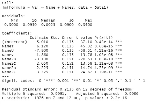
coefficient of determination (R-squared) is 0.9991, we can see that a very high model formula is created.
As for the result, the inference value of the combination of "T and B" is
5.010 + 6.120 -3.100 = 8.03
. To avoid multicollinearity , A and S are
omitted from the dummy variable. For example, the value of the combination of "A and T" is
5.010 + 6.120 = 11.13
As a result, if a significant model expression is created, it can be inferred that the value is determined by a complicated rule, but we do not know what kind of rule it is.
The values ??in the table are for qualitative data.
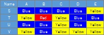
Both methods are used after rearranging the data so that the item name in the row is in the first column, the item in the column is in the second column, and the value is in the third column.
library(tidyr) #
library(dplyr) #
setwd("C:/Rtest") #
Data <- read.csv("Data.csv", header=T) #
Data1 <- tidyr::gather(Data, key="Name2", value = Val, -Name) #
Data21 <- Data1#
Data21[,2] <- NULL # #
Data22 <- Data1[,2:3] ##
names(Data22)[1] <- "Name"#
Data31 <- count(group_by(Data21,Data21[,1:2],.drop=FALSE)) # #
Data32 <- count(group_by(Data22,Data22[,1:2],.drop=FALSE)) # #
Data4 <- rbind(Data31,Data32)#
Data5 <- Data4/max(Data4)*5#
DM.g<- graph.data.frame(Data5[,c(1,2)], directed = F)#
E(DM.g)$weight <-Data5[[3]]#
plot(DM.g, edge.width=E(DM.g)$weight)#
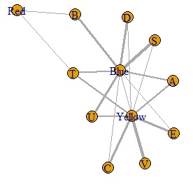
This result is difficult to interpret, but for the time being, the data has become a graph.
library(tidyr)#
library(dplyr)#
library(dummies)#
library(MASS) #
library(ggplot2) #
setwd("C:/Rtest") #
Data <- read.csv("Data.csv", header=T) #
Data1 <- tidyr::gather(Data, key="Name2", value = Val, -Name) #
Data_dmy <- dummy.data.frame(Data1)#
pc <- corresp(Data_dmy,nf=min(ncol(Data_dmy)))#
pc1 <- pc$cscore #
pc1 <- transform(pc1 ,name1 = rownames(pc1))#
round(pc$cor^2/sum(pc$cor^2),2)#

In the above example, the 9th and subsequent eigenvalues ??have a low contribution rate, so we will exclude them from the subsequent analysis.
MaxN = 8#
Data11 <- pc1[,1:MaxN]#
Data11_dist <- dist(Data11)#
sn <- sammon(Data11_dist)#
output <- sn$points#
Data2 <- cbind(output, pc1)#
ggplot(Data2, aes(x=Data2[,1], y=Data2[,2],label=name1)) + geom_text() #
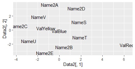
This is also difficult to interpret, but for the time being The data is now a graph. The Red is placed where it is off, just like the method above.
