 -->
-->
You can analyze the grouping of samples by using the method of compressing and visualizing high dimensions into two dimensions .
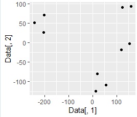
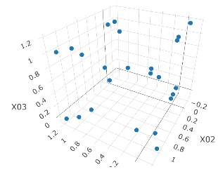
Making it two-dimensional makes it easier to see what the data looks like and makes it easier to grasp the characteristics of the data. The example below is an example of converting 3D data to 2D. It is easy to see in the 2D scatter plot that the samples are divided into 4 groups . The data before conversion can be created in higher dimensions.
-->
When examining data with many columns (explanatory variables) using a two-dimensional scatter plot , generally, the combination of two columns is made into a scatter plot in order.
A scatter plot is also created by compressing high dimensions into two dimensions and visualizing it, but this scatter plot contains information on all columns, not two columns.
The explanation of "turning high-dimensional data into two-dimensional data" may not come to mind, but it is a good idea to draw a lot of columns of information on a scatter plot that should normally be able to represent only two columns. ,It's amazing.
After brainstorming , you may try to group the opinions that come up with similar ones, or put some collections close together with similar ones, but this 2D map is , It's close to that idea. In other words, it makes sense if it's close, but it doesn't make much sense where it's on the map.
A two-dimensional map is a way to look at a map and analyze the big picture of a sample.
Even if you want to divide the data into groups and treat them after you see them, you will have to manually label the groups. Cluster analysis is a way to automatically label .
Two-dimensional maps and cluster analysis can be used to complement each other's weaknesses and inability.
The method of compressing and visualizing high dimensions to 2 dimensions is basically the same as the work of creating a 2D scatter diagram after 2D data is created . The difference between the methods is the part of "compressing high dimensions to two dimensions".
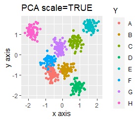
Principal component analysis is probably the most famous method on this page. When using principal component analysis as a method of compressing high dimensions to two dimensions, it may be possible to compress up to two dimensions even with principal component analysis, but depending on the data, it may not be possible to compress only two dimensions.
There are multidimensional scaling , self-organizing maps , tSNE, and LLE as methods for compressing high-dimensional data into two-dimensional data, even if it is a little difficult.
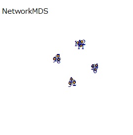
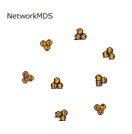
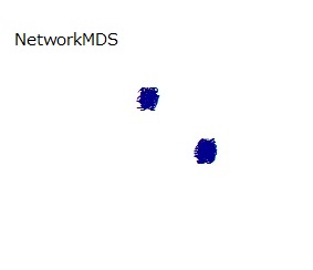
All of the above methods use 2D scatter plots for 2D maps . For those who use network graphs , there is a network-type multidimensional scaling method on this site. The network graph and the 2D scatter plot are the same in that they use 2D coordinate data. The difference between network graphs is that the lines connecting the samples are created as needed.
The method of compressing high-dimensional data to two-dimensional data can also be compressed to three-dimensional or one-dimensional by changing the parameters. The default method that can be used without specifying it is "2".
When compressing to 3D, it may be used as dimensional compression, but it is not suitable for "viewing on a map".
When compressing to one dimension, it seems that it can be used to "order the groups", but there is no index, and the data compressed from higher dimension to one dimension has no meaning in the one-dimensional value. I can't use it to order. For that reason, I don't think there is any use for positively using compression to one dimension.
The above is the story when compressing into one-dimensional quantitative data. Cluster analysis is a method of converting high-dimensional quantitative data into one-dimensional qualitative data . If you want to make it one-dimensional, qualitative data is more useful.
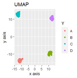
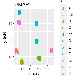
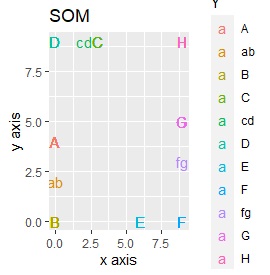
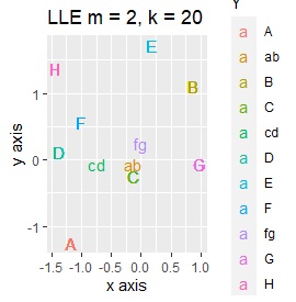
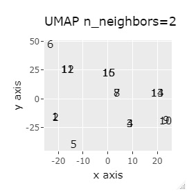
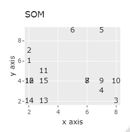
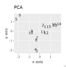
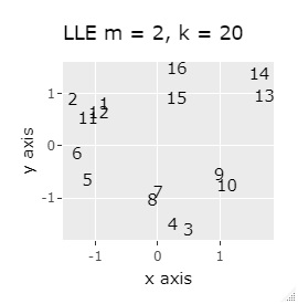
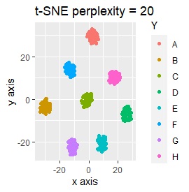
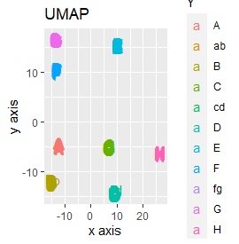
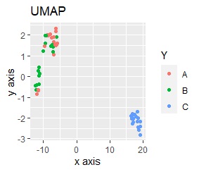
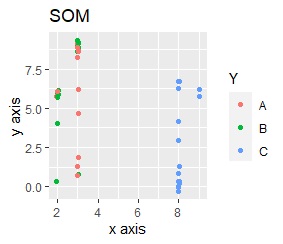
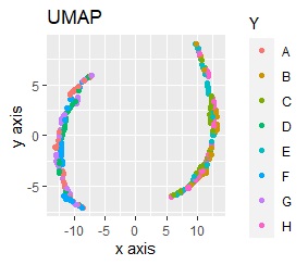
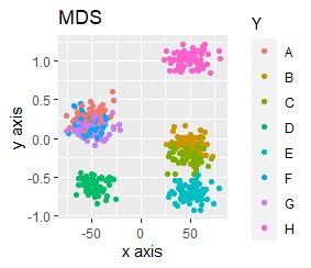
Examples include Principal Component Analysis (PCA), Multidimensional Scaling (MDS), Self-Organizing Map (SOM), t-SNE, UMAP, LLE, and Networked Multidimensional Scaling (NetworkMDS).
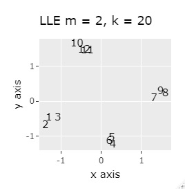
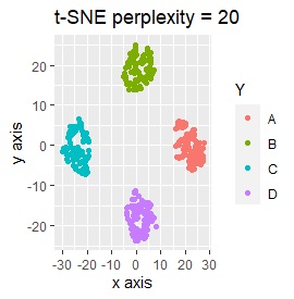
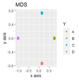
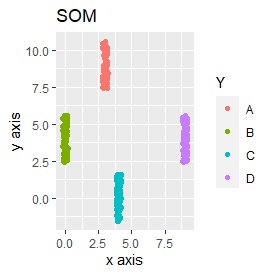
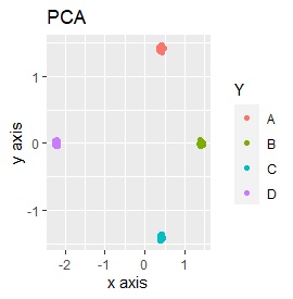
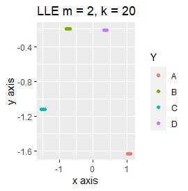
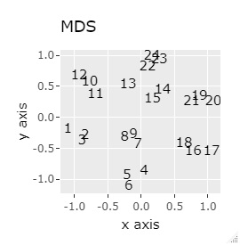
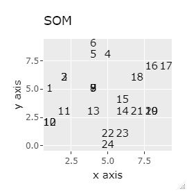
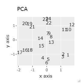
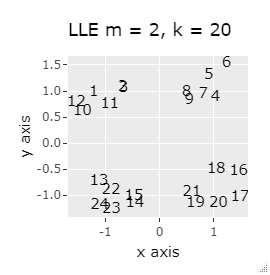
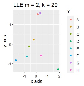
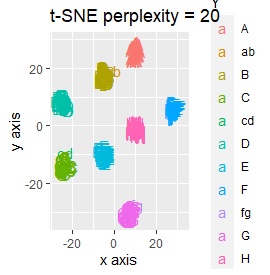
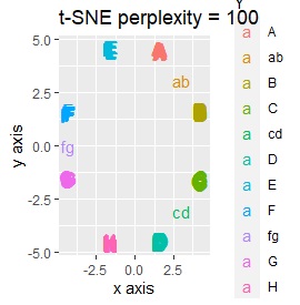
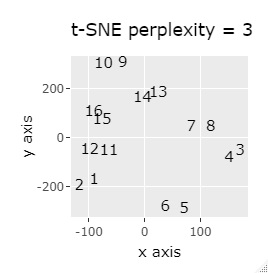
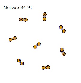
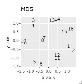
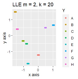
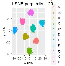
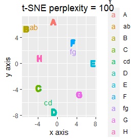
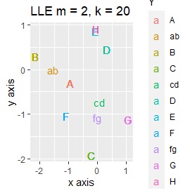
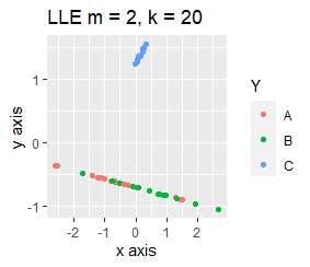
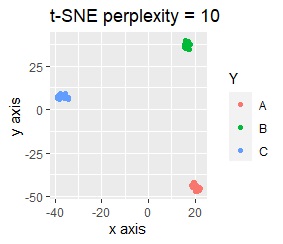
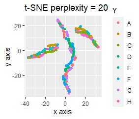
PCA sees only the first and second principal components. MDS uses sammon. As the number of samples increases, NetworkMDS takes a very long time to draw the graph and the graph becomes unreadable, so in the following cases, it is not implemented with a large number of samples. LLE is m = 2 because we want to make it two-dimensional. k corresponds to the number of clusters that converge, and if it is made large, it will take a long time to calculate, but since large is also small, it is made large at 20 here. t-SNE changes variously depending on the parameter adjustment, so it is just an example.
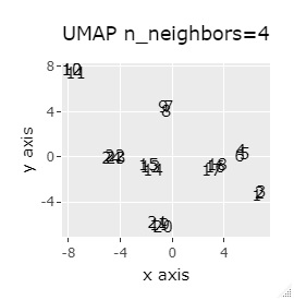
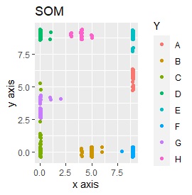
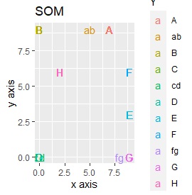
If LLE and SOM are separated well, multiple samples will be overlapped at the same coordinates, so it is scattered a little to make it easier to see how they are gathered.
To the last, it will be from the following cases, but the conclusion is two points.
(1,2,3), (4,5,6), (7,8,9), (10,11,12) are close to each other and form a group.
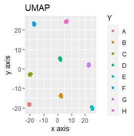
UMAP was uncalculable. Other than that, there was no big difference.
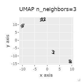
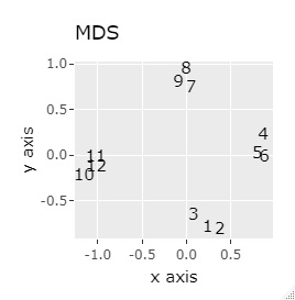
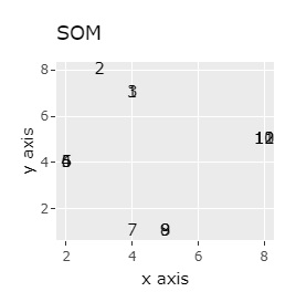
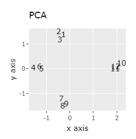
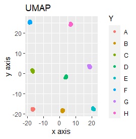
In Example 1-1, one group had three, but in Example 1-2, there are 96 in one group.
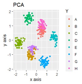
Samples of the same color have the same original group.
Except for LLE, the color areas were clearly separated, which was a good result.
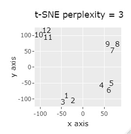
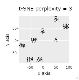
t-SNE does not divide well depending on the parameter adjustment.
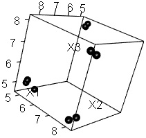
It is three-dimensional data. It is the data with 3 samples each near the apex of the cube.
(1,2,3), (4,5,6), (7,8,9), (10,11,12), (13,13,15), (16,17,18), (19 , 20,21) and (22,23,24) are close to each other and form a group.
If the goal was to clearly divide the eight groups, only t-SNE and Network MDS were able to achieve the goal.
Other than that, there were no major mistakes, and although they were separated, it seemed unclear.
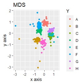
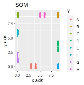
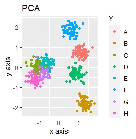
In Example 2-1 there were 3 in one group, but in Example 1-2 there are 48 in one group.
Samples of the same color have the same original group.
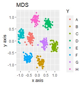
Except for PCA and SOM, it feels good. PCA and SOM are a mixture of two groups.
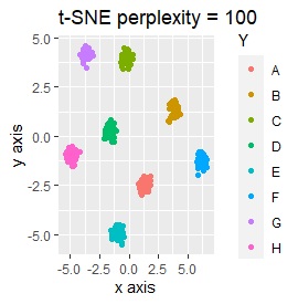
Three samples are added to the group in Example 2-2. One sample is added between A and B, between C and D, and between F and G.
Only t-SNE with perplexity of 100 could represent an intermediate sample.
SOM and LLE can describe the intermediate sample as foreign, but for example, there is no CE in the middle of C and E.
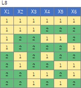
It is 6-dimensional data created by the orthogonal array of L8 . There are two samples at each level, and the two are a little apart.
(1,2), (3,4), (5,6), (7,8), (9,10), (11,12), (13,14), (15,16), respectively It's close and is in a group.
If the goal was to clearly divide the eight groups, it was t-SNE, NetworkMDS, and MDS that achieved the goal. Other than that, there are no major mistakes, but the division is ambiguous.
In Example 3-1 there were two groups, but in Example 1-2 there are 64 groups.
Except for PCA and MDS, I broke up well.
Three samples are added to the group in Example 3-2. One sample is added between A and B, between C and D, and between F and G.
Only t-SNE with perplexity of 100 could represent an intermediate sample.
It is true that LLE has AB between A and B, CD between C and D, and FG between F and G, but it is happening that CD and FG are close. increase.
This is the case when there are three groups in a two-dimensional space and they are clearly separated.
PCA and MDS are neatly divided into three. Except for PCA and MDS, it was divided into two. Since it converts 2D to 2D, it seems that any method can be divided into 3 well, but this is not the case.
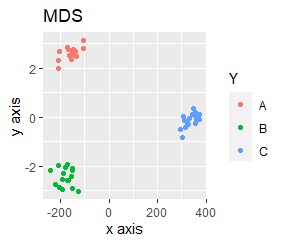
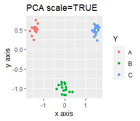
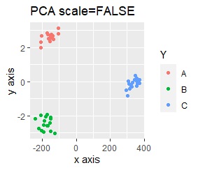
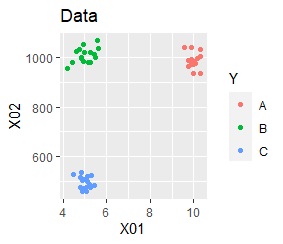
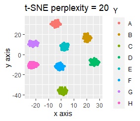
The point of this data is that the scale is orders of magnitude on the X and Y axes. The MDS and PCA maintain the layout visible in the 2D scatter plot, so there is no significant difference in the converted scatter plot.
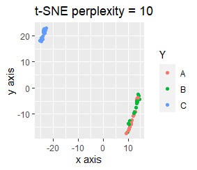
On the other hand, other than PCA and MDS, the influence of scale is large. For analyzes that do not make a difference in scale other than PCA and MDS, perform scale conversion (Standardization and Normalization ). For example, if you perform t-SNE after normalization, the figure below is shown, and it is neatly divided into three groups.
When studying the method of dimension reduction, the subject matter is usually 2D or 3D position coordinate data. With such data, things like this example are unlikely to happen.
On the other hand, in actual data analysis, variables with different units may be mixed, and you need to be aware of things like this example. Normalization loses the physical meaning of the original data, so it's difficult to simply say, "Be sure to include normalization in the preprocessing."
It is almost the same as the data in Example 3-1 but when the value of only one variable (dimension) is an order of magnitude.
For this data, both Example 3-1 and Example 4-1 came in and there was no way to divide the eight groups.
What's interesting is that PCA and MDS, which seemed to give bad results in Example 3-1 but are reasonably good in this example. In general, PCA and MDS are not very good ways to see higher dimensions in two dimensions. So is Correspondence analysis . However, when a group with a narrow range is scattered in a high dimension, it is possible to arrange the scattered things well in two dimensions by rotating the space well. I have. This may be the reason why these analysis methods have been useful in their own way even before the development of t-SNE and SOM.
For example, if t-SNE after normalizing, the figure below will be obtained. It is neatly divided into 8 groups.
R examples are in Visualization by compressing high dimensions into two dimensions by R.
NEXT  Multi Dimensional Scaling
