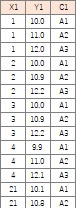
ggplot2 is the software made for Graphical Analysis in R. Today there is for Python. The code in this page is for R.
This example is needed the code starting "ggplot".
library(ggplot2)
setwd("C:/Rtest")
Data <- read.csv("Data.csv", header=T) # Read data
Graph for the analysis the relationship 2 variables
>>>Line Graph
>>>Stratified Line Graph
>>>Same Space Line Graph
>>>Basic Scatter Plot
>>>Stratified Scatter Plot
>>>Regression Line
>>>Scatter Plot for Words
Histgram
>>>Basic Histgram
>>>Stratified Histgram
>>>Good Range Histgram
Graph for 1 Variable
>>>Graph for 1 Variable Stratified by 1 Variable
>>>Graph for 1 Variable Stratified by 2 Variables
>>>Graph for 1 Variable Stratified by 3 Variables
Bar Plot
>>>Basic Bar Plot
>>>Stratified Bar Plot
>>>Frequency Plot
Adjusting the Graph
>>>Angle of Label
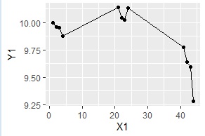
There is Line Graph as Graph for Change .
After Common Code
ggplot(Data, aes(x=X1,y=Y1, group=1)) + geom_line() + geom_point()# Line Graph
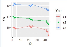
This code is imaged that stratified data is not in same variable.
library(ggplot2)
setwd("C:/Rtest")
Data <- read.csv("Data.csv", header=T)
library(tidyr)
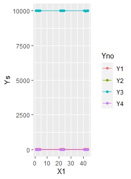
Data_long <- tidyr::gather(Data, key="Yno", value = Ys, -X1) # Pile up the data
ggplot(Data_long, aes(x=X1,y=Ys, colour=Yno)) + geom_line() + geom_point()# Stratified Line Graph
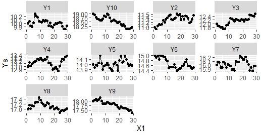
facet is used to separate the are of graphs.
ggplot(Data_long, aes(x=X1,y=Ys)) + geom_line() + geom_point() + facet_wrap(~Yno,nrow=1000)
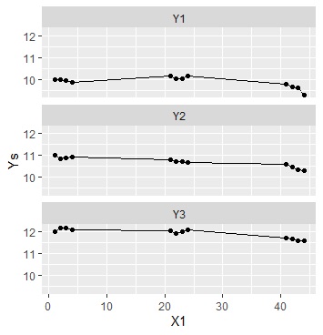
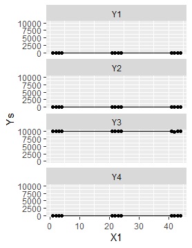
Y range is adjusted for each graph.
ggplot(Data_long, aes(x=X1,y=Ys)) + geom_line() + geom_point() + facet_wrap(~Yno,scales="free",nrow=1000)
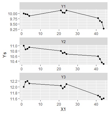
The effect of adjusting the Y range is clear if units or orders of each variable are different.
Graphs below are made to check this effect.
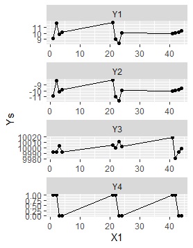
ggplot(Data_long, aes(x=X1,y=Ys)) + geom_line() + geom_point() + facet_wrap(~Yno,scales="free")
# Make many line graghs that of Y ranges are different
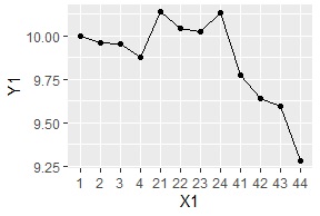
In the graphs above, space of plots of X axis are not same because X axis data is number type data.
If we want same space, changing data type into factor data is one of the solution.
Data$X1 <-factor(Data$X1) # Changing data type into factor data
ggplot(Data, aes(x=X1,y=Y1, group=1)) + geom_line() + geom_point()
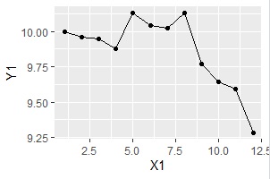
The other solution is changing X1 into numbers of columns.
Data$X1 <-as.numeric(row.names(Data)) # changing X1 into numbers of columns
ggplot(Data, aes(x=X1,y=Y1)) + geom_line() + geom_point()
ggplot(Data, aes(x=X1, y=Y1)) + geom_point(aes(colour=C1, shape=C1))
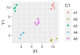
ggplot(Data, aes(x=X1, y=Y1)) + geom_point(aes(colour=C1, shape=C1)) + coord_cartesian(xlim=c(0,20),ylim=c(0,20))
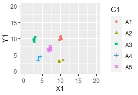
ggplot(Data, aes(x=X1, y=Y1)) + geom_point(aes(colour=C1, shape=C1)) + geom_smooth(method = "lm",aes(fill = C1))
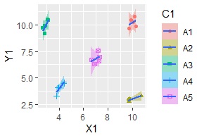
If without "aes(fill = C1)", regression line is made for all data not for each category.
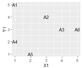
Scatter Plot for Words is also made.
ggplot(Data, aes(x=X1, y=Y1,label=C1)) + geom_text() # Scatter Plot for Words

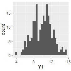
Histgram is made
Histgram is one of the Graph for 1 Variable . But I separate the introduction because making process is different.
ggplot(Data, aes(x=Y1)) + geom_histogram()
ggplot(Data, aes(x=Y1)) + geom_histogram() + facet_grid(C1~.)
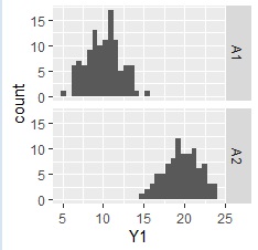
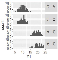
ggplot(Data, aes(x=Y1)) + geom_histogram() + facet_grid(C1+C2~.)
Default setting od ggplot2 make 30 section for data range.
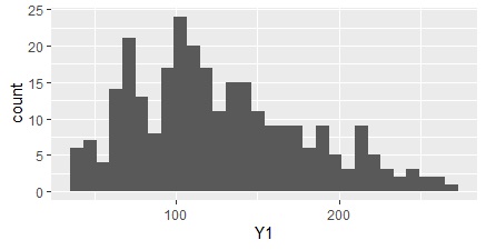
Example below is made to change sections for easy understanding of data.
Data[,'Y1r']<-trunc(Data[,'Y1']/10)*10# unit is 10
ggplot(Data, aes(x=Y1r)) + geom_histogram(binwidth = 10)
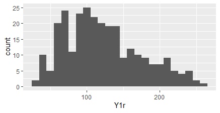
Example to change the section
Data[,'Y1r']<-trunc(Data[,'Y1']) # unit is 1
Data[,'Y1r']<-trunc(Data[,'Y1']/0.5)*0.5 # unit is 0.5
Making 1-Dimension Scatter Plot .
ggplot(Data, aes(x=C1, y=Y1)) + geom_point()
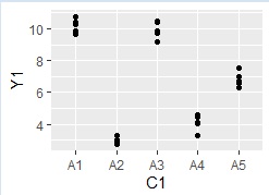
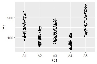
ggplot(Data, aes(x=C1, y=Y1)) + geom_jitter(size=1, position=position_jitter(0.1))# 1-Dimension Jitter Plot
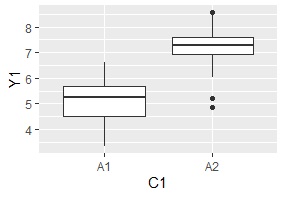
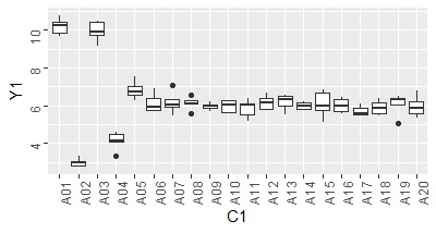
Making Box Plot .
ggplot(Data, aes(x=C1, y=Y1)) + geom_boxplot()
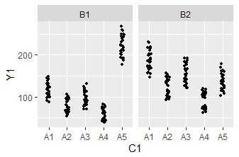
 Graph for 1 Variable Stratified by 2 Variables
ggplot(Data, aes(x=C1, y=Y1)) + geom_jitter(size=1, position=position_jitter(0.1)) +facet_grid(.~C2)
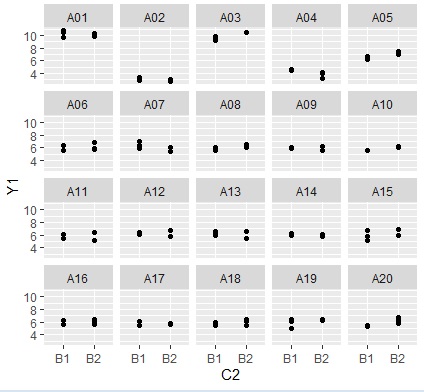
Example of many categories.
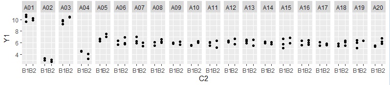
"facet_grid" puts graphs on a line. "facet_wrap" puts graphs in a good balance.
ggplot(Data, aes(x=C2, y=Y1)) + geom_point() +facet_wrap(~C1)
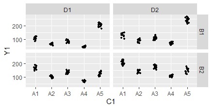
ggplot(Data, aes(x=C1, y=Y1)) + geom_jitter(size=1, position=position_jitter(0.1)) +facet_grid(.~C2+C3)
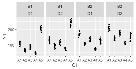
ggplot(Data, aes(x=C1, y=Y1)) + geom_jitter(size=1, position=position_jitter(0.1)) +facet_grid(C2~C3)
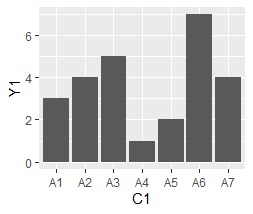
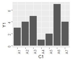
Making Bar Plot
ggplot(Data, aes(x=C1, y=Y1)) + geom_bar(stat = "identity")
ggplot(Data, aes(x=C1, y=Y1)) + geom_bar(stat="identity", aes(fill=C1)) + facet_grid(. ~ C2)
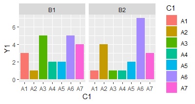
"C1" and "C2" are categorical data.
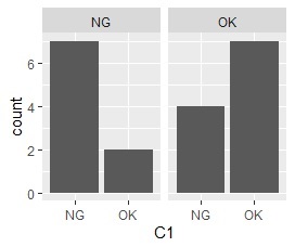
ggplot(Data, aes(x=C1)) + geom_bar() + facet_grid(. ~ C2)

Changing the angle of label/
ggplot(Data, aes(x=C1, y=Y1)) + geom_bar(stat = "identity") + theme(axis.text = element_text(angle = 90))
ggplot(Data, aes(x=C1, y=Y1)) + geom_boxplot() + theme(axis.text = element_text(angle = 90))
NEXT  Plotly
