Outlier Detection by R
This is an example when searching for Outlier Detection.
This page is a way to look especially at the off-the-shelf samples.
The method of Visualization by compressing high dimensions into two dimensions is not introduced on this page because the procedure is the same as that of Visualization by compressing high dimensions into two dimensions .
One dimension
Histogram
Outliers are small in number and can be overlooked in regular Histogram . Here, ggplot2 to Plotly a combination of, we are in the graph, which is free to change the range.
library(ggplot2)
library(plotly))
setwd("C:/Rtest")
Data1 <- read.csv("Data.csv", header=T)
ggplotly(ggplot(Data1, aes(x=X1)) + geom_histogram()))
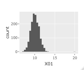
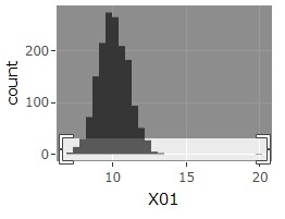
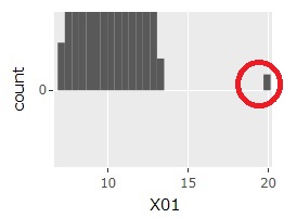
The histogram can be the one on the far left at first. If you select a range like the graph in the middle, you will get the one on the far right. Then, the sample around 20 will be easier to see.
Box plot
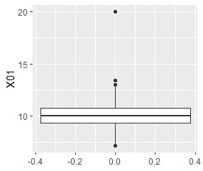
In the box plot , a "whisker" is drawn at 1.5 times the width of the upper and lower quartiles, and samples farther away are represented by "dots" as if they were outliers.
library(ggplot2)
library(plotly))
setwd("C:/Rtest")
Data1 <- read.csv("Data.csv", header=T)
ggplot(Data1, aes(y=X1)) + geom_boxplot()
Smirnov-Grabs test
The Smirnov-Grabs test determines what outliers are for one-dimensional data and for the outermost sample of the distribution.
library(outliers)
setwd("C:/Rtest")
Data <- read.csv("Data.csv", header=T)
grubbs.test(Data[,1])
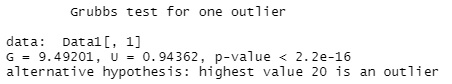
This case, it is tested whether the maximum value "20" is an outlier, and since the p value is quite small, it is judged as an outlier.
It is judged by the p value, but the p value tends to be small when the number of samples is large. As a guide, the author thinks, "When the number of samples is up to 30th place, if the p value is larger than 0.01, it is not an outlier." If it is greater than 30, I don't think it is possible to quantitatively determine outliers using this method.
Multi dimension
Cluster analysis (hierarchical)
This is a method of using the hierarchical type of Cluster Analysis. There are various hierarchical types, but it is the closest method (single) that makes it easy to find outliers, so the following is set to single.
In addition, the dendrogram is combined with plotly so that it can be expanded.
library(plotly)
library(ggdendro)
setwd("C:/Rtest")
Data1 <- read.csv("Data.csv", header=T)
Data10 <- Data1[,1:2]## Specify the data to be used for cluster analysis. Here, in the case of the 1st and 2nd columns
Data11_dist <- dist(Data10)
hc <- hclust(Data11_dist, "single")
ggplotly(ggdendrogram(hc, segments = TRUE, labels = TRUE, leaf_labels = TRUE, rotate = FALSE, theme_dendro = TRUE))
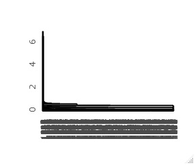
First dendrogram you can create is on the left, and the left side of that dendrogram is expanded to the right. The vertical axis of the graph corresponds to the distance, so you can see from this graph that the first and second samples are far from the majority of the others.
output <- cutree(hc,k=3)# Group into 3
Data <- cbind(Data1, output)
Data$output <-factor(Data$output)
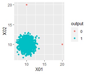
ggplot(Data, aes(x=X1, y=X2)) + geom_point(aes(colour=output))
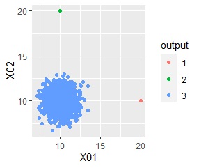
Outliers, "1 , "2", which distinguishes it from the "3" group, which contains the majority.
Cluster analysis (DBSCAN)
The method useing DBSCAN as Cluster Analysis.
library(ggplot2)
setwd("C:/Rtest")
Data1 <- read.csv("Data.csv", header=T)
Data10 <- Data1[,1:2]## Specify the data to be used for cluster analysis. Here, in the case of the 1st and 2nd columns
Data11 <- Data10
for (i in 1:ncol(Data10)) {
Data11[,i] <- (Data10[,i] - min(Data10[,i]))/(max(Data10[,i]) - min(Data10[,i]))
}
Data11_dist <- dist(Data10)
library(dbscan)
dbs <- dbscan(Data11, eps = 0.2)
output <- dbs$cluster
Data <- cbind(Data1, output)
Data$output <-factor(Data$output)
ggplot(Data, aes(x=X1, y=X2)) + geom_point(aes(colour=output))
Outliers are in the group "0".
LOF
How to use
LOF.
library(Rlof)
library(ggplot2)
setwd("C:/Rtest")
Data <- read.csv("Data.csv", header=T)
Data1 <- Data
Data1 <- Data[,1:2]# Specify the data to be used for cluster analysis. Here, in the case of the 1st and 2nd columns
LOF <- lof(Data1,5)# When using 5 nearby
Data2 <- as.data.frame(cbind(LOF ,Data))
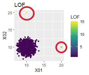
ggplot(Data2, aes(x=X1, y=X2)) + geom_point(aes(colour=LOF))+ggtitle("LOF")+ scale_color_viridis_c(option = "D")
ggplot(Data2, aes(y=LOF)) + geom_boxplot()
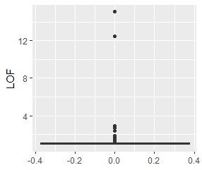
The LOF of the outliers samples are calculated high.
One-Class SVM
One-Class SVM is a way to separate the inside and outside of a distribution.
library(ggplot2)
library(kernlab)
setwd("C:/Rtest")
Data1 <- read.csv("Data.csv", header=T)
Data10 <- Data1[,1:2]# Specify the data to be used for cluster analysis. Here, in the case of the 1st and 2nd columns
Data11 <- transform(Data10, type=1)
OC <- ksvm(type~.,data=Data11,type='one-svc', kernel="besseldot", nu = 0.01)# nu is the ratio of outliers
output <- predict(OC,Data11)
#Kernel is anovadot
OC <- ksvm(type~.,data=Data11,type='one-svc', kernel="anovadot", nu = 0.01)
#Kernel is rbfdot
OC <- ksvm(type~.,data=Data11,type='one-svc', kernel="rbfdot", nu = 0.01)
Data <- cbind(Data1, output)
Data$output <-factor(Data$output)
ggplot(Data, aes(x=X1, y=X2)) + geom_point(aes(colour=output))
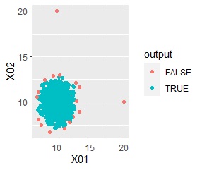
Outliers are in the group "FALSE".
