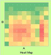
Heat Map is the graph that uses colors to show the numbers in the table.
Heat Map is used in various ways.
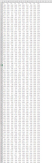
The tabel below is the part of 1000-10 size table.
We cannot see full of them.
Heat Map for this table is below.
The left side is made by
seaborn
.
The right side is made by R (code is below).
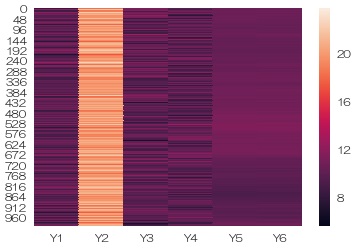
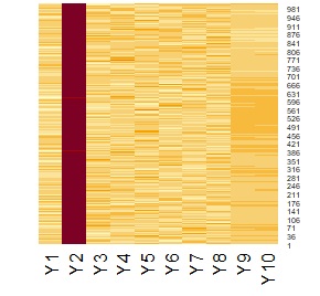
Colors shows numbers of the table.
If the line up of data has the meaning of space or time, heat map could be the Graph for Change .
If the table is the multi dimensional data. heat map is the multi dimensional graph. Generally, 3-dimension is the limit of graphical way. But heat map shows more than 3 dimension easily.
In this way, heat map can be used for the method of Correlation Analysis for Multi-Variable .
Heat map is used to show 3-dimension data using "X : Column, Y : Row, Z : Color".
If we make frequency or density data by the range in the X and Y,
heat map is used as
Histogram
of 2D.
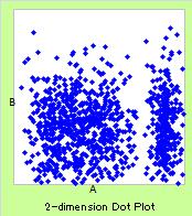
And it covers the weakness of
2-Dimension Scatter Plot
.
Example of R is in the page, Standard graph function of R , .
NEXT  Graphs for 2-Dimension Distribution and Relationship
