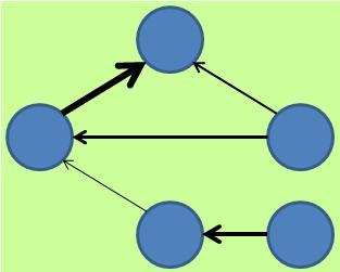
Graphs connected by arrows are called "directed graphs". Directed graphs can be used for both Quality Way of Making Hypothesis and Quantity Way of Making Hypothesis .
When used in a qualitative hypothesis search , it is used as a visible representation of the hypothesis. If the hypothesis is true, this graph will be the graph that shows the causal relationship.
It can also be used to search for quantitative hypotheses, and there is a way to quantitatively create a directed graph from the structure of the data.
Both the directed graph created as a diagram showing the causal relationship and the directed graph created from the structure of the data use arrows. Since they look the same and can be reasoned in that way, directed graphs made from the structure of the data seem to represent causality as they are. But it's not that easy.
To put it in an easy-to-understand conclusion, the directed graph that is made as a diagram showing the causal relationship shows the causal relationship with an arrow. Use it so that the start point of the arrow is the cause and the end point is the result. However, when compared to the true causal relationship of a directed graph created from the structure of the data, there are times when the starting point of the arrow is the cause, but also when it is the result.
Directed graphs created from the structure of data are misused to be treated as graphs in which arrows indicate the direction of causality. Keeping in mind that the direction of the arrow does not represent the direction of causality, treat it as a graph showing the asymmetric structure of the data, consider the background of the data from the asymmetric structure, and think about the hypothesis of causality. Will be.
A directed graph created from the structure of data is interpreted by the general usage of arrows when viewed by a person who does not know how to create it, so it is seen as a diagram showing a causal relationship.
Therefore, it is confusing to put out a directed graph created from the structure of data in materials that various people see, such as company meetings and reports. In some cases, it can lead to distrust of data analysis.
As an asymmetrical structure of data, we have summarized three types here. I'm still not sure if this is all.
Basically, all of them are used to see if they hold between two or three variables. As an application, it can also be used as a way to see the relationships between combinations of variables. However, as it becomes more complicated, it is difficult to take countermeasures, and it is difficult to get the people involved to understand it, so it is difficult to use it in practical analysis.
The above three types of data are not used even if the data table contains time or the table order is in chronological order.
The method of using time series information is also a kind of asymmetrical structure, but it is not included in the above because it is not a general theory. On this site,Time Difference of Cause-Effect is one of the ways.

