Some people may think that Excel is not useful for Graphical Analysis . But I do not think so. In Excel, we can touch data directly. And plots in the graph and data are linked directly. It is good to think data itself deeply.
Excel is build in almost all PCs in the offices. If I need analize in the ohter persons' PC, knowledge of Excel is useful. And owner of the PC is happy if new method of Excel is introduces through the analysis.
Graphs in this page is not famous as the Excel function. But useful as the tool of Data Science .
1 To see many variables
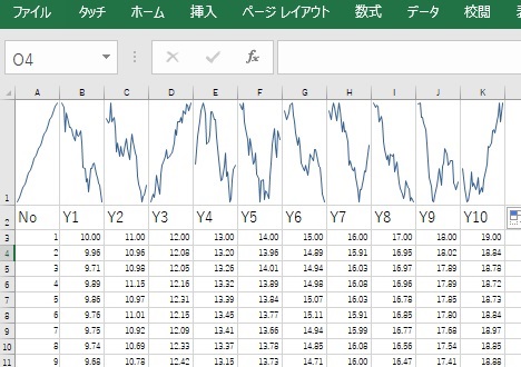
(1) Line graph for many variables (Spark line)
(2) 1-dimension distribution of many variables (Box plot)
(3) Colorful analysis for many variables (Heat map)
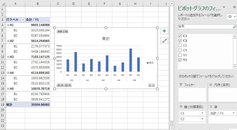
2 Graph for thinking (Pivot table)
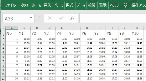
Data
Make new column.
And adjust the height.
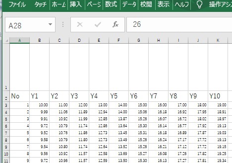
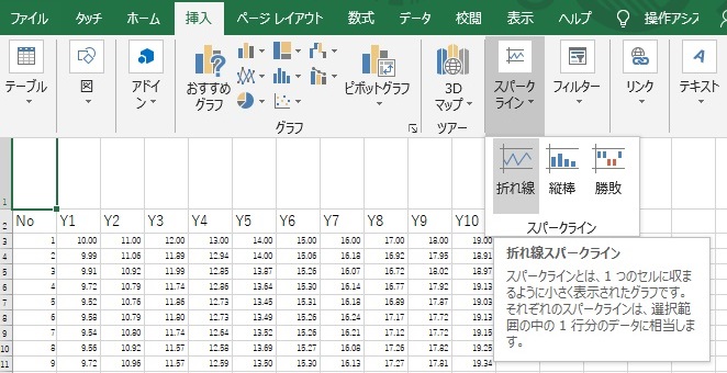
Select spark line.
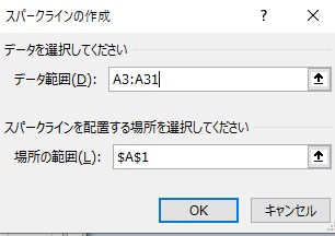
A1 cell is the space to make the graph.
One of them is made.
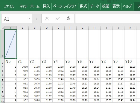
Copy A1 cell and paste B1,C1 and so on.
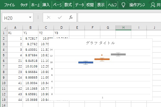
Box plot can be used for the tool to see many variables.
Data
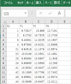
Select the range.
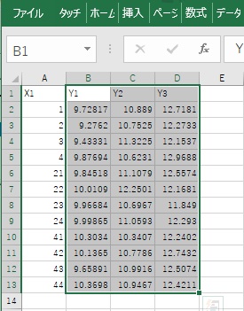
Select box plot.
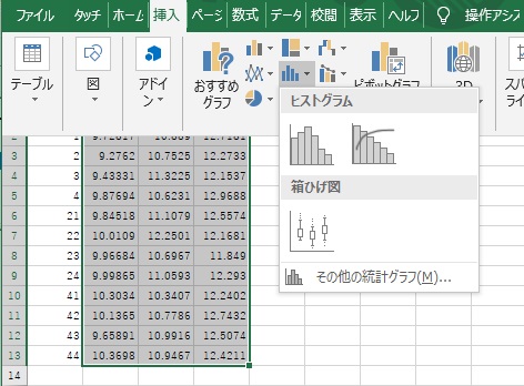
One box is one variable.
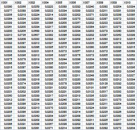
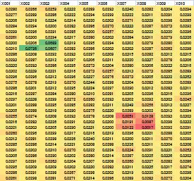
There are not the graph named " Heat Map ". But we can make heat map by the function of "Color scale".
We can analyze interactively by pivot table and pivot graph.
NEXT  ggplot2
