This page, association analysis in a different approach and, analysis of fellow division of the individual category is a way to make.
* The following content on this page was devised by the author. The same thing may already be in the world, but at least I don't know. If you know this, I would appreciate it if you could teach me.
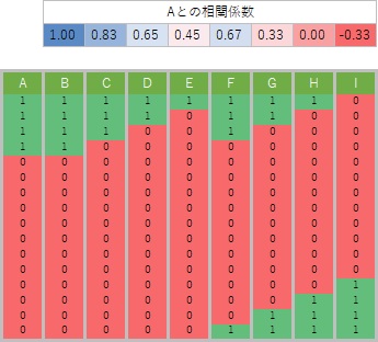
The data used on this page is a dummy conversion of qualitative data and conversion to quantitative data of only 1 and 0. Since it is quantitative data, the correlation coefficient can be calculated, but since there are only 1 and 0, it has a unique property.
The figure below shows the correlation coefficient calculated by preparing various variables with different positions of 1 and 0 for the variable A. If the positions of 1 and 0 are exactly the same, it will be 1, and otherwise it will be smaller than 1.
Using this property to find similar categories is "correlation analysis of individual categories". Generally, when using the correlation coefficient, we try to look at both positive and negative correlations, but in this analysis we only focus on when the positive correlation is strong.
Dummy transform the qualitative data into quantitative data of 1s and 0s, then calculate the correlation coefficient for all combinations of variables. For quantitative data, one-dimensional clustering is performed to make it qualitative data, and then dummy conversion is performed to convert it into quantitative data with properties different from the original quantitative data.
An example of using R is as follows. (The following is copy-paste and can be used as it is. In this example, it is assumed that the folder named "Rtest" on the C drive contains data with the name "Data.csv" before this code. You need to install the libraries "dummies", "reshape" and "ggplot2".
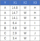
The table below is part, and actually has 106 rows. Data is a mixture of qualitative and quantitative data. Quantitative data is converted to qualitative data by one-dimensional clustering and analyzed. This makes it easier to use with decision trees .
setwd ("C: / Rtest") #Change working directory
library (dummies)#Read library
Data <-read.csv ("Data.csv", header = T) #Read data
for (i in 1: ncol (Data)) { # The beginning of the loop. Count the number of columns of data and repeat the same number of times
if (class (Data [, i]) == "numeric") { # Start of conditional branch
Data [, i] <-droplevels (cut (Data [, i], breaks) = 5, include.lowest = TRUE)) # When dividing into 5 parts. Quantitative data is converted into qualitative data.
} #End of if statement processing
}#End of loop
Data_dmy <-dummy.data.frame (Data) #Dummy conversion
corr <- cor(Data_dmy) #Create a correlation matrix
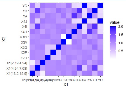
#This is the creation of data for analysis. After this, create various graphs. First, from the heat map of the correlation matrix .
library (reshape) # load library
library (ggplot2) # Load library
corr2 <-corr # Create correlation matrix corr3 <-melt(corr2) # Convert to graph data
ggplot (corr3, aes (X1, X2, fill = value)) + geom_tile () + scale_fill_gradient (low = "white", high = "blue") # Make a graph
# Bar graph
corr2 [upper.tri (corr2, diag = TRUE)] <-0 # Convert to data for output corr4 <-melt (corr2) ) # Convert to data for output
corr4 $ set <-paste (corr4 $ X1, "_", corr4 $ X2) # Add line to data for output
corr4 <-corr4 [order (corr4 $ value, decreasing = T) ),] # Sort data for output
ggplot (head (corr4,10), aes (x = value, y = reorder (set, value))) + geom_bar (stat = "identity") # Draw a bar chart of the top 10 set
# network graph
library (igraph) # Load the library
corr5 <-corr # Make a correlation matrix
diag (corr5) <-0 # Set the diagonal component to 0
corr5 [corr5 <0.1] <-0 # Set to 0 if the correlation coefficient is less than 0.1 (To hide)
corr5 <-corr5 * 10 # Corrected so that the largest value is 10 (to specify the thickness of the path)
corr6 <-graph.adjacency (corr5, weighted = T, mode =) "undirected") # Create data for graph
plot (corr6, edge.width = E (corr6) $ weight) # Create graph
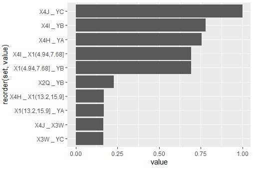
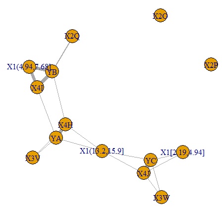
YA, YB, YC have closely related categories. , YB, I found that they are forming groups in 3 categories.
NEXT  Rough Sets Analysis
