Data <- dummy.data.frame(Data)
If you look closely at the table of tabular data, you may get a good idea of ??the overall picture of the data and the background of the data.
What you can do right away is to "read" the characters in the data. However, with this method, the limit is reached when the data becomes large. First, the table doesn't fit on the screen. Also, I can't read it completely, and I can't understand what I've read.
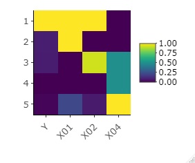
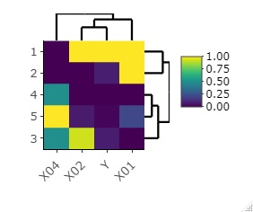
Heatmap are a way of "seeing" tabular data. Heatmaps can significantly improve the weaknesses of "reading" and can make the big picture easier to understand, even on fairly large tables.
R's heatmap library not only creates heatmaps with colored tables, but also provides a way to make it easier to reach what you want to know by performing Cluster Analysis and rearranging the data. Below, other pretreatment methods are also included.
For example, if the first column (leftmost column) is the sample name, if you specify that column, the sample name will be the name of the vertical column of the heat map.
setwd("C:/Rtest")
Data <- read.csv("Data.csv", header=T, row.names=1) # 1st column is used as sample name.
If you do not specify a sample name, all columns will be colored in the heatmap.
setwd("C:/Rtest")
Data <- read.csv("Data.csv", header=T)
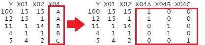
Heatmaps color numbers, so if you have qualitative variables, you need to preprocess them.
Dummy conversion creates a new column for each qualitative variable for each category, with the numbers 0 and 1 in it.
library(dummies)
Data <- dummy.data.frame(Data)
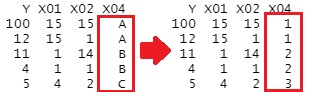
When set as a factor, numbers are assigned to each category in sequence. Unlike dummy conversion, it is convenient that the number of columns does not increase.
Data2 <- Data
n <- ncol(Data)
for (i in 1:n) {
if(class(Data[,i]) == "character"){
Data[,i] <- as.numeric(as.factor(Data[,i]))
}
}
Normalization make it easier to see the difference in how the numbers appear.
n <- ncol(Data)
for (i in 1:n) {
Data[,i] <- (Data[,i]-min(Data[,i]))/(max(Data[,i])-min(Data[,i]))
}
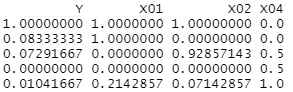
This example is the normalized data after being factored above.
Reordering certain columns in numerical order may make it easier to see similar columns.
Data <- Data[order(Data[,1], decreasing=T),] # When using the 1st column as a reference
You can also use heatmaply to partially magnify.
If you do a cluster analysis on a column, the samples will be clustered together, so the sort above will be invalid.
library(heatmaply)
heatmaply(Data, Colv = NA, Rowv = NA)
library(heatmaply)
heatmaply(Data)
library(heatmaply)
heatmaply(Data, Colv = NA)
library(heatmaply)
heatmaply(Data, Rowv = NA)
