Line graphs that show "rising to the right" are often used, both good and bad.
It is very happy if the upward trend is "sales" or "performance", so this graph alone may walk alone. In addition, the line graph that rises to the right has a strong impression on the viewer, so it can be effectively used in the decision "So, let's do this".
However, it is necessary to confirm "Isn't it a coincidence?"
If you know this confirmation method, it is also a method to analyze "small data" that seems to be only a few with confidence that it is "not a coincidence".
In addition, on this page, the method of confirmation is "Is it rising?", But the idea is the same for "Is it falling?".
If there are 5 points, it makes sense to think that "it is not a coincidence, but there is a possibility that it is rising due to some cause."
For that reason, if we hypothesize that there is no tendency to rise and fall, the probability of rising and falling is 0.5 for each point next to one point. The probability of rising four times in a row is
0.5 * 0.5 * 0.5 * 0.5 = 0.0625
so it is a fairly small probability.
If something with such a small probability is happening, it makes sense to think, "It's not a coincidence, it's possible that something is happening and it's rising."
By the way, although it is more than "5 points", this method is also in the theory of Control Chart .
Of the two graphs below, the one above is a Random Walk Model . It is the result of simulating the phenomenon that the rise and fall of the next point is 0.5. It is a line graph of 1000 points.
Of the two graphs below, the one below is the number of times the rise has continued. The phenomenon that the rise continued 5 times or more has occurred 40 times.
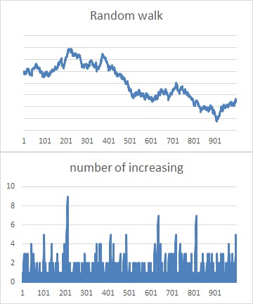
Although the probability is low, if the number of samples is large, "rise at 5 points" is a common occurrence, so it is not effective to discuss "rise at 5 points".
First of all, if you can get a lot of samples, it is better to take a lot and then discuss the tendency.
"Rise at 5 points" is effective for "a phenomenon that occurs only a few times a year" and "it costs money to collect one piece of data". When arranging a few samples in chronological order, if "rising at 5 points" occurs, it makes sense to think that it is not a coincidence.
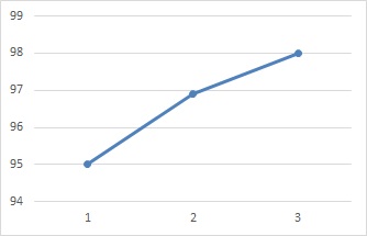
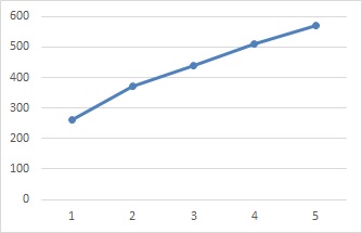
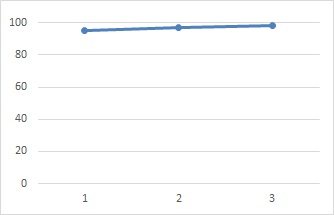
Even with three points, it may be thought that "it is not a coincidence, but there is a possibility that it is rising due to some cause."
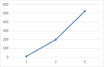
In the case of 3 points, it is difficult to base the probabilistic way of thinking as in the case of 5 points. Instead, focus on the fact that the value is extremely high. In the case of the above figure, it went up from near 0 to 200, and it has more than doubled, so I thought, "It's not a coincidence, it's possible that it's going up for some reason." Will be.
Even if it is "rising at 3 points", it is hard to think that, for example, in the example below, "it is not a coincidence, there is a possibility that it is rising due to some cause". For such a small change, I would like to confirm 5 points or more.
If you change the vertical axis of the graph, you can make small changes look bigger, so the graph will give you the impression that it is "extremely rising". Checking the numbers on the axes of the graph is important. You should also be careful with these line charts, as they can be misleading to those who see them.