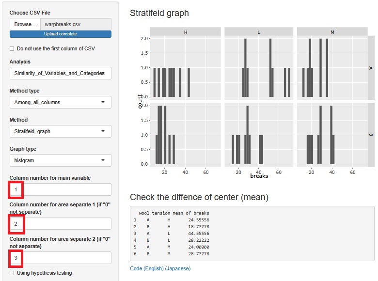
warpbreaks are experimental data. When there are 2 types of wool (2 levels) and 3 types of tension (3 levels), the number of cuts is the data for all combinations.
This page is an example of analysis by R-EDA1 .
The author obtains the data with the following code and makes it into a csv file. Save it in a folder called Rtest directly under the C drive.
write.csv(warpbreaks, row.names = FALSE, "C:/Rtest/warpbreaks.csv")
You can download the csv file saved in this site at the link of warpbreaks.csv . The saved file is "warpbreaks.csv", but it is downloaded as a file called "warpbreaks.xls", and there is a phenomenon that an error message meaning "extension is strange" appears. If you change the extension of the downloaded file from "xls" to "csv", you can use it without any problem.
From here on, I'm using a file called "warpbreaks.csv" in any location.
Create a stratified histogram using two factors.
It seems that the average value differs depending on the conditions.
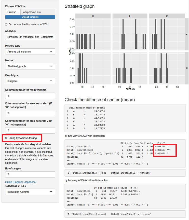
If you check "Using hypothesis testing", the results of ANOVA will appear at the bottom of the graph.
If you look at the p-value Pr (> F), it is marked with *. Even those without it are smaller than 0.1. Therefore, both of the two factors are considered to influence breaks. Since "Data1 [, input $ Scol]: Data1 [, input $ Scol2]" also has one *, it can be said that there is an interaction.
As in Strength and Weakness of Big Data, the idea of ??statistics these days is that it is no longer possible to judge the result by the p-value, but for the author, the data of this number of samples is the p-value. Then, I think it is a good way to discuss whether or not there is an effect with a p-value of about 0.05 as a guide.
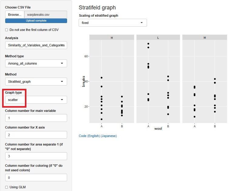
Now make a scatter plot.
You can see the same as the histogram, but it is easier to understand that in H and L, A has a higher mean value than B, but in M, B has a higher value. Also, in the case of H and L, it is easier to understand that B has smaller variation than A.
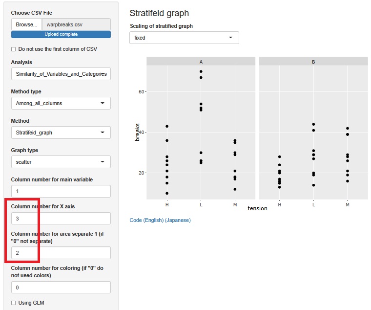
Change the variables by layer. Then, it can be found that "at H, both A and B have low", "In A, there seems to be no difference between H and M, only L is high", and "In B, there seems to be no difference between L and M, but only H is low".
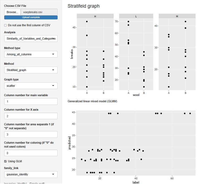
Check "Using GLM" to perform Multi-Regression Analysis . In this case, the explanatory variable is a qualitative variable, so it is the same as Quantification theory 1.
A two-dimensional scatter plot can be created under the one-dimensional scatter plot for each layer. In this scatter plot, the horizontal axis is the value of the original data with label (in this case breaks). The vertical axis is the predicted value of label. The larger the predicted value, the greater the variability of the label.
What you can see in multiple regression analysis is the same as in ANOVA.
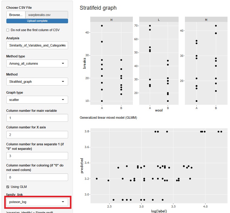
Since the function of "Using GLM" is a Generalized Linear Mixed Model , Poisson regression analysis is also possible. In this case, set "family_link" to "poisson_log".
At the time of multiple regression analysis, the larger the predicted value, the larger the variability of the label, but that is no longer the case, so this seems to be better. The reason why Poisson regression analysis is better than multiple regression analysis is that breaks are count values, and when the mean value is large, the variability is large.
The above function is designed to create a generalized linear mixed model with only the variables selected for the stratified scatter plot, so if there are more variables, it will not be possible to create a model. In R-EDA1, the generalized linear mixed model can have another function. With this feature, you can't create a stratified scatter plot, but you can consider a model that uses all variables, even if there are many variables.
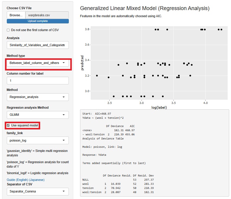
This example is for Poisson regression analysis.
In the stratified scatter plot function, the interaction term is always included in the model. For this function, check "use squared model".
Analysis revealed that both of the two factors in the warpbreaks experiment were important and also had the effect of interaction.
In other words, it was found that one of the two types of wool is not simply more resistant to tension, and the superiority or inferiority changes depending on the range of tension.
This result can be visually confirmed with a one-dimensional scatter plot, but it can also be confirmed using analysis of variance and a generalized linear mixed model.
