Analysis of quantification of abnormalities by R
Abnormalities that are determined by only one variable can be easily analyzed by graphing that variable. You can view data such as "5 or more is abnormal".
However, as long as it is determined by two or more variables, it is not possible to see simple data such as "5 or more is abnormal" just by looking at the data. The method on this page is a simple way to express the degree of anomaly even with multivariates.
Code assumptions on this page
The code on this page assumes that the input data contains a variable named "Y".
The "Y" variable assumes that it contains two numbers, "0" and "1". The "0" sample assumes that it is a unit space . A model is created with only "0" samples.
The "1" sample is the signal space. It is the data that you want to see if it is abnormal with respect to the data in the unit space.
Variables other than Y have no fixed name.
I tried to make the calculation result a graph, but as a quantitative result, I also tried to understand the number of samples that would be misjudged. That is the last number that comes out.
Method based on MT method
MT method
This is the case of the basic MT method . In this case, you can only use quantitative variables. If qualitative variables are included, I wrote the replacement method below.
library(ggplot2) #
setwd("C:/Rtest") #
Data <- read.csv("Data.csv", header=T) #
Data1 <- Data#
Data2 <- subset(Data1, Data1$Y == 0)#
Data2$Y <- NULL #
n <- nrow(Data2) #
Ave1 <- colMeans(Data2) #
Var1 <- var(Data2)*(n-1)/n #
k <- ncol(Data2) #
Data1$Y <- NULL #
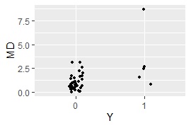
MD <- mahalanobis(Data1, Ave1, Var1)/k #
Data3 <- cbind(Data, MD)#
Data3$Y <- factor(Data3$Y)#
ggplot(Data3, aes(x=Y, y=MD)) + geom_jitter(size=1, position=position_jitter(0.1))#
MaxMDinUnit <- max(subset(Data3, Data3$Y == 0)$MD)#
Data6 <- subset(Data3, Data3$Y == 1)#
nrow(subset(Data6, Data6$MD < MaxMDinUnit))#
When qualitative variables are included
The code of the MT method uses only quantitative variables, but if qualitative variables are included , replace the one line that says
" Data1 <-Data # Replace this line if there is a qualitative variable"
. Rewrite in the following two lines.
library(fastDummies) #
Data1 <- dummy_cols(Data,remove_first_dummy = TRUE,remove_selected_columns = TRUE)#
principal component MT method
This is the case of the principal component MT method . It is designed so that it can be done even if qualitative variables are mixed.
The basic MT method is useful when multicollinearity does not allow calculations. In some cases, "number of variables> number of samples" is also useful.
library(dummies) #
library(ggplot2) #
setwd("C:/Rtest") #
Data <- read.csv("Data.csv", header=T) #
Data1 <- Data #
Y <- Data1$Y#
Data1 <- dummy.data.frame(Data)#
Data1$Y <- NULL #
Data2 <- subset(Data1, Data$Y == 0)#
Data2$Y <- NULL #
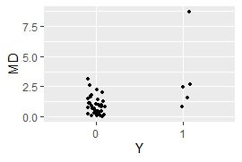
model <- prcomp(Data2, scale=TRUE, tol=0.01)#
Data3 <- predict(model, Data1)#
Data4 <- subset(Data3, Data$Y == 0)#
n <- nrow(Data4) #
Ave1 <- colMeans(Data4) #
Var1 <- var(Data4)*(n-1)/n #
k <- ncol(Data4) #
MD <- mahalanobis(Data3, Ave1, Var1)/k #
Data5 <- cbind(Data, MD,Data3)#
Data5$Y <- factor(Data5$Y)#
ggplot(Data5, aes(x=Y, y=MD)) + geom_jitter(size=1, position=position_jitter(0.1))#
MaxMDinUnit <- max(subset(Data5, Data5$Y == 0)$MD)#
Data6 <- subset(Data5, Data5$Y == 1)#
nrow(subset(Data6, Data6$MD < MaxMDinUnit))#
Kernel principal component MT method
This is the case of the kernel principal component MT method . It is designed so that it can be done even if qualitative variables are mixed.
library(dummies)#
library(ggplot2)#
library(kernlab)#
setwd("C:/Rtest")#
Data <- read.csv("Data.csv", header=T)#
Data1 <- Data #
Y <- Data1$Y#
Data1 <- dummy.data.frame(Data)#
Data1$Y <- NULL #
Data2 <- subset(Data1, Data$Y == 0)#
Data2$Y <- NULL #
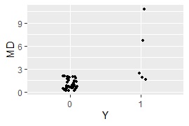
model <- kpca(as.matrix(Data2),kernel="rbfdot",kpar=list(sigma=0.1))#
Data3 <- predict(model, as.matrix(Data1))#
Data4 <- subset(Data3, Data$Y == 0)#
n <- nrow(Data4) #
Ave1 <- colMeans(Data4) #
Var1 <- var(Data4)*(n-1)/n #
k <- ncol(Data4) #
MD <- mahalanobis(Data3, Ave1, Var1)/k #
Data5 <- cbind(Data, MD,Data3)#
Data5$Y <- factor(Data5$Y)#
ggplot(Data5, aes(x=Y, y=MD)) + geom_jitter(size=1, position=position_jitter(0.1))#
MaxMDinUnit <- max(subset(Data5, Data5$Y == 0)$MD)#
Data6 <- subset(Data5, Data5$Y == 1)#
nrow(subset(Data6, Data6$MD < MaxMDinUnit))#
Mixture distribution MT
Mixture distribution MT
is a method when data with multiple multidimensional normal distributions is in the unit space. After dividing into groups by
Cluster Analysis
, MD is calculated for each, and each sample outputs the minimum value of MD (MD with the nearest group).
library(ggplot2)
library(mclust)
setwd("C:/Rtest")
Data <- read.csv("cluster7d.csv", header=T)
Data1 <- Data
Data2 <- subset(Data1, Data1$Y == 0)
Data2$Y <- NULL
YData <- Data1$Y
Data4<- as.data.frame(YData)
Data1$Y <- NULL
k <- ncol(Data2)
kNumber <- 2
mc <- Mclust(Data2,kNumber)
output <- mc$classification
Data3 <- cbind(Data2, output)
for (i2 in 1:kNumber) {
Data101 <- subset(Data3, Data3$output == i2)
Data101$output <- NULL
n1 <- nrow(Data101)
Ave1 <- colMeans(Data101)
Var1 <- var(Data101)*(n1 - 1)/n1
MD <- mahalanobis(Data1, Ave1, Var1)/k
Data4 <- cbind(Data4,MD)
colnames(Data4)[i2+1]<-i2
}
Data5 <- Data4
Data4$YData <- NULL
MinMD<- apply(Data4, 1, min)
MinMD<- as.data.frame(MinMD)
Data5 <- cbind(Data5,MinMD)
Data5$YData <- factor(Data5$YData)
ggplot(Data5, aes(x=YData, y=MinMD)) + geom_jitter(size=1, position=position_jitter(0.1))
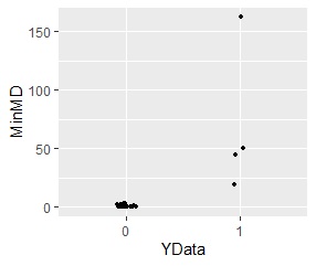
Samples away from either of the two groups have higher MD.
method based on the neighbor method
The advantage of the neighbor method- based method is that it does not assume a particular distribution. Instead, it reacts sensitively to the individual values ??of the unit space data, making it very important to check the content of the unit space data compared to methods based on the MT method.
LOF-based method
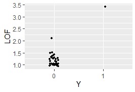
This is the method using LOF .
When using the code below, one sample of "Y = 1" is basic. It is possible to calculate with two or more, but even if it is "abnormal" when viewed from the normal value, it may be judged as "normal area" in the calculation if the abnormal values ??are close to each other.
When there are multiple "Y = 1", it is possible to rotate the LOF calculation one by one, but even though the calculation time is long, it is the number of samples of "Y = 1". It will be doubled by the minute. I didn't think there was that much benefit, so I stopped posting code examples.
library(Rlof)#
library(dummies) #
library(ggplot2) #
setwd("C:/Rtest") #
Data <- read.csv("Data.csv", header=T) #
Data1 <- Data #
Y <- Data1$Y#
Data1 <- dummy.data.frame(Data)#
Data1$Y <- NULL #
Data2 <- subset(Data1, Data$Y == 0)#
model <- prcomp(Data2, scale=TRUE, tol=0.01)#
Data3 <- predict(model, as.matrix(Data1))#
std <- apply(model$x, 2, sd)#
Data4 <- Data3#
for (i in 1:ncol(Data3)) { #
Data4[,i] <- Data3[,i]/std[i]#
} #
Data4 <- cbind(Data4 ,Y)#
LOF <- lof(Data4,5)#
Data8 <- as.data.frame(cbind(LOF ,Data))#
Data8$Y <- factor(Data8$Y)#
ggplot(Data8, aes(x=Y, y=LOF)) + geom_jitter(size=1, position=position_jitter(0.1))#
method based on the minimum distance method
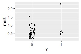
This is the method using the minimum distance method .
library(dummies) #
library(ggplot2) #
setwd("C:/Rtest") #
Data <- read.csv("Data.csv", header=T)#
Data1 <- Data#
Y <- Data1$Y#
Data1 <- dummy.data.frame(Data)#
Data1$Y <- NULL#
Data2 <- subset(Data1, Data$Y == 0)#
model <- prcomp(Data2, scale=TRUE, tol=0.01)#
Data3 <- predict(model, as.matrix(Data1))#
std <- apply(model$x, 2, sd)#
Data4 <- Data3#
for (i in 1:ncol(Data3)) { #
Data4[,i] <- Data3[,i]/std[i]#
} #
Data5 <- dist(Data4, diag = TRUE, upper = TRUE)#
Data5 <-as.matrix(Data5)#
diag(Data5) <- 1000 #
Data5 <-as.data.frame(Data5)#
Data5 <- cbind(Data5 ,Y)#
Data6 <- subset(Data5, Data5$Y == 0)#
Data6$Y <- NULL#
Data7 <- as.data.frame(t(Data6))#
min0 <- apply(Data7, 1,min)#
Data8 <- as.data.frame(cbind(min0 ,Y))#
Data8$Y <- factor(Data8$Y)#
ggplot(Data8, aes(x=Y, y=min0)) + geom_jitter(size=1, position=position_jitter(0.1))#
MaxMDinUnit <- max(subset(Data8, Data8$Y == 0)$min0)#
Data9 <- subset(Data8, Data8$Y == 1)#
nrow(subset(Data9, Data9$min0 < MaxMDinUnit))#
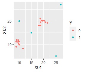
method based on multidimensional scaling
It uses almost the same method as the analysis of sample similarity with R.
In the method based on the MT method, the degree of anomaly is viewed in one dimension, but in this method, it is viewed in two dimensions.
library(dummies) #
library(som) #
library(MASS) #
library(ggplot2) #
setwd("C:/Rtest") #
Data <- read.csv("Data.csv", header=T) #
Data1 <- Data#
Data1$Y <- NULL #
Data2 <- dummy.data.frame(Data1)#
Data3 <- normalize(Data2[,1:ncol(Data2)],byrow=F)#
Data4 <- dist(Data3)#
sn <- sammon(Data4)#
Data5 <- sn$points#
Data6 <- cbind(Data5 ,Data)#
Data6$Y <- as.factor(Data6$Y)#
ggplot(Data6, aes(x=Data6[,1], y=Data6[,2])) + geom_point(aes(colour=Y))#
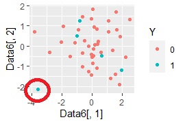
In the example of the method based on the MT method, only one sample in the "1" group was separated from the "0" group, but this can be seen in the two-dimensional sample.
