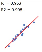
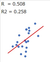
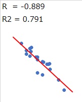
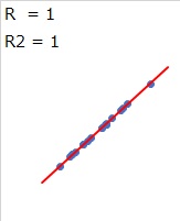
When the data of two items is plotted (dotted) on a 2-Dimension Scatter Plot, If the plots are arranged in an almost "straight line", it is said that there is a correlation. It is also said to be "highly correlated" or "highly correlated".
The scale for evaluating correlation is the "correlation coefficient (R)". If the correlation coefficient is +1 or -1, the plot is perfectly linear. The closer it is to 0, the more it varies. The correlation coefficient is a type of measure of variation.
When the correlation coefficient is close to +1 or -1, it is said to be correlated. If it is +1, it is said to be "positive correlation", and if it is -1, it is said to be "negative correlation". The criteria for "correlated" are: You need to think about the implications of the actual data and analysis on a case-by-case basis. In the manual, for example, it may be written as "0.7 or more". This is a good guide when you think about it.


As you can see on the Simple Regression Analysis page, the square of the correlation coefficient can be used as a contribution factor.
If the contribution rate is 0.5 (50%), it means 0.5 that can be explained by the factor that "the values of the two items are determined by a linear relationship between the two items." 0.5 is exactly half, so it's a good guide.
The square of 0.7 is about 0.5 at 0.49. In other words, using a correlation coefficient of 0.7 as a guideline is almost the same as using a contribution rate of 0.5 as a guide.
In this way, it seems that the fact that the guideline is 0.7 instead of 0.6 or 0.8 makes a certain amount of sense.
NEXT 

 Faults When We Find Correlation
