Data analysis to draw out the knowledge of experts
When it comes to "data analysis of huge amounts of data," there are many talks about "using statistics ." This site is no exception, but this page is an example where statistics did not play a leading role.
Statistics didn't help directly, but indirectly. This is an example of a solution that is a result of the successful collaboration between data science and the knowledge of experts.
We will utilize the knowledge of experts to search for data, and devise ways to show the data so that the knowledge of experts can be extracted. When exploring data, things like "If you do this much sampling , you can see if there is a difference", "Use this graph to clearly see what is happening", etc. Knowledge of data science can help you think.
Tha case that there is a difference, but there is no difference in the data
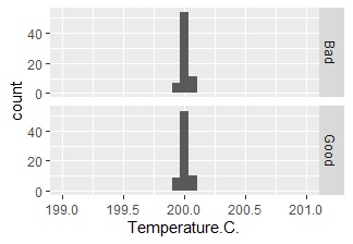
This example is a graph that examines the difference in Temperature for each of Good (good product) and Bad (defective product). How the quality changes depending on the maximum temperature when processing the product was known when the maximum temperature was decided, so it is the result of trying to confirm the maximum temperature.
If there was a difference of about 2 to 3 degrees Celsius, it was "the temperature was still strange", but no difference was seen in the data.
Normally, I would say, "Because temperature is not the cause, let's think about a hypothesis other than temperature." In this case, I didn't do that. It was rather unnatural because there was no difference at all.
When I checked, "unnatural" was correct, and the maximum temperature had a set value and was controlled to reach that temperature. The above graph was a graph that confirmed that it was working according to the set value .
At this point, the question is, "It's working according to the set value. But can the maximum temperature deviate?"
By narrowing down the problem so far, the hypothesis of the cause "Is the thermometer misaligned?" Came out. And after some additional research, I found that the cause was a misalignment of the thermometer.
Once you know the answer, it may seem like a simple story. However, this problem was a big problem because the cause was unknown even if the people who had been involved in this product for many years gathered.
The breakthrough was to cut out the necessary information from the huge amount of data and make it visible, and checking the facts one by one led to a solution.
The case where the previous problem can be seen from the data
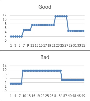
This example is a graph that examines the change of a certain value for each of Good (good product) and Bad (defective product).
When this problem occurred, I couldn't tell the difference between when a good product was made and when a defective product was made, which was a source of concern for the people involved. I was looking for differences between good and defective products in various data, but I couldn't see any difference in the data.
However, at one point, when I was looking at this graph with the people involved, one person noticed something unusual.
"There should be only two types of this value, but it is strange that such various values are available!"
By identifying the causes of the various values, we were able to ensure the quality as originally designed, and this problem was solved.
In this case as well, the breakthrough was to cut out the necessary information from the huge amount of data and make it visible. By doing so, the knowledge of experts was put to good use and led to a solution.
NEXT  Seven QC Tools and New Seven QC Tools
