"airquality" is the measurement data of air. It is characterized by the fact that there are missing values, that it is time-series data, and that it is multivariate data with only quantitative variables.
This page is an example of analysis with R-EDA1 from the perspectives of "what is this data?" And "what can be learned from this data?" .
Since R-EDA1 is not all-purpose, we plan to use EXCEL together.
The author obtains the data with the following code and makes it into a csv file. Save it in a folder called Rtest directly under the C drive.
write.csv(airquality, row.names = FALSE, "C:/Rtest/airquality.csv")
You can download the csv file saved in this site at the link of airquality.csv . The saved file is "airquality.csv", but it is downloaded as a file called "airquality.xls", and there is a phenomenon that an error message meaning "extension is strange" appears. If you change the extension of the downloaded file from "xls" to "csv", you can use it without any problem.
From here on, I'm using a file called "airquality.csv" in any location.
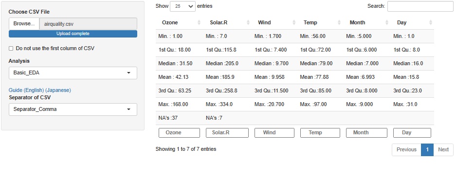
Ozone is "NA's: 37" and Solar.R is "NA's: 7", and there are missing values.
The time information is stored in variables called Month and Day.
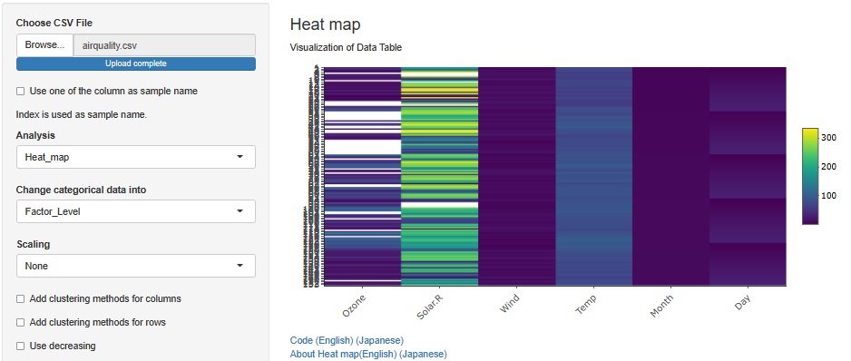
Missing values are white. It doesn't seem to be concentrated somewhere, but it's not completely disjointed.
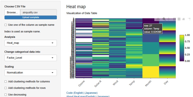
When Normalization is performed, variables with missing values are not used in calculation.
You can see that Month is in ascending order and Day is in ascending order within the month. In other words, this data is arranged in chronological order and can be treated as time series data as it is.
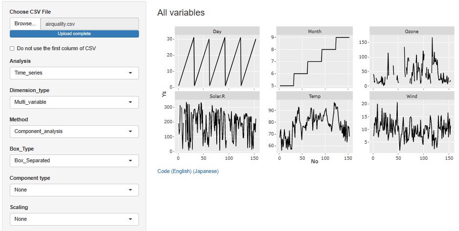
In the line chart by variable, you can see not only what you noticed in the heatmap, but also the specific numbers of the variables that contain the missing values. In the case of this data, the data is arranged in chronological order, so the polygonal line shows how it changes.
If you want to see the entire table of data, heatmaps are good, so this method and heatmaps are complementary to each other.
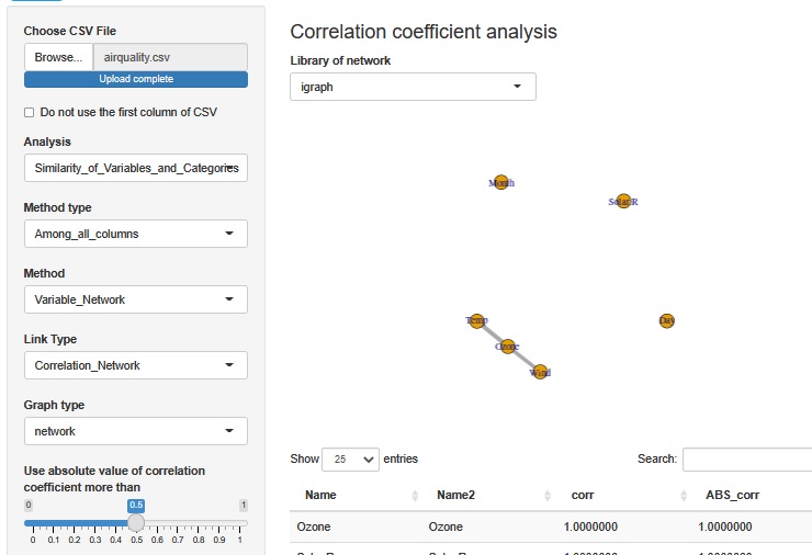
Look at the correlation coefficient. Calculated except for samples with missing values.
First, we can see that Solar.R (solar radiation), Day (day), and Month (month) are not correlated with each other. It can be seen that Ozone correlates with Wind and Temp respectively.
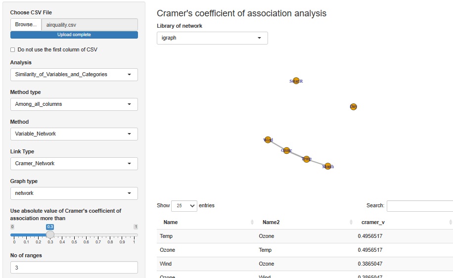
Analyze the correlation using the number of Klamer associations. In this example, the interval is divided into three for each variable and converted into qualitative variables. Missing values ??are in the category "NA" with only missing values.
First, we can see that Solar.R (solar radiation) and Day (day) are not correlated with each other. The correlation between Temp (temperature) and Month (month) is a result that is easy to understand even in common sense. It can be seen that Ozone correlates with Wind and Temp respectively.
The relationship between Wind and Ozone may be that the chemical reaction that Ozone can make is difficult to proceed because air exchange occurs when Wind is fast.
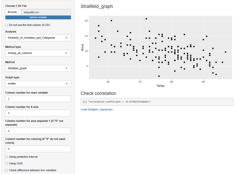
Let's make a scatter plot only with Temp and Wind that were connected to Ozone. It seems that there is a negative correlation, but it seems better to think that it is not related to this kind of relationship.
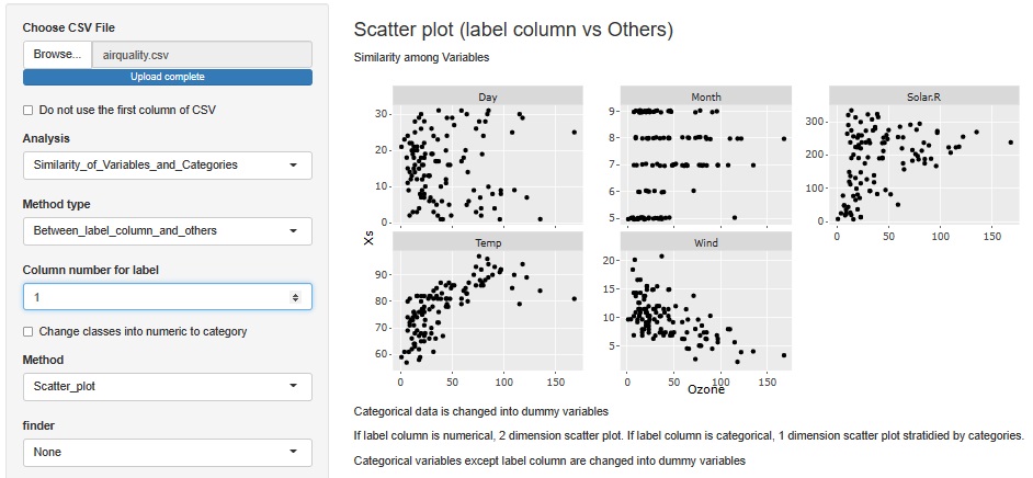
Try Ozone on the horizontal axis and all other variables on the vertical axis. Then, you can see that there seems to be a positive correlation with Temp and a negative correlation with Wind. Solar.R is not a simple positive correlation, but at least when Solar.R is large, you can see that Ozone has a large value.
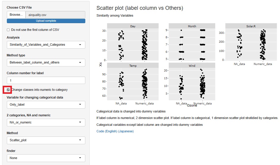
On the previous analysis screen, check "Change classes into numeric to category". Then, the horizontal axis is divided into NA_data (missing value) and Numeric_data (numerical data: data that is not missing value).
The appearance of missing values in Ozone has nothing to do with other variables.
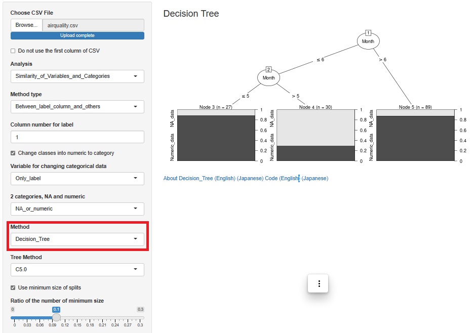
On the previous analysis screen, set "Method" to Decision_Tree.
Then, you can see that the ratio of NA_data is high in Month of "> 5" with "?6", that is, June. Looking at the scatter plot of the previous analysis, it is true that NA_data has more plots in June.
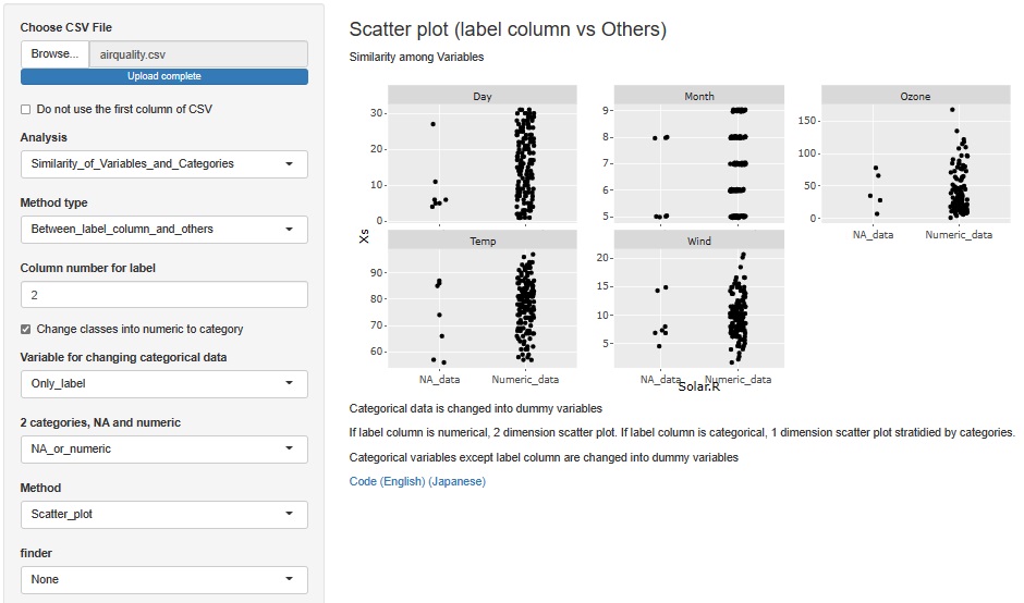
This time, set the horizontal axis to "Solar.R".
You can see that Month is only in May and August. You can also see that Days are relatively high in the first half of the month.
See if you can explain Ozone with the three variables Temp, Wind, and Solap.R.
First, create a csv file with Month and Day deleted from the data. Here, the name is "aiaquality2.csv".
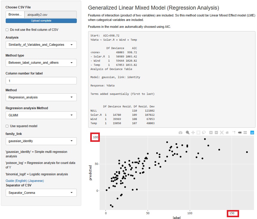
In GLMM (Generalized Linear Mixed Models), setting "family_link" to "gaussian_identity" results in a general multiple regression analysis.
When viewed from the horizontal axis, the Ozone of the original data has numbers from 0 to 170, but the vertical axis has only numbers up to 100. Therefore, although the numerical magnitude relations are generally correct, it is a poor prediction model.
By the way, in R-EDA1, GLMM is executed by a function called "glm". This function runs without error even if it contains missing values. It seems to make a model without using a sample that contains missing values. For samples where the explanatory variable contains the missing value "NA", the predicted value will be "NA".
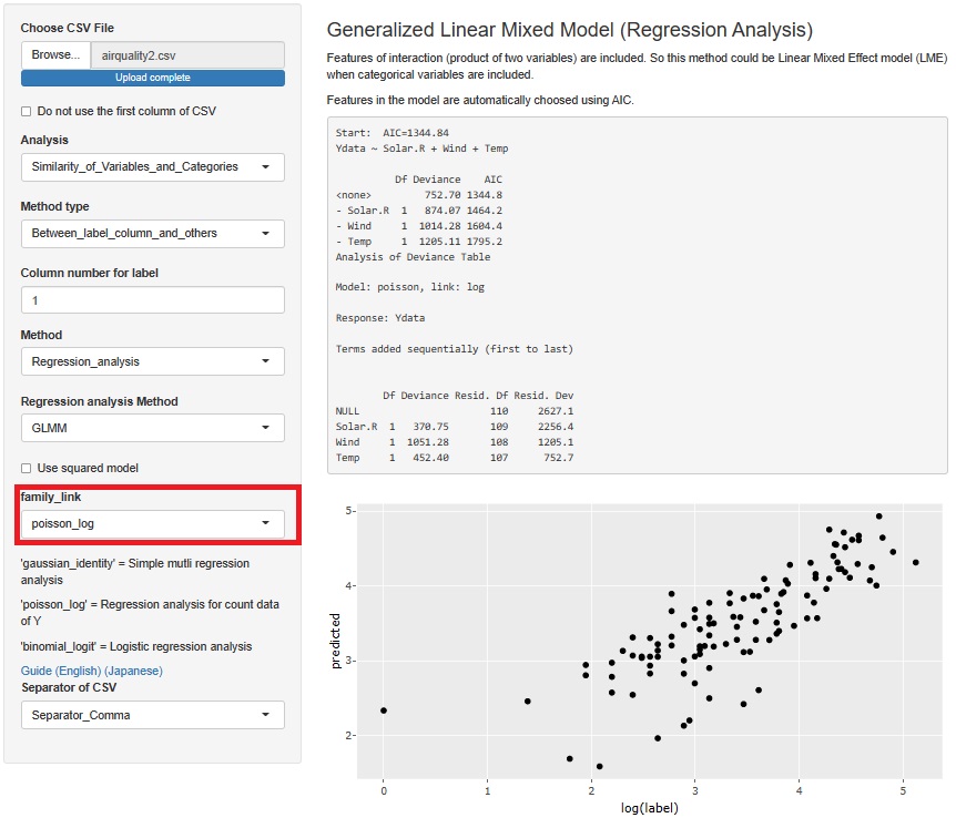
In GLMM (generalized linear mixed model), if "family_link" is set to "poisson_log", the regression analysis assumes a Poisson distribution.
In this case, the range of data is almost the same on the vertical and horizontal axes, and it seems to va
ry from the straight line with the Y-intercept set to 0. This seems to be a better predictive model. I think the reason Poisson regression analysis is better is that this model was suitable for dealing with the property that when Solar.R is large, both the mean and variance of Ozone are large.
If we want to consider which model is better, we need a data measurement method and a hypothesis of the mechanism of Ozone generation, which is a science area rather than a data science.
R Documentation
There is a detailed description of air quality data.
https://stat.ethz.ch/R-manual/R-devel/library/datasets/html/airquality.html
RPubs by RStudio
There is a detailed description of airquality data and the results of a basic analysis.
https://rpubs.com/shailesh/air-quality-exploration
