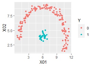
An example of Vector quantization label classification by R.
Vector quantization compresses the explanatory variables into one-dimensional qualitative variables, and then Aggregate based on that. It then joins the objective variable.
Vector quantization compresses the explanatory variables into one-dimensional qualitative variables, and then Aggregate based on that. It then joins the objective variable.
setwd("C:/Rtest")
Data <- read.csv("Data.csv", header=T)
Y <- Data$Y
Data10 <- Data
Data10$Y <- NULL
Data11 <- Data10
for (i in 1:ncol(Data10)) {
Data11[,i] <- (Data10[,i] - min(Data10[,i]))/(max(Data10[,i]) - min(Data10[,i]))
}
km <- kmeans(Data11,10) # Classified by k-means method. This is for 10 clusters
cluster <- km$cluster
cluster <- as.character(cluster)
cluster <- as.data.frame(cluster)
Data4 <-cbind(Y,cluster)
Data6 <-aggregate(Y~cluster,data=Data4,FUN=mean)
colnames(Data6)[2]<-paste0("predicted_Y")
library(dplyr)
Data4 <-left_join(Data4,Data6,by="cluster")
colnames(Data4)[3]<-paste0("predicted_Y")
library(ggplot2)
Data4$Y <-NULL
Data2s2 <- cbind(Data,Data4)
ggplot(Data2s2, aes(x=X01, y=X02)) + geom_point(aes(colour=predicted_Y)) + scale_color_viridis_c(option = "D")
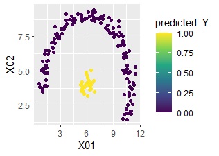
You can see that it is perfectly predictable.
You can see that it is perfectly predictable.
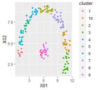
ggplot(Data2s2, aes(x=X01, y=X02)) + geom_point(aes(colour=cluster))
If the objective variable is quantitative, the same is true in the code above.
The example above is the k-means method. Since we do not know the cluster of data where Y is unknown, we use the mixed distribution method below.
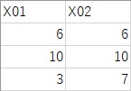
The training data is the same as above. The test data is the following three samples, which are included in Data2.csv.
setwd("C:/Rtest")
Data <- read.csv("Data.csv", header=T)
Y <- Data$Y
Data10 <- Data
Data10$Y <- NULL
Data11 <- Data10
for (i in 1:ncol(Data10)) {
Data11[,i] <- (Data10[,i] - min(Data10[,i]))/(max(Data10[,i]) - min(Data10[,i]))
}
library(mclust)
mc <- Mclust(Data11,10)
cluster <- mc$classification
cluster <- as.character(cluster)
cluster <- as.data.frame(cluster)
Data4 <-cbind(Y,cluster)
Data6 <-aggregate(Y~cluster,data=Data4,FUN=mean)
colnames(Data6)[2]<-paste0("predicted_Y")
Data2 <- read.csv("Data2.csv", header=T)
Data21 <- Data2
for (i in 1:ncol(Data2)) {
Data21[,i] <- (Data2[,i] - min(Data10[,i]))/(max(Data10[,i]) - min(Data10[,i]))
}
output2 <- predict(mc, Data21)$classification
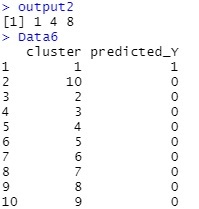
output2 is the predicted value for the cluster. Data2.csv is the ranking of the data in the file. Data6 is the predicted Y value for each cluster. For example, if the cluster is 1, you can see that the predicted value of Y is 1.
CRAN
https://cran.r-project.org/web/packages/MASS/MASS.pdf
MASS manual.
CRAN
https://cran.r-project.org/web/packages/nnet/nnet.pdf
MASS manual.
