This is an example of Principal Component Analysis by R.
There are many uses for principal component analysis , but the following is a step-by-step explanation.
An example of R is as follows. The following can be used as is with copy paste.
setwd("C:/Rtest")
Data <- read.csv("Data.csv", header=T)
DataName <- Data$Name
Data$Name <- NULL
pc <- prcomp(Data, scale=TRUE)
summary(pc)
This is a continuation of the above code. This is a method to obtain the principal component score required for "using it for data preprocessing in other multivariate analysis".
Make a graph with line numbers.
pc1 <- pc$x # Get the principal component score
For example, if you decide to use up to the second principal component by looking at the cumulative contribution rate, the left two columns of "pc1" are the data after dimension reduction. It will be.
This is a continuation of the above code. It is a method of "viewing samples comprehensively" and "grouping samples". You will need to have ggplot2 installed before you can proceed with this.
Make a graph with line numbers.
pc1 <- transform(pc1 ,name1 = DataName,name2 = "A")
library(ggplot2)
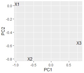
ggplot(pc1, aes(x=PC1, y=PC2,label=rownames(pc1))) + geom_text()# Scatter plot of words with the first and second principal components
If you use data with a "Name" column, you can also create a graph with "Name".
ggplot(pc1, aes(x=PC1, y=PC2,label=name1)) + geom_text()
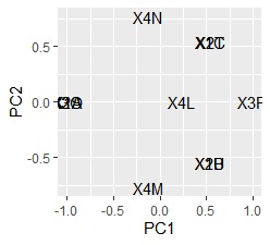
pc2 <- sweep(pc$rotation, MARGIN=2, pc$sdev, FUN="*") # Calculate factor load
pc2 <- transform(pc2,name1=rownames(pc2),name2="B")
ggplot(pc2, aes(x=PC1, y=PC2,label=name1)) + geom_text()
I found that there are no similar three variables.
This is a continuation of "Variable grouping" 1.
If there are many variables, the points that appear to overlap on the scatter plot created with the two main components from the top may be separated when viewed with the other main components. If you want to find out the similarity of variables rather than which principal components they are related to, you can use Multi Dimensional Scaling to condense a large number of principal components into two.
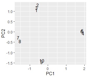
MaxN = 5# Specify the number of eigenvalues to use
library(MASS)
Data11 <- pc2[,1:MaxN]
Data11_dist <- dist(Data11)
sn <- sammon(Data11_dist)
output <- sn$points
Data2 <- cbind(output, pc2)Å@
ggplot(Data2, aes(x=Data2[,1], y=Data2[,2],label=name1)) + geom_text()
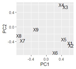
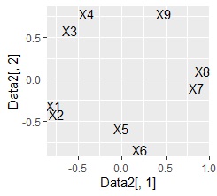
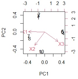
left is made with the first and second main components In the scatter plot, the right is a scatter plot made by condensing the 5th principal component into 2 variables. This data was created so that the pairs of "X1 and X2", "X3 and X4", "X5 and X6", and "X7 and X8" have a high correlation. You will want a scatter plot.
The relationship between the original variable and the principal component can be understood by making a Bipartite graph.
library(igraph)
library(sigmoid)
Data1p = Data11
colnames(Data1p) = paste(colnames(Data1p),"+",sep="")
DM.matp = apply(Data1p,c(1,2),relu)
Data1m = -Data11
colnames(Data1m) = paste(colnames(Data1m),"-",sep="")
DM.matm = apply(Data1m,c(1,2),relu)
DM.mat =cbind(DM.matp,DM.matm)
DM.mat <- DM.mat / max(DM.mat) * 3
DM.mat[DM.mat < 1] <- 0
DM.g<-graph_from_incidence_matrix(DM.mat,weighted=T)
V(DM.g)$color <- c("steel blue", "orange")[V(DM.g)$type+1]
V(DM.g)$shape <- c("square", "circle")[V(DM.g)$type+1]
plot(DM.g, edge.width=E(DM.g)$weight)
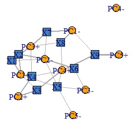
Factor loading that makes the graph has plus and minus, and the absolute value is large. The more closely it correlates with the original variable. For example, for the factor loading of PC1, the original variable is divided into three cases: a high correlation on the positive side, a high correlation on the negative side, and a low correlation. To understand this, I tried to create variables "PC1 +" and "PC1-" from the variable PC1 so that I could see which one had the higher correlation.
With biplot, you can create a diagram that depicts a sample and a variable at the same time.
biplot(pc)
The data to make this graph can be made below.
Data1 <- rbind(pc1,pc2)
It is one of the methods called Broadly defined Quantification theory 3 on this site.
There are two types of preprocessing methods for qualitative variables, so the two types are shown below.
In this example, it is assumed that the folder named "Rtest" on the C drive contains data with the name "Data.csv".
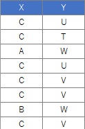
setwd("C:/Rtest")
Data <- read.csv("Data.csv", header=T)
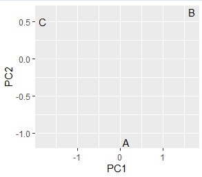
crs <- table(Data$X,Data$Y)
pc <- prcomp(crs, scale=TRUE)
pc1 <- pc$x
pc1 <- transform(pc1 ,name = rownames(pc1))
library(ggplot2)
ggplot(pc1, aes(x=PC1, y=PC2,label=name)) + geom_text()
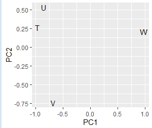
# Up to this point, it was a grouping of categories on the X side. After this is the grouping of categories on the Y side.
pc2 <- sweep(pc$rotation, MARGIN=2, pc$sdev, FUN="*")
pc2 <- transform(pc2,name=rownames(pc2))
ggplot(pc2, aes(x=PC1, y=PC2,label=name)) + geom_text()
# Combine the two results.
pc3 <- rbind(pc1,pc2)
ggplot(pc3, aes(x=PC1, y=PC2,label=name)) + geom_text()
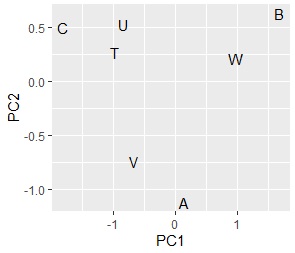
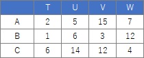
Comparing the contingency table and the graph , You can see that the relationships where the numbers are large are located close together.
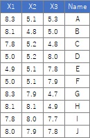
The sample data uses the following. It works even if there is no "Name" column.
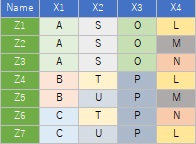
library(dummies)
setwd("C:/Rtest")
Data <- read.csv("Data.csv", header=T)
DataName <- Data$Name
Data$Name <- NULL
Data_dmy <- dummy.data.frame(Data)
pc <- prcomp(Data_dmy, scale=TRUE)
summary(pc)
pc1 <- pc$x
pc1 <- transform(pc1 ,name = DataName)
pc1$Index <-row.names(Data)
library(ggplot2)
ggplot(pc1, aes(x=PC1, y=PC2,label=name)) + geom_text()
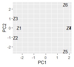
Z4 and Z7 overlap. Since quantification type III is based on principal component analysis , samples may be allocated in three or more dimensions when the sample grouping is analyzed , and it cannot be seen well in the scatter plot. If you want to see it in two dimensions, the multidimensional scaling method is better.
pc2 <- sweep(pc$rotation, MARGIN=2, pc$sdev, FUN="*")
pc2 <- transform(pc2,nameCol=rownames(pc2))
ggplot(pc2, aes(x=PC1, y=PC2,label=nameCol)) + geom_text()