Principal component regression analysis by R
This is an introduction to how to use Principal Component Regression Analysis .
Basics of Principal Component Regression Analysis
Imagine a situation where you have a file called Data.csv in a folder called Rtest on your C drive. The objective variable must be named "Y". All variables except Y are principal component analyzed, so the name of the explanatory variable can be anything.
The main components to be extracted are up to the third place. It is necessary to consider the cumulative contribution rate when deciding how much of the main component to use.
setwd("C:/Rtest")
Data <- read.csv("Data.csv", header=T)
DataY <- Data$Y # Save Y column with a different name
Data$Y <- NULL
pc <- prcomp(Data, scale=TRUE)
summary(pc) #"Cumulative Proportion" Is the cumulative contribution rate. You can use this to decide how many main components to use.
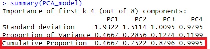
In the case of this example, the cumulative contribution rate is 99% up to PC3, so we will perform regression analysis with the main components up to PC3.
pc1 <- predict(pc, Data)[,1:3]
DataPCR <- transform(pc1, Y = DataY)Å@
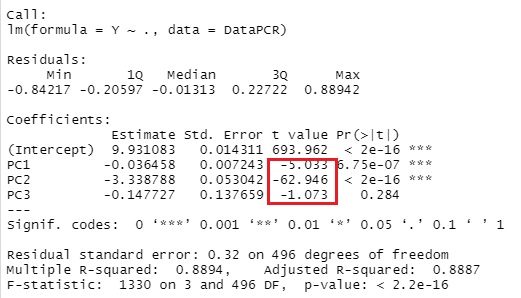
pcr <- lm(Y ~ . ,DataPCR)
summary(pcr)
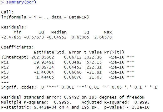
this example, looking at t-Value, only PC1 is very large, so it is considered to be a model that is almost fixed only by PC1. Can be done.
Analysis of explanatory variables by principal component analysis (Pattern 1)
We found that there is a correlation between Y and PC1 which is the principal component, but this does not show the relationship between Y and the explanatory variables. Therefore, we will investigate the relationship between PC1 and explanatory variables by principal component analysis. This method is on the Principal Component Analysis page with R.
MaxN = 3# specifies the number of eigenvalues to use
library(MASS)
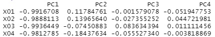
pc2 <- sweep(pc$rotation, MARGIN=2, pc$sdev, FUN="*") # actor loading the calculation
pc2 # Display Factor Loads
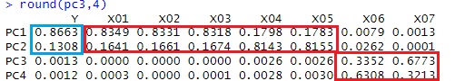
Looking at this result, we can see that PC1 has a high correlation with X01, X02, and X03.
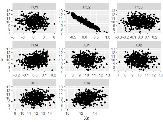
Let's make a graph to see the whole picture of the strength of correlation between the principal component and the original variable.
Data11 <- pc2[,1:MaxN]# Specify the principal component column
Data11_dist <- dist(Data11)# Calculate the distance between samples
library(igraph)
library(sigmoid)
Data1p = Data11
colnames(Data1p) = paste(colnames(Data1p),"+",sep="")
DM.matp = apply(Data1p,c(1,2),relu)
Data1m = -Data11
colnames(Data1m) = paste(colnames(Data1m),"-",sep="")
DM.matm = apply(Data1m,c(1,2),relu)
DM.mat =cbind(DM.matp,DM.matm)
DM.mat <- DM.mat / max(DM.mat) * 3
DM.mat[DM.mat < 1] <- 0
DM.g<-graph_from_incidence_matrix(DM.mat,weighted=T)
V(DM.g)$color <- c("steel blue", "orange")[V(DM.g)$type+1]
V(DM.g)$shape <- c("square", "circle")[V(DM.g)$type+1]
plot(DM.g, edge.width=E(DM.g)$weight)
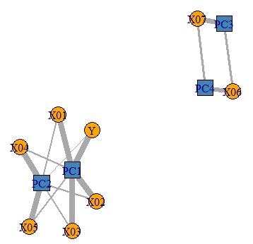
6 variables that were there can be classified into 3 principal components. I understand this.
Analysis of explanatory variables by principal component analysis (Pattern 2)
Pattern 1 above is an analysis by principal component regression analysis, which is a simple case. In most cases, pattern 1 applies.
Pattern 2 below is a case where it is difficult to consider in principal component regression analysis. It's difficult, but it's a pattern of data that's more difficult to consider in ordinary regression analysis that doesn't use principal components.
In the above code, suppose the regression analysis looks like this: You can see that the variable that has a high correlation with Y is PC2.
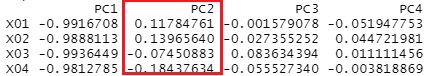
Looking at the factor loadings, all variables are highly correlated with PC1 and none are highly correlated with PC2. When this happens, it is not possible to consider like pattern 1.
You can get a good idea of the overall correlation by creating a scatter plot using the method in Analysis of hidden variables by R. Only PC2 has a high correlation with Y, and it can be seen that the other principal components and the variables of the original data have a low correlation with Y.
If you look closely at the factor loading of PC2, you can see that X01 and X02 have a positive sign, and X03 and X04 have a negative sign.
Principal component regression analysis shows that the variables are divided into two groups, X01 and X02 and X03 and X04, and that something in this group has a very high correlation with Y. By the way, on this site, this "something" is called a hidden variable .
In principal component analysis, we don't know how hidden variables are included in explanatory variables, so let's do factor analysis . In the principal component regression analysis, Y was separated from the original data, but the point here is to combine them.
Data <- read.csv("Data.csv", header=T)
factanal(Data,2)$loadings # Assuming two latent variables and factor analysis
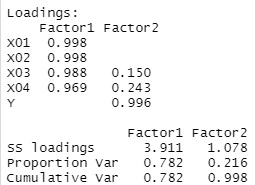
, the latent variables common to Y You can see that there are two of them, X03 and X04.
By doing this, you can see that something different from the X01 and X02 groups is included in the X03 and X04 groups a little, and that it is related to Y.
By the way, even if the method of combining Y with principal component analysis or independent component analysis, at least for this data, the result was not clear.
Note that the method of considering variables in the relationship between the objective variable and the explanatory variable in the same line and performing factor analysis is misused if the original usage of factor analysis is used because the structure of the causal relationship is strange. Originally, it is for SEM and Covariance Structure Analysis.
However,SEM and Covariance Structure Analysisis time-consuming, so here we use the method of treating the objective variable and the explanatory variable in the same row as a simple method for analyzing the causal relationship.
