We can make beautiful graph easily in Python by seaborn.
This page is made for Graphical Analysis . I do not write about adjusting the colors and shapes.
Plot of Panda is good at to see many variables. But Stratified Graph is not easy in the Plot of Panda.
This code set is needed before the code starting "sns".
import pandas as pd
import matplotlib.pyplot as plt
import seaborn as sns
%matplotlib inline
sns.set()
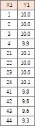
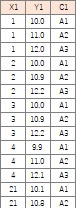
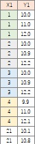
df= pd.read_csv("Data.csv" , engine='python')
Graph to visualize all data
>>>Heatmap for All Variables
Graph to visualize many variables
>>>Compare 1-dimension distribution of all variables
>>>Line graph for all variables
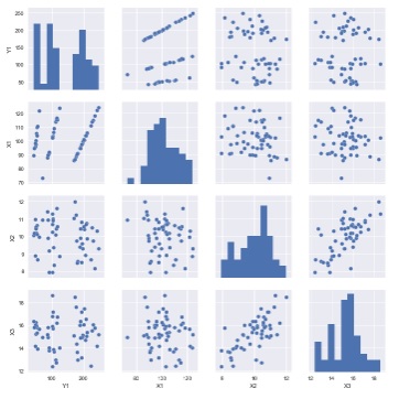
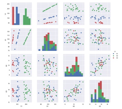
>>>All pairs in all variables
Graph for the analysis the relationship 2 variables
>>>Basic line graph
>>>Stratified line graph
>>>Line graph with confidence interval
>>>Basic scatter plot
>>>Stratified scatter plot
>>>Regression line
>>>Joint plot
>>>2-dimension histgram using hexagon
>>>Density distribution
Histgram
>>>Basic histgram
>>>Stratified histgram
>>>Good range histgram
Graph for 1 Variable Analysis
>>>Graph for 1 Variable
>>>Graph for 1 variable using 1 categorical variable
>>>Graph for 1 variable using 2 categorical variables
>>>Graph for 1 variable using 3 categorical variables
Bar plot
>>>Basic bar plot
>>>Bar plot for statistics
>>>Frequency plot
Memo
>>>Size of graph
>>>Effect of the orders of data
>>>I cannot use the graph ?!
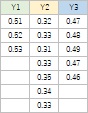
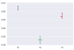
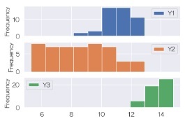
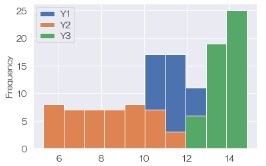
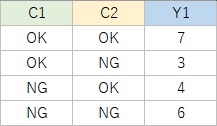
There are 2 types of data. Left graph is made using left type data and the method " Compare 1-dimension distribution of all variables ".
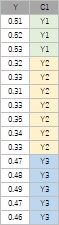
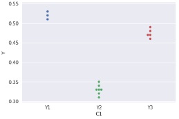
Right graph is made using right type data and the method " Graph for 1 variable using 1 categorical variable ".
They are very similar.
We can make heatmap for all variables. This method is not used for the categorical data.
sns.heatmap(df)
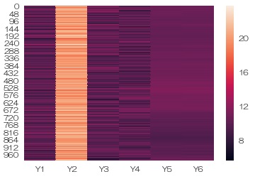
Y2 is very high. Y5 and Y6 seems to be similar.
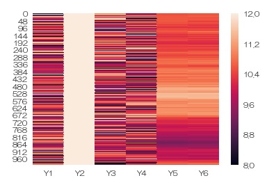
Change the range of color from 8 to 12.
sns.heatmap(df,vmin=8,vmax=12)
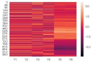
Using normalization .
df2 = (df - df.mean())/df.std() # normalization
sns.heatmap(data = df2)
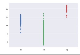
Graph to visualize many variables is used for the data type below.
sns.stripplot(data = df)
sns.swarmplot(data = df)
sns.boxplot(data = df)
sns.violinplot(data = df)
sns.pointplot(data = df)
Graph of average and
confidence interval
.
df.plot.hist(subplots=True)
I use
Plot of Panda
for histgram.
I often use separated graph for histgram. But if distribution is separated clearly I draw in one graph.
df.plot.hist()
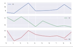
sns.lineplot(data = df)
For the separated graph, I use
Plot of Panda.
sns.pairplot(df)
sns.pairplot(df, hue='C1')
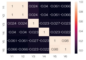
Correlation Analysis for Multi-Variable with heatmap.
sns.heatmap(data = df.corr(), annot=True)# correlation matrix
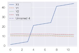
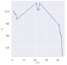
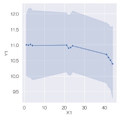
sns.lineplot(data=df, x='X1', y='Y1',marker='o')
OR
sns.relplot(data=df, x='X1', y='Y1', kind='line',marker='o')
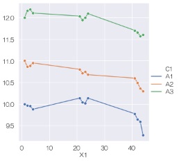
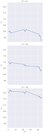
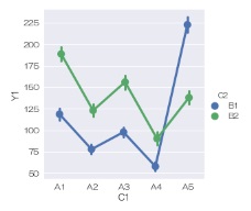
sns.lineplot(data=df, x='X1', y='Y1',marker='o',hue='C1')
OR
sns.relplot(data=df, x='X1', y='Y1', kind='line',marker='o',hue='C1'
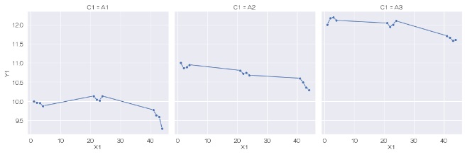
sns.relplot(data=df, x='X1', y='Y1', kind='line',marker='o',col='C1')
sns.relplot(data=df, x='X1', y='Y1', kind='line',marker='o',row='C1')
sns.relplot(data=df, x='X1', y='Y1', kind='line',marker='o')
We can change the size of size of graph only for scatterplot.
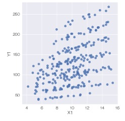
sns.scatterplot(data=df, x='X1', y='Y1')
OR
sns.relplot(data=df, x='X1', y='Y1',kind='scatter')
OR
sns.lmplot(data=df, x='X1', y='Y1', fit_reg=False)
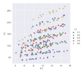
sns.scatterplot(data=df, x='X1', y='Y1', hue='C1')
OR
sns.relplot(data=df, x='X1', y='Y1',kind='scatter', hue='C1')
OR
sns.lmplot(data=df, x='X1', y='Y1', fit_reg=False, hue='C1')
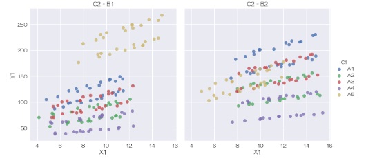
sns.relplot(data=df, x='X1', y='Y1',kind='scatter', hue='C1', col='C2')
OR
sns.lmplot(data=df, x='X1', y='Y1', fit_reg=False, hue='C1', col='C2')
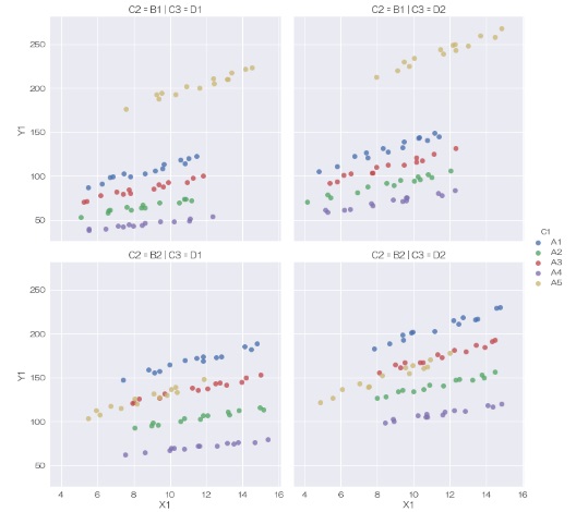
sns.relplot(data=df, x='X1', y='Y1',kind='scatter', hue='C1', col='C3', row='C2')
OR
sns.lmplot(data=df, x='X1', y='Y1', fit_reg=False, hue='C1', col='C3', row='C2')
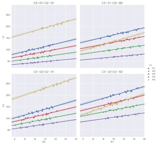
sns.lmplot(data=df, x='X1', y='Y1', hue='C1', col='C2',row='C3',fit_reg=True)
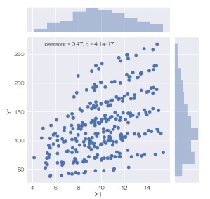
sns.jointplot(data = df, x='X1', y='Y1')
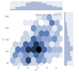
sns.jointplot(data = df, x='X1', y='Y1', kind="hex")
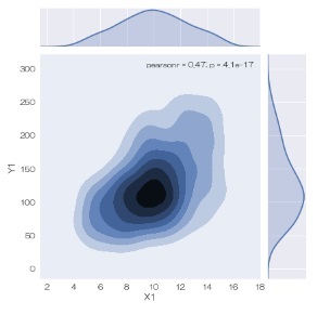
sns.jointplot(data = df, x='X1', y='Y1', kind="kde")
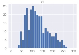
Histgram is for the right type data.
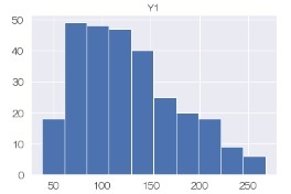
df.hist('Y1')
sns.FacetGrid(df,col='C1').map(plt.hist,'Y1'))
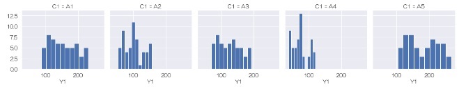
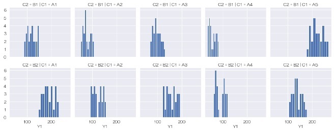
sns.FacetGrid(df,row='C2',col='C1').map(plt.hist,'Y1'))
df.hist('Y1',bins=30,range=(0,300))
Data type for below.
We cannot change the size of graph when we use catplot.
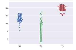
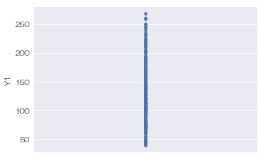
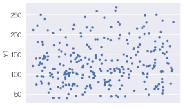
sns.stripplot(data = df, y='Y1')
OR
sns.catplot(data = df, y='Y1', kind='strip', jitter=False)
sns.stripplot(data = df, y='Y1', jitter=True)
OR
sns.catplot(data = df, y='Y1', kind='strip', jitter=True)
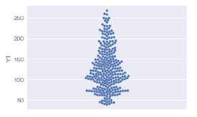
sns.swarmplot(data = df, y='Y1')
OR
sns.catplot(data = df, y='Y1', kind='swarm')
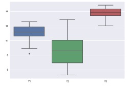
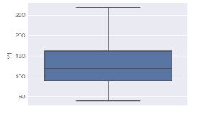
sns.boxplot(data = df, y='Y1')
OR
sns.catplot(data = df, y='Y1', kind='box')
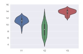
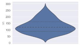
sns.violinplot(data = df, y='Y1', inner="quartile")
OR
sns.catplot(data = df, y='Y1', kind='violin', inner="quartile")
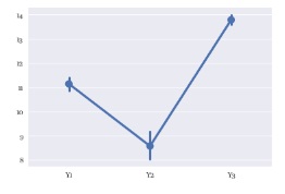
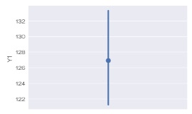
sns.pointplot(data = df, y='Y1')
OR
sns.catplot(data = df, y='Y1')
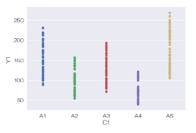
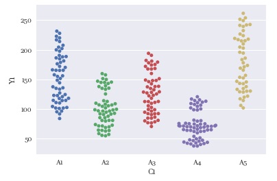
sns.stripplot(data = df, x='C1', y='Y1')
OR
sns.catplot(data = df, x='C1', y='Y1', kind='strip', jitter=False)
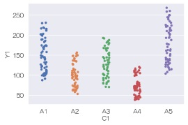
sns.stripplot(data = df, x='C1', y='Y1', jitter=True)
OR
sns.catplot(data = df, x='C1', y='Y1', kind='strip', jitter=True)
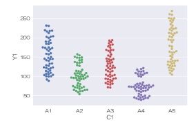
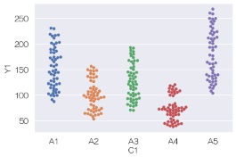
sns.swarmplot(data = df, x='C1', y='Y1')
OR
sns.catplot(data = df, x='C1', y='Y1', kind='swarm')
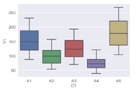
sns.boxplot(data = df, x='C1', y='Y1')
OR
sns.catplot(data = df, x='C1', y='Y1', kind='box')
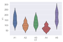
sns.violinplot(data = df, x='C1', y='Y1', inner="quartile")
OR
sns.catplot(data = df, x='C1', y='Y1', kind='violin', inner="quartile")
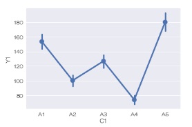
sns.pointplot(data = df, x='C1', y='Y1')
OR
sns.catplot(data = df, x='C1', y='Y1')
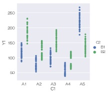
sns.stripplot(data = df, x='C1', y='Y1', hue='C2', jitter=False, dodge=True)
OR
sns.catplot(data = df, x='C1', y='Y1', hue='C2', kind='strip', jitter=False, dodge=True)
sns.stripplot(data = df, x='C1', y='Y1', hue='C2', jitter=True, dodge=True)
OR
sns.catplot(data = df, x='C1', y='Y1', hue='C2', kind='strip', jitter=True, dodge=True)
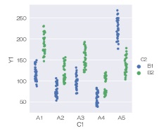
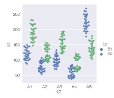
sns.swarmplot(data = df, x='C1', y='Y1', hue='C2', dodge=True)
OR
sns.catplot(data = df, x='C1', y='Y1', hue='C2', kind='swarm', dodge=True)
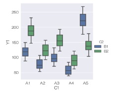
sns.boxplot(data = df, x='C1', y='Y1', hue='C2')
OR
sns.catplot(data = df, x='C1', y='Y1', hue='C2', kind='box')
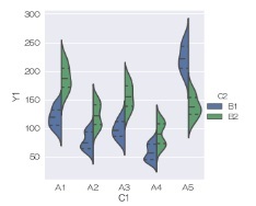
sns.violinplot(data = df, x='C1', y='Y1', hue='C2', split=True, inner="quartile")
OR
sns.catplot(data = df, x='C1', y='Y1', hue='C2', kind='violin', split=True, inner="quartile")
sns.pointplot(data = df, x='C1', y='Y1',hue ='C2', dodge=True)
OR
sns.catplot(data = df, x='C1', y='Y1',hue ='C2', dodge=True)
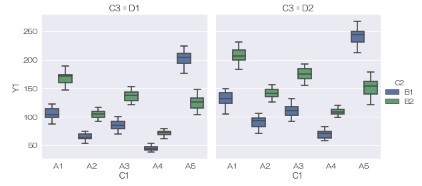
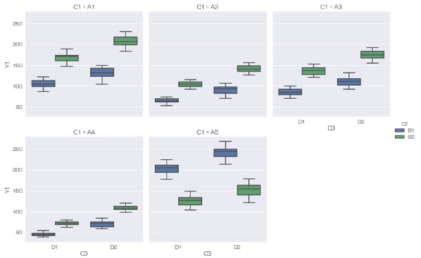
sns.catplot(data = df, x='C1', y='Y1', col='C3', hue='C2',kind='box')
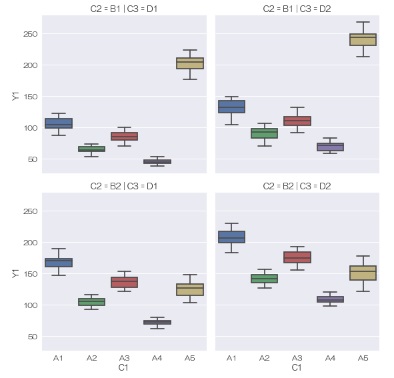
sns.catplot(data = df, x='C1', y='Y1', col='C3', row='C2',kind='box')
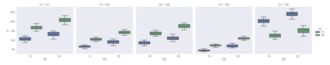
sns.catplot(data = df, x='C3', y='Y1', col='C1', hue='C2',kind='box')
sns.catplot(data = df, x='C3', y='Y1', col='C1', hue='C2',kind='box',col_wrap = 3)
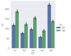
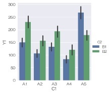
sns.barplot(data = df, x='C1', y='Y1', hue='C2')
OR
sns.catplot(data = df, x='C1', y='Y1', hue='C2',kind='bar')
When there are some values for same category data, length is the average of them. And confidense range also appers.
sns.barplot(data = df, x='C1', y='Y1', hue='C2')
OR
sns.catplot(data = df, x='C1', y='Y1', hue='C2', kind='bar')
Average and confidense range could be changed.
sns.barplot(data = df, x='C1', y='Y1', hue='C2', ci='sd', estimator=max) # max and standard deviation
OR
sns.catplot(data = df, x='C1', y='Y1', hue='C2', kind='bar', ci='sd', estimator=max) # max and standard deviation
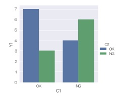
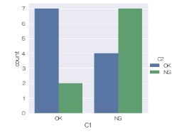
sns.countplot(data = df, x='C1', hue='C2')
OR
sns.catplot(data = df, x='C1', hue='C2',kind='count')

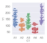
plt.figure(figsize=(3,3))
sns.swarmplot(data = df, x='C1', y='Y1')
Left is default size. Right is made by (3,3)
"plt.figure(figsize=(3,3))" is not effect for pairplot jointplot and catplot.
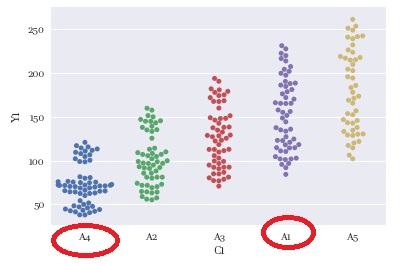
When I make graphs in this page, I changed the order of categorical variables to make the left graph.
If I do not change the order the graph is the right.
At first time, I want to use lineplotm replot and catplot, I could not use the function.
Because the version was 0.8.0
To make this page, I use 0.10.0
To examine the version, I used the code
print(sns.__version__)
To update the version I used
Anaconda Prompt and wrote
pip install seaborn -U
https://seaborn.pydata.org/index.html
NEXT  Stratified Graph
