hc <- hclust(Data11_dist, "ward.D2") # Hierarchical cluster analysis
plot(hc)
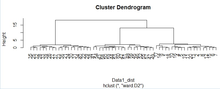
From the dendrogram, 3 as intended You can see that it is roughly divided into two groups.
Cluster Analysis is a well-known technique for Data Mining . Here, we will introduce how to use it.
This is an example of cluster analysis using R. There are various methods of cluster analysis, but the common parts are written together.
The following is copy paste and can be used as it is. If you use the code below, you will get the same result as the color-coded graph at the top of this page, except for X-means. This example assumes that the input data is quantitative data. An error will occur if there is qualitative data.
There are multiple methods below, but the input data is created in the same way, so they are summarized here.
In this example, it is assumed that the folder named "Rtest" on the C drive contains data with the name "Data1.csv".
Reads the input data. The Data10 to Data11 conversion is to make all columns data between 0s and 1s. It's better to have it when you do DBSCAN, and whatever method you use, it's essential if you have a mixture of variables with different units, such as height and weight.
setwd("C:/Rtest")
Data1 <- read.csv("Data1.csv", header=T)
Data10 <- Data1[,1:2]## Cluster analysis Specify the data to be used for. Here, in the case of the 1st and 2nd columns
Data11 <- Data10
for (i in 1:ncol(Data10)) {
Data11[,i] <- (Data10[,i] - min(Data10[,i]))/(max(Data10[,i]) - min(Data10[,i]))
}
Data11_dist <- dist(Data11)# Calculate the distance between samples
hc <- hclust(Data11_dist, "ward.D2") # Hierarchical cluster analysis
plot(hc)

From the dendrogram, 3 as intended You can see that it is roughly divided into two groups.
This example is not impossible because there are 60 data, but when there are many samples, it becomes difficult to read how each sample is divided from the dendrogram. It is a method to output the result as data, but if you divide each sample into 3 groups, you can output which group you belong to by doing the following.
output <- cutree(hc,k=3)# Group into 3
km <- kmeans(Data11,3) # Classified by k-means method. This is for 3 groups
output <- km$cluster
The usage of the X-means method is similar to the k-means method, but the library must be installed in advance. Also, the details are a little different.
library(clusternor)
Data11 <- as.matrix(Data11) # convert data into a matrix
xm <- Xmeans(Data11,10) # Xmeans method. Specify the maximum number of groups as 10.
output <- xm$cluster
Even with a mixture distribution, the library must be installed in advance.
library(mclust)
mc <- Mclust(Data11,3) # Classify by mixture distribution. This is for 3 groups
output <- mc$classification
In the case of a mixture distribution, it is possible not only to classify the data, but also to predict which of the classifications found from the data used for classification when there are other data. This is the same as how to use the Software for Prediction .
Data2 <- read.csv("Data2.csv", header=T)
for (i in 1:ncol(Data2)) {
Data21[,i] <- (Data2[,i] - min(Data2[,i]))/(max(Data2[,i]) - min(Data2[,i]))
}
output2 <- predict(mc, Data21)
The table below shows an example of the contents output to the file. In the end, it's not just about predicting which of the three groups it will be, but also knowing the probabilities of belonging to each group.
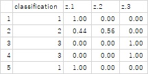
DBSCAN also requires the library to be installed in advance. In DBSCAN, setting eps is a problem, but since the data is preprocessed to the range of 0 to 1, the guideline for the range of the group should be about 0.1 to 0.3.
library(dbscan)
dbs <- dbscan(Data11, eps = 0.2) # eps is the range of distances from the core point. Here, I set it to 0.2.
output <- dbs$cluster
HDBSCAN does not need eps value. But it needs minPts. If minPts is small, small size clusters made.
library(dbscan)
dbs <- hdbscan(Data11, minPts = 5) # minPts is minimum number of samples in a cluster
output <- dbs$cluster
R also has a graph package for cluster analysis, but here's an example using the generic ggplot2.
library(ggplot2)
Data <- cbind(Data1, output)Å@
Data$output <-factor(Data$output)
Data$Index <-row.names(Data)
ggplot(Data, aes(x=X1, y=X2)) + geom_point(aes(colour=output))
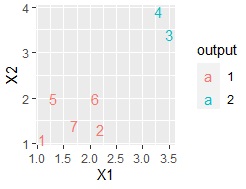
Here, if you have a small amount of data, such as the data below, plotting the line numbers is also useful.
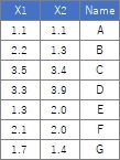
ggplot(Data, aes(x=X1, y=X2,label=Index)) + geom_text(aes(colour=output))
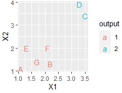
If you have a column for the name of each sample, you can also use it.
ggplot(Data, aes(x=X1, y=X2,label=Name)) + geom_text(aes(colour=output))
write.csv(Data, file = "Output.csv")
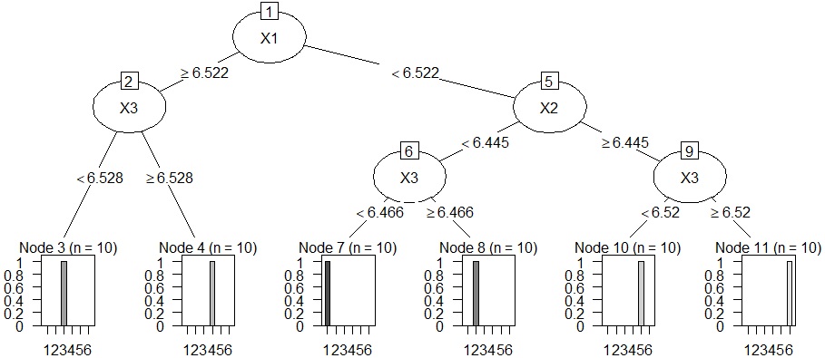
Analysis of clustering by decision tree . The cluster analysis does not tell us why the clusters in the cluster analysis did so, so we use a decision tree to find out.
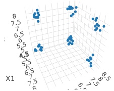
In this example, it is assumed that the folder named "Rtest" on the C drive contains data with the name "Data1.csv". The data used here is when there are 6 groups in 3D space.
#First, prepare the input data.
setwd("C:/Rtest")
Data10 <- read.csv("Data1.csv", header=T)
Data11 <- (Data10 - apply(Data10,2,min))/(apply(Data10,2,max)-apply(Data10,2,min))
# Perform cluster analysis.
library(dbscan)
dbs <- dbscan(Data11, eps = 0.2)
output <- dbs$cluster
Data <- cbind(Data10, output)
Data$output <-factor(Data$output)
# When the decision tree is rpart.
library(partykit)
library(rpart)
treeModel <- rpart(output ~ ., data = Data)
plot(as.party(treeModel))
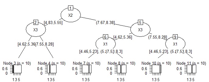
# When setting the decision tree to CHAID. There is a lot of work to turn quantitative data into qualitative data. In this example, I don't know the effect of the effort, but since it is anN-try tree, it is easy to consider the reason when the data structure is complicated.
library(CHAID)
Data <- read.csv("Data.csv", header=T, stringsAsFactors=TRUE)
Data$X1 <- droplevels(cut(Data$X1, breaks = 5,include.lowest = TRUE))
Data$X2 <- droplevels(cut(Data$X2, breaks = 5,include.lowest = TRUE))
Data$X3 <- droplevels(cut(Data$X1, breaks = 5,include.lowest = TRUE))
treeModel <- chaid(Y ~ ., data = Data)
plot(treeModel)
