Network graph is a useful way to show relationships between things in an easy-to-understand way.
There seem to be various free software that can draw pictures of networks. Here, about igraph that can be applied in various ways. The following is how to make an AA type graph.
* Folder locations and file names are examples.
(1) Download and install R, on your computer.
(2) Download igraph so that it can be used as an R module.
(3) Create a folder called "Rtest" in the C drive.
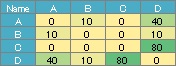
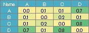
(4) Put the numerical data with the names of the vertices in the 1st row and 1st column into a csv file called "NetSample.csv" and put it in the "Rtest" folder.
In the example below, the sample file is executed in the Rtest folder.
library(igraph)
setwd("C:/Rtest")
DM <- read.csv("NetSample.csv", header=T, row.names=1)
DM.mat = as.matrix(DM)
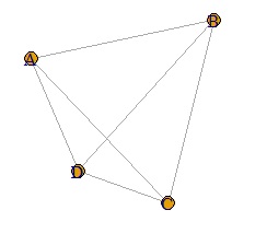
DM.g<-graph.adjacency(DM.mat,weighted=T, mode = "undirected")
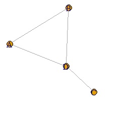
plot(DM.g)
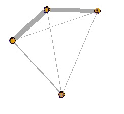
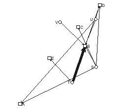
If the last line is as follows, the thickness will change depending on the numerical value of the data. If the values ??of the diagonal components of the matrix are different, the thickness will be the larger one.
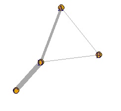
plot(DM.g, edge.width=E(DM.g)$weight)
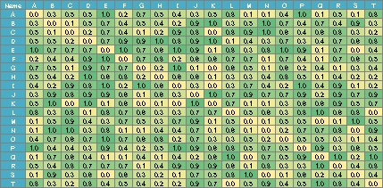
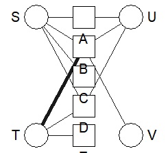
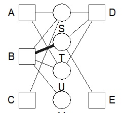
Since the numerical value of the data is used as it is for the thickness information, a negative number cannot be used, and even if it is a positive number, if it is in the range of 0 to 1, the difference in the numerical value will be seen as the difference in thickness. I can't do that. For example, in the graph on the page, Correlation Analysis for Multi-Variable, by converting the data to an absolute value and then multiplying it by 10, the data in the range -1 to 1 is converted to the data in the range 0 to 10. From, it is made into a graph.
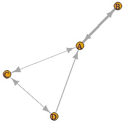
If you make the last two lines below, you will get a graph with arrows. In the example below, you can see that there is one arrow with only one direction and the other with both directions.
DM.g<-graph.adjacency(DM.mat,weighted=T, mode = "directed")
plot(DM.g, edge.width=E(DM.g)$weight)
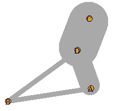
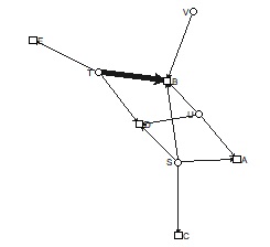
One of the problems with network graphs is that as the number of items increases, the characters overlap and become difficult to understand. Creating an interactive graph allows you to pinch and move the graph.
It seems that networkD3 cannot make directed graphs or weighted graphs.
library(igraph)
library(networkD3)
setwd("C:/Rtest")
DM <- read.csv("NetSample.csv", header=T, row.names=1)
DM.mat = as.matrix(DM)
DM.g<-graph.adjacency(DM.mat)
DM.g2 <- data.frame(as_edgelist(DM.g))
simpleNetwork(DM.g2, fontSize = 14, nodeColour = "0000A2", opacity = 1, fontFamily = "Meiryo UI")
In this graph, you can move the part clicked with the mouse.
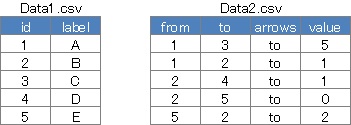
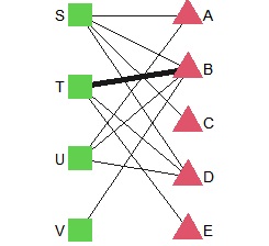
vvisNetwork can be moved, and you can also create directed graphs and weighted graphs. It is inconvenient to prepare two input files, one for vertices and one for edges, but it has the advantage of being able to make detailed settings for each vertex and edge.
The weight is automatically determined from the maximum and minimum values ??of value. Therefore, it is inconvenient that the line is drawn even if it is set to "0".
If there is no arrow column, it will be an undirected graph, and if there is no value column, it will be an unweighted graph.
library("visNetwork")
setwd("C:/Rtest")
D1 <- read.csv("Data1.csv", header=T)
D2 <- read.csv("Data2.csv", header=T)
visNetwork(D1,D2,height = "200px",width = "100%")
In this graph, you can move the part clicked with the mouse.
There is a little trick in the network graph.
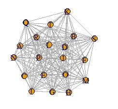
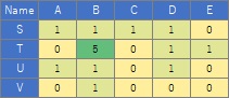
In the case of the data below, if you make a graph using the simple graph above, it will be a messy graph. I don't know anything about this.
In such a case, set the small value to 0. It can also be called sparse modeling . Here, try to set the number less than 0.8 to 0.
library(igraph)
setwd("C:/Rtest")
DM <- read.csv("NetSample.csv", header=T, row.names=1)
DM.mat = as.matrix(DM)
DM.mat[DM.mat < 0.8] <- 0 #�@Set to 0 if the absolute value of the correlation coefficient is less than 0.8
DM.g<-graph.adjacency(DM.mat,weighted=T, mode = "undirected")
plot(DM.g)
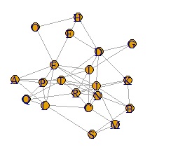
It became clear where the connection was strong.
For the data below, you can create the simple graph above.
A weighted graph is hard to call a network graph.
In such a case, adjust the value so that it falls between 0 and 10.
library(igraph)
setwd("C:/Rtest")
DM <- read.csv("NetSample.csv", header=T, row.names=1)
DM.mat = as.matrix(DM)
DM.mat <- DM.mat / max(DM.mat) * 10
DM.g<-graph.adjacency(DM.mat,weighted=T, mode = "undirected")
plot(DM.g, edge.width=E(DM.g)$weight)
It looks like a weighted network graph.
The case where the value is larger than 10 is taken as an example, but the method of adjusting from 0 to 10 is also effective when all the data is smaller than 1. For example, in the case of the data below, even if you make a weighted graph, you cannot see the difference in weights.
In such a case, you can use the code that adjusts from 0 to 10 to see the difference in weight.
It is a know-how to adjust so that it fits between 0 and 10, but it is caused by using the data value as the line thickness when drawing the graph. In general graphs, color coding and frame ranges are automatically adjusted to the data range, so you don't need this kind of know-how, but in the case of network graphs, you probably don't know. I can't make a nice graph.
For Bipartite graph, multigraph seems to be easy to use.
(1) Download and install R, on your computer.
(2) Download multigraph so that it can be used as an R module.
(3) Create a folder called "Rtest" in the C drive.
(4) Put the numerical data with the names of the vertices in the 1st row and 1st column into a csv file called "Data.csv" and put it in the "Rtest" folder.
library(multigraph)
setwd("C:/Rtest")
DM <- read.csv("Data.csv", header=T, row.names=1)
bmgraph(DM)
The simplest way to use it is to draw a line depending on whether the data is 0 or not, so the thickness will be the same regardless of the value. Use valued when you want the value to correspond to the thickness.
bmgraph(DM, valued = TRUE)

Various layouts are available.
bmgraph(DM, valued = TRUE, layout = "bipc")
default and left / right are different.
bmgraph(DM, valued = TRUE, layout = "circ")
bmgraph(DM, valued = TRUE, layout = "circ2")

bmgraph(DM, valued = TRUE, layout = "stress")
bmgraph(DM, valued = TRUE, layout = "CA")
bmgraph(DM, valued = TRUE, layout = "bip3")
bmgraph(DM, valued = TRUE, layout = "bip3e")
bmgraph(DM, valued = TRUE, layout = "force", directed = TRUE)
bmgraph(DM, valued = TRUE, layout = "rand", directed = TRUE)
bmgraph(DM, valued = TRUE, fsize = 9, cex = 3, pch = c(15, 17), vcol = 3:2)
You can also make a Bipartite graph with igraph, but it takes a little time and effort.
library(igraph)
setwd("C:/Rtest")
DM <- read.csv("Data.csv", header=T, row.names=1)
DM.mat = as.matrix(DM)
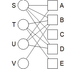
DM.g<-graph_from_incidence_matrix(DM.mat)
plot(DM.g, layout = layout_as_bipartite)
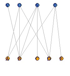
The simplest way to use it is to draw a line depending on whether the data is 0 or not, so the thickness will be the same regardless of the value. Use valued when you want the value to correspond to the thickness.
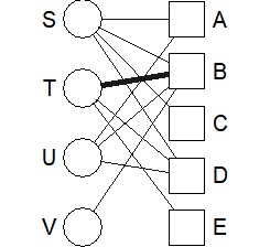
DM.g<-graph_from_incidence_matrix(DM.mat,weighted=T)
plot(DM.g, edge.width=E(DM.g)$weight, layout = layout_as_bipartite)
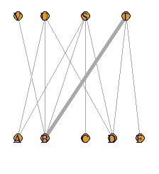
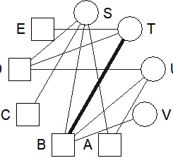
DM.g<-graph_from_incidence_matrix(DM.mat,weighted=T)
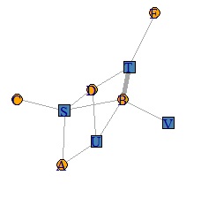
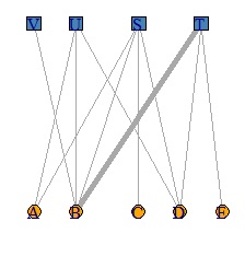
V(DM.g)$color <- c("steel blue", "orange")[V(DM.g)$type+1]
V(DM.g)$shape <- c("square", "circle")[V(DM.g)$type+1]
plot(DM.g, edge.width=E(DM.g)$weight, layout = layout_as_bipartite)
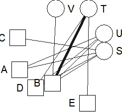
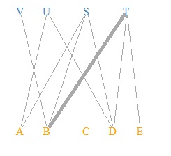
DM.g<-graph_from_incidence_matrix(DM.mat,weighted=T)
V(DM.g)$color <- c("steel blue", "orange")[V(DM.g)$type+1]
plot(DM.g, edge.width=E(DM.g)$weight, layout = layout_as_bipartite, vertex.shape="none", vertex.label.color=V(DM.g)$color)
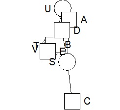
This is the default layout. If you use the default layout and the default mark, it will be a bipartite graph, so the color and shape of the mark are changed here.
DM.g<-graph_from_incidence_matrix(DM.mat,weighted=T)
V(DM.g)$color <- c("steel blue", "orange")[V(DM.g)$type+1]
V(DM.g)$shape <- c("square", "circle")[V(DM.g)$type+1]
plot(DM.g, edge.width=E(DM.g)$weight)