Analysis of similarity of individual categories by R
This is a method of analyzing the grouping of individual categories .
Basically, it is a method for qualitative variables, but quantitative variables are a one-dimensional clustering method and contain code to convert to qualitative variables, so qualitative and quantitative are mixed. , Only quantitative variables can be used.
For quantitative variables only, it can be used as a way to analyze the non-linear relationships of variables.
Correspondence analysis-based analysis
It is a method of combining correspondence analysis and multidimensional scaling .
library(dummies) #
library(MASS) #
library(ggplot2) #
setwd("C:/Rtest") #
Data <- read.csv("Data.csv", header=T) #
for (i in 1:ncol(Data)) { #
if (class(Data[,i]) == "numeric") {#
Data[,i] <- droplevels(cut(Data[,i], breaks = 5,include.lowest = TRUE))#
}#
}#
Data_dmy <- dummy.data.frame(Data)#
pc <- corresp(Data_dmy,nf=nf=min(ncol(Data),nrow(Data)))#
pc1 <- pc$cscore #
pc1 <- transform(pc1 ,name1 = rownames(pc1))#
round(pc$cor^2/sum(pc$cor^2),2)#

#In the above example, the 7th and subsequent eigenvalues ??have a low contribution rate, so we will exclude them from the subsequent analysis.
MaxN = 6#
Data11 <- pc1[,1:MaxN]#
Data11_dist <- dist(Data11)#
sn <- sammon(Data11_dist) #
output <- sn$points#
Data2 <- cbind(output, pc1)#
ggplot(Data2, aes(x=Data2[,1], y=Data2[,2],label=name1)) + geom_text() #
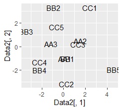
plot of words using Name Plots close to each other have a high degree of similarity. .. The vertical and horizontal axes of the graph have no particular meaning.
Association analysis-based analysis
This is a method of combining association analysis and network graphs .
setwd("C:/Rtest") #
library(arules) #
library(dummies)#
library(igraph)#
library(ggplot2)#
Data <- read.csv("Data.csv", header=T) #
for (i in 1:ncol(Data)) { #
if (class(Data[,i]) == "numeric") { #
Data[,i] <- droplevels(cut(Data[,i], breaks = 5,include.lowest = TRUE))#
} #
} #
Data <- dummy.data.frame(Data)#
Data3 <- as(Data, "matrix")#
Data4 <- as(Data3, "transactions")#
ap <- apriori(Data4, parameter = list(support = 5/nrow(Data), maxlen = 2, minlen = 2))#
ap_inspect <- inspect(ap)#
ap_inspect$set <- paste(ap_inspect$lhs,"->",ap_inspect$rhs)#
# Process for drawing a bar graph
ap21 <- head(ap_inspect[order(ap_inspect$support, decreasing=T),],20)#
ggplot(ap21, aes(x=support, y=reorder(set, support))) + geom_bar(stat = "identity") #
ap22 <- head(ap_inspect[order(ap_inspect$confidence, decreasing=T),],20)#
ggplot(ap22, aes(x=confidence, y=reorder(set, confidence))) + geom_bar(stat = "identity") #
ap23 <- head(ap_inspect[order(ap_inspect$lift, decreasing=T),],20)#
ggplot(ap23, aes(x=lift, y=reorder(set, lift))) + geom_bar(stat = "identity")#
#network graph
ap31<- graph.data.frame(ap21[,c(1,3)], directed = F)#
plot(ap31)#
ap32<- graph.data.frame(ap22[,c(1,3)])#
plot(ap32)#
ap33<- graph.data.frame(ap23[,c(1,3)])#
plot(ap33)#
below are all confidence graphs.
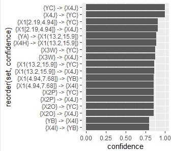
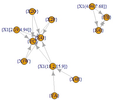
The arrows only represent the inclusion relationship of the data, not the causal relationship. ( This story is summarized in detail in the relationship between if-then rules and causality .)
Concept of parameter setting
In the above code, I set the parameters according to the following idea. I don't know if it's the best.
-
support = 5/nrow(Data): First, if you do not set this parameter, rules for infrequent categories will not appear. On the other hand, if you set it to "0", even combinations with a frequency of 0 (A and B, etc. in the case of example data) will be extracted. With this setting, combinations with a frequency of 5 or more will be extracted.
-
maxlen = 2: If this parameter is not set, combinations of 3 or more categories will also be extracted. It sounds good for category grouping, but it's hard to think about.
-
minlen = 2: If this parameter is not set, "1" "combination?" Will also be extracted. One piece of information (frequency of each category) is set to be deleted because it is not the purpose of this analysis.
