library(psych)#
setwd("C:/Rtest")#
Data <- read.csv("Data.csv", header=T)#
Data1 <- dummy.data.frame(Data)#
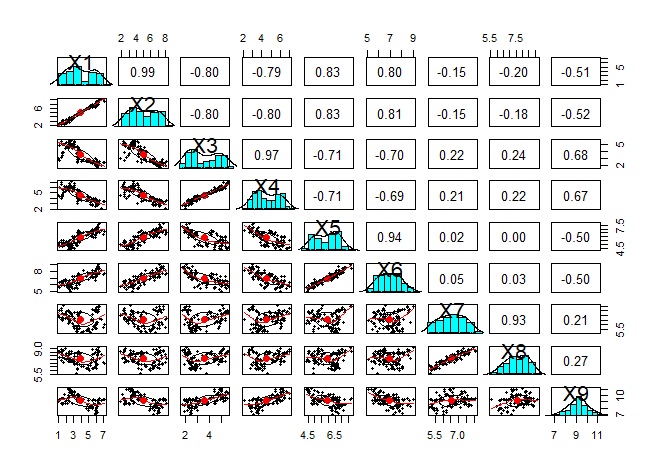
pairs.panels(Data1)#
Analysis of variable grouping .
The original method is for groups with only quantitative variables and groups with only qualitative variables, but for both, the code on this page allows you to use both quantitative and qualitative.
Basically, it is a method of handling quantitative variables, but qualitative variables are dummy-converted so that qualitative and quantitative variables are mixed, or even qualitative variables alone can be used.
With this method, the results of the analysis of qualitative variables are similar to R's analysis of the similarity of individual categories .
Since scatter plots are the basic way to see the similarity of quantitative variables, it is important to look at brute force scatter plots.
However, the following is the case when there are 9 variables, but even if only 9 variables are used, a graph will be created that makes it difficult to proceed with the subsequent analysis. It is better to use other methods to narrow down the variables to be graphed.
library(dummies) #
library(psych)#
setwd("C:/Rtest")#
Data <- read.csv("Data.csv", header=T)#
Data1 <- dummy.data.frame(Data)#
pairs.panels(Data1)#
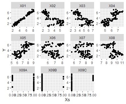
When analyzing causality, you don't need a brute force scatter plot, and you may want to see a scatter plot for a combination of one variable and all the other variables. How to make it at that time.
In the code below, one variable must be named "Y". The names of other variables are not specified.
The first is when the variable you want to focus on is a quantitative variable.
library(dummies) #
library(ggplot2) #
library(tidyr) #
setwd("C:/Rtest")#
Data <- read.csv("Data.csv", header=T) #
Data2 <- dummy.data.frame(Data)#
Data_long <- tidyr::gather(Data2, key="X", value = Xs, -Y) #
ggplot(Data_long, aes(x=Xs,y=Y)) + geom_point() + facet_wrap(~X,scales="free")#
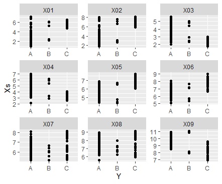
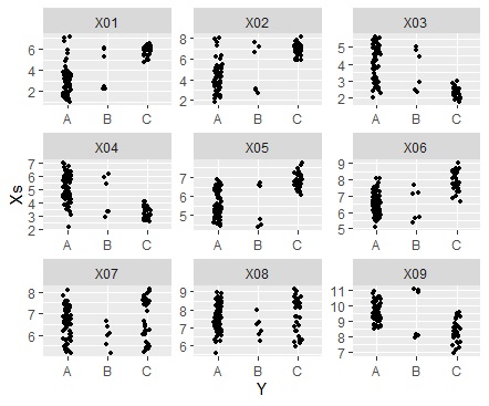
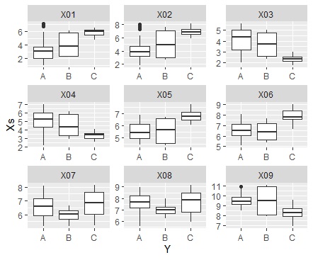
If the variable you want to focus on is a qualitative variable.
library(dummies) #
library(ggplot2)#
library(tidyr) #
setwd("C:/Rtest") #
Data <- read.csv("Data.csv", header=T) #
Data1 <- Data #
Y <- Data1$Y #
Data1$Y <- NULL #
Data2 <- dummy.data.frame(Data1)#
Data3 <- cbind(Data2, Y)#
Data_long <- tidyr::gather(Data3, key="X", value = Xs, -Y) #
ggplot(Data_long, aes(x=Y,y=Xs)) + geom_point() + facet_wrap(~X,scales="free")#
ggplot(Data_long, aes(x=Y,y=Xs)) + geom_jitter(size=1, position=position_jitter(0.1)) + facet_wrap(~X,scales="free")#
ggplot(Data_long, aes(x=Y,y=Xs)) + geom_boxplot() + facet_wrap(~X,scales="free")#
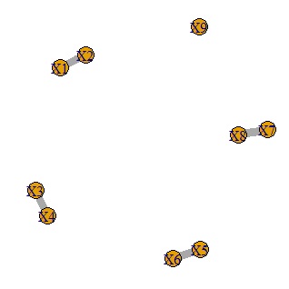
It is a method to calculate the correlation coefficient and make only the one with a large correlation into a network graph.
library(dummies) #
library(igraph)#
setwd("C:/Rtest")#
Data <- read.csv("Data.csv", header=T)#
Data1 <- dummy.data.frame(Data)#
DataM <- as.matrix(Data1)#
GM1 <- cor(DataM)#
diag(GM1) <- 0#
GM2 <- abs(GM1)#
GM2[GM2<0.9] <- 0#
GM3 <- GM2*10#
GM4 <- graph.adjacency(GM3,weighted=T, mode = "undirected")#
plot(GM4, edge.width=E(GM4)$weight)#
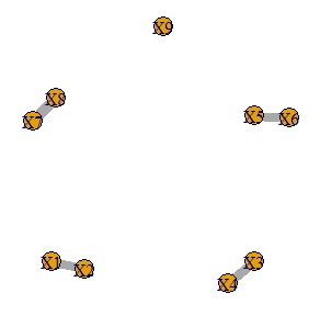
It is a method to make a network graph after doing a graphical lasso.
library(dummies) #
library(glasso) #
library(igraph)#
setwd("C:/Rtest")#
Data <- read.csv("Data.csv", header=T)#
Data1 <- dummy.data.frame(Data)#
DataM <- as.matrix(Data1)#
COR <- cor(DataM)#
RHO <- 0.2#
GM1 <- glasso(COR,RHO)$wi#
diag(GM1) <- 0#
GM2 <- abs(GM1)#
GM2max <- max(GM2)#
GM3 <- GM2/GM2max*10#
GM3[GM3<5] <- 0#
rownames(GM3) <- rownames(COR)#
colnames(GM3) <- colnames(COR)#
GM4 <- graph.adjacency(GM3,weighted=T, mode = "undirected")#
plot(GM4, edge.width=E(GM4)$weight)#
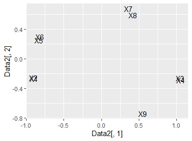
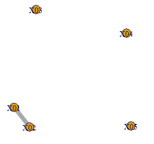
This is a method of visualizing multidimensional principal components by multidimensional scaling after performing principal component analysis .
library(dummies) #
library(ggplot2)#
library(MASS)#
setwd("C:/Rtest") #
Data <- read.csv("Data.csv", header=T) #
Data1 <- dummy.data.frame(Data)#
pc <- prcomp(Data1, scale=TRUE) #
summary(pc) #
pc2 <- sweep(pc$rotation, MARGIN=2, pc$sdev, FUN="*")#
MaxN = 5#
Data11 <- pc2[,1:MaxN]#
Data11_dist <- dist(Data11)#
sn <- sammon(Data11_dist) #
Data2 <- sn$points#
Data2 <- transform(Data2 ,name1 = rownames(Data2))#
ggplot(Data2, aes(x=Data2[,1], y=Data2[,2],label=name1)) + geom_text() #
Basically, it is a method of handling qualitative variables, but quantitative variables are a one-dimensional clustering method, and since the code to convert to qualitative variables is included, qualitative and quantitative are mixed or quantitative variables. It is designed to be used just by itself.
The method based on the analysis of similarity of quantitative variables above only looks at linear relationships, but the method based on the analysis of similarity of qualitative variables is non-linear of quantitative variables. You will also be able to see the relationships . There is a weakness that the numerical information becomes coarse, but I think that you do not have to worry too much in exploratory data analysis.
This is a method of calculating the coefficient of association and extracting only those with a large correlation using a network graph.
library(igraph)#
library(vcd)#
setwd("C:/Rtest")#
Data <- read.csv("Data.csv", header=T)#
Data1 <- Data#
n <- ncol(Data1)#
for (i in 1:n) { #
if (class(Data1[,i]) == "numeric") { <#
Data1[,i] <- droplevels(cut(Data1[,i], breaks = 5,include.lowest = TRUE))#
} #
}#
GM2 <- matrix(0,nrow=n,ncol=n)#
for (i in 1:(n-1)) { #
for (j in (i+1):n) { #
cross<-xtabs(~Data1[,i]+Data1[,j],data=Data1)#
res<-assocstats(cross)#
cramer_v<-res$cramer#
GM2[i,j] <- cramer_v#
GM2[j,i] <- cramer_v#
}#
}#
rownames(GM2)<-colnames(Data1)#
colnames(GM2)<-colnames(Data1)#
GM2[GM2<0.8] <- 0#
GM3 <- GM2*10#
GM4 <- graph.adjacency(GM3,weighted=T, mode = "undirected")#
plot(GM4, edge.width=E(GM4)$weight)#
Log-linear analysis
library(dplyr)#
library(MASS) #
setwd("C:/Rtest")#
Data <- read.csv("Data.csv", header=T, stringsAsFactors=TRUE) #
Data1 <- Data #
nc <- ncol(Data1)#
for (i in 1:nc) { #
if (class(Data1[,i]) == "numeric") { #
Data1[,i] <- droplevels(cut(Data1[,i], breaks = 5,include.lowest = TRUE))#
} #
} #
Data2 <- count(group_by(Data1,Data1[,1:nc],.drop=FALSE))#
gm <- step(glm(n~.^2, data=Data2,family=poisson)) #
summary(gm) #

this result, we found that there are groups of variables A, B, and C, and groups of variables D, E, and F.
In the case of the above code, the narrowing down of variables starts from the model that contains all the interaction terms of two variables. In this case, it is not much different from the method of using the number of associations looking at the combination of two.
For example, if you want to include the interaction term of 3 variables, do as follows. In this case, not only does it take a considerable amount of calculation time, but it is also prone to errors that may be due to insufficient n numbers. If you have a few variables, you can do it without any problems. When I tried it, it was useless when there were 6 variables, and it was possible to have 3 variables.
gm <- step(glm(n~.^3, data=Data2,family=poisson)) #
summary(gm) #
