Visualization of the entire data with R
This is a way to see all of the variables when there are multiple variables. If the data is arranged in time series, it will be time series analysis.
Qualitative variables are dummy-converted so that this method can be used. If there are 3 categories in 1 column, 3 columns of data will be created.
In the example below, the variables X1 to X9 are quantitative variables and the variable X10 is a qualitative variable.
Line graph by variable
Line graphs by variable can be roughly divided into a method of superimposing on one graph and a method of creating a graph by variable. For those who create a graph by variable, the number of variables is large in the case of the following method. It takes a lot of time to draw a graph. Depending on the PC, it may freeze. I haven't found an easier way to use this graph in R.
If you want to use this graph, it is easier to use Python, Pandas Plot (matplotlib) , or Excel sparkline .
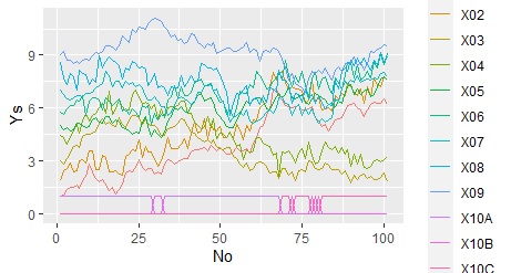
Overlay on one graph
library(dummies) #
library(ggplot2) #
library(tidyr) #
setwd("C:/Rtest") #
Data <- read.csv("Data.csv", header=T) #
Data2 <- dummy.data.frame(Data)#
Data2$No <-as.numeric(row.names(Data2)) #
Data_long <- tidyr::gather(Data2, key="Yno", value = Ys, -No) #
ggplot(Data_long, aes(x=No,y=Ys, colour=Yno)) + geom_line() #
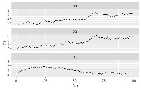
Separate the graph for each variable, but match the Y-axis range
"Nrow = 1000" is an instruction to "make 1000 frames vertically", and it does not have to be 1000 if it is more than the number of categories.
library(dummies) #
library(ggplot2) #
library(tidyr) #
setwd("C:/Rtest") #
Data <- read.csv("Data.csv", header=T) #
Data2 <- dummy.data.frame(Data)#
Data2$No <-as.numeric(row.names(Data2)) #
Data_long <- tidyr::gather(Data2, key="Yno", value = Ys, -No) #
ggplot(Data_long, aes(x=No,y=Ys)) + geom_line() + facet_wrap(~Yno,nrow=1000)#
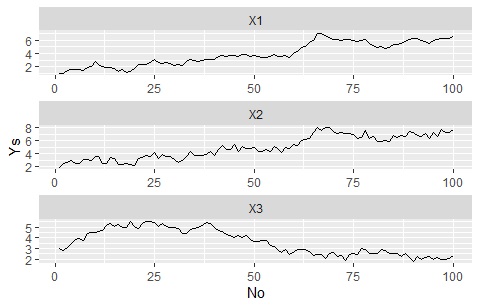
The Y-axis range changes for each graph
library(dummies) #
library(ggplot2) #
library(tidyr) #
setwd("C:/Rtest") #
Data <- read.csv("Data.csv", header=T) #
Data2 <- dummy.data.frame(Data)#
Data2$No <-as.numeric(row.names(Data2)) #
Data_long <- tidyr::gather(Data2, key="Yno", value = Ys, -No) #
ggplot(Data_long, aes(x=No,y=Ys)) + geom_line() + facet_wrap(~Yno,scales="free",nrow=1000)#
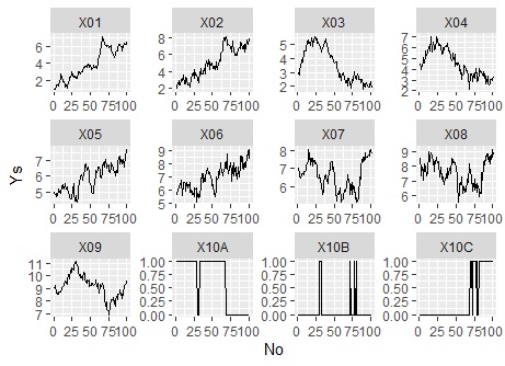
The range of the Y axis is changed for each graph. Also, when leaving the arrangement of graphs to the software
library(dummies) #
library(ggplot2) #
library(tidyr) #
setwd("C:/Rtest") #
Data <- read.csv("Data.csv", header=T) #
Data2 <- dummy.data.frame(Data)#
Data2$No <-as.numeric(row.names(Data2)) #
Data_long <- tidyr::gather(Data2, key="Yno", value = Ys, -No)#
ggplot(Data_long, aes(x=No,y=Ys)) + geom_line() + facet_wrap(~Yno,scales="free"#
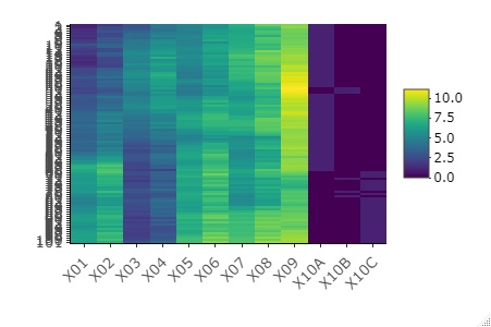
Heat map
Heat map the data as it is
library(dummies)#
library(heatmaply)#
setwd("C:/Rtest")#
Data <- read.csv("Data.csv", header=T)#
Data2 <- dummy.data.frame(Data)#
heatmaply(Data2, Colv = NA, Rowv = NA)#
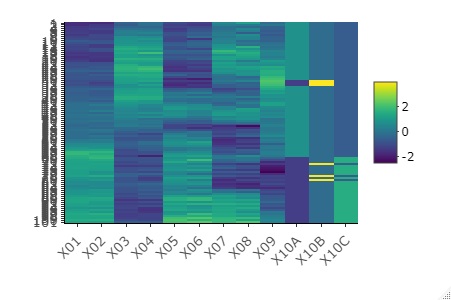
Standardize data and heatmap
In each variable, the average 0, standard deviation 1 standardization from it, and in the graph. When variables with very different values ??are included, you can see what each variable looks like.
library(dummies) #
library(heatmaply) #
setwd("C:/Rtest")#
Data <- read.csv("Data.csv", header=T)#
Data2 <- dummy.data.frame(Data)#
heatmaply(scale(Data2), Colv = NA, Rowv = NA)#
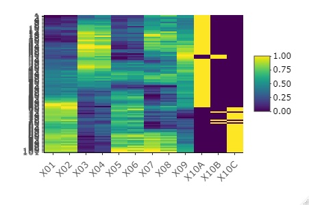
Normalize the data and heatmap
For each variable, normalize to a minimum value of 0 and a maximum value of 1, and then graph. The effect is similar to standardization. If qualitative variables are mixed, it is easier to see the appearance of 0 and 1 here.
library(dummies) #
library(heatmaply)#
setwd("C:/Rtest")#
Data <- read.csv("Data.csv", header=T)#
Data2 <- dummy.data.frame(Data)#
heatmaply(normalize(Data2), Colv = NA, Rowv = NA)#
Line graph that can be enlarged
With Plotly , you can magnify a part of it. Time-series data with many waveforms is convenient because the waveforms are crushed and difficult to understand if there are many waveforms, but you can magnify and view any place. Also, Plotly is attractive because it is very light in operation.
library(plotly)#
setwd("C:/Rtest")#
Data <- read.csv("Data.csv", header=T)#
Data$Index <-as.numeric(row.names(Data))#
plot_ly(Data, x=~Index, y=~Y, type = 'scatter', mode = 'lines') #
