Analysis of variable similarity with Python
Analysis of variable grouping .
The original method is a group method with only quantitative variables, but the code on this page allows you to use both quantitative and qualitative.
R's analysis of variable similarity is not limited to the methods on this page, but also includes principal component analysis, graphical rasus, and methods based on qualitative variable similarity analysis methods.
A method based on the method of analyzing the similarity of quantitative variables
Basically, it is a method of handling quantitative variables, but qualitative variables are dummy-converted so that qualitative and quantitative variables are mixed, or even qualitative variables alone can be used.
With this method, the results of analyzing qualitative variables are similar to Python's analysis of the similarity of individual categories .
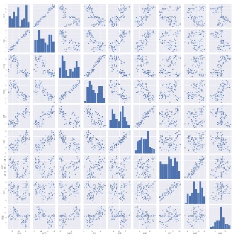
Brute force scatter plot
Since scatter plots are the basic way to see the similarity of quantitative variables, it is important to look at brute force scatter plots.
However, the following is the case when there are 9 variables, but even if only 9 variables are used, a graph will be created that makes it difficult to proceed with the subsequent analysis. It is better to use other methods to narrow down the variables to be graphed.
import os #
import pandas as pd #
import matplotlib.pyplot as plt#
import seaborn as sns #
from sklearn import preprocessing #
%matplotlib inline
sns.set(font='HGMaruGothicMPRO') #
os.chdir("C:\\PyTest") #
df= pd.read_csv("Data.csv" , engine='python')#
df2 = pd.get_dummies(df)#
sns.pairplot(df2) #
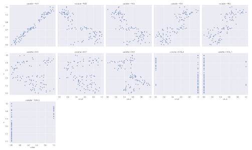
Graph of combinations of one quantitative variable and all other variables
When analyzing causality, you don't need a brute force scatter plot, and you may want to see a scatter plot for a combination of one variable and all the other variables. How to make it at that time.
In the code below, one variable must be named "Y". The names of other variables are not specified.
The first is when the variable you want to focus on is a quantitative variable.
import os #
import pandas as pd #
import matplotlib.pyplot as plt#
import seaborn as sns #
from sklearn import preprocessing #
%matplotlib inline
sns.set(font='HGMaruGothicMPRO') #
os.chdir("C:\\PyTest") #
df= pd.read_csv("Data.csv" , engine='python')#
df2 = pd.get_dummies(df)#
df3 = preprocessing.minmax_scale(df2)#
df4 = pd.DataFrame(df3, columns = df2.columns.values)#
df5 = pd.melt(df4, id_vars=['Y'])#
sns.relplot(data=df5, x='value', y='Y', col='variable',kind='scatter',col_wrap = 5) #
Graph of combinations of one qualitative variable and all other variables
If the variable you want to focus on is a qualitative variable.
import os #
import pandas as pd #
import matplotlib.pyplot as plt#
import seaborn as sns #
from sklearn import preprocessing #
%matplotlib inline
sns.set(font='HGMaruGothicMPRO') #
os.chdir("C:\\PyTest") #
df= pd.read_csv("Data.csv" , engine='python')#
df11 =pd.DataFrame(df['Y'])#
df12 = df.drop('Y', axis=1)#
df2 = pd.get_dummies(df12)#
df3 = preprocessing.minmax_scale(df2)#
df3 = pd.DataFrame(df3, columns = df2.columns.values)#
df4 = pd.concat([df11, df3], axis = 1)#
df5 = pd.melt(df4, id_vars=['Y'])#
sns.catplot(data=df5, x='Y', y='value', col='variable', kind='strip', jitter=False,col_wrap = 5) #

sns.catplot(data=df5, x='Y', y='value', col='variable', kind='strip', jitter=True,col_wrap = 5) #

sns.catplot(data=df5, x='Y', y='value', col='variable', kind='box', col_wrap = 5) #

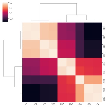
Heat map with correlation coefficient + clustering
It is a method to calculate the correlation coefficient and graph it with a heat map with clustering.
import os #
import pandas as pd #
import matplotlib.pyplot as plt#
import seaborn as sns #
from sklearn import preprocessing #
%matplotlib inline
sns.set(font='HGMaruGothicMPRO')#
os.chdir("C:\\PyTest")#
df= pd.read_csv("Data.csv" , engine='python')#
df2 = pd.get_dummies(df)#
df3 = df2.corr()#
sns.clustermap(df3, method='ward', metric='euclidean') #