import pandas as pd #
os.chdir("C:\\PyTest") #
df= pd.read_csv("Data.csv" , engine='python')#
df2 = pd.get_dummies(df)#
df2.plot()#
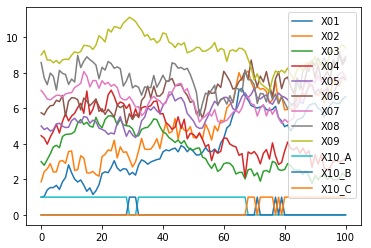
This is a way to see all of the variables when there are multiple variables. If the data is arranged in time series, it will be time series analysis.
Qualitative variables are dummy-converted so that this method can be used. If there are 3 categories in 1 column, 3 columns of data will be created.
In the example below, the variables X1 to X9 are quantitative variables and the variable X10 is a qualitative variable.
Line graphs by variable can be roughly divided into a method of superimposing on one graph and a method of creating a graph by variable. For those who create a graph by variable, the number of variables is large in the case of the following method. It takes a lot of time to draw a graph. Depending on the PC, it may freeze. I haven't found an easier way to use this graph in R. If you want to use this graph, it is easier to use Python, Pandas Plot (matplotlib) , or Excel sparkline .
import os #
import pandas as pd #
os.chdir("C:\\PyTest") #
df= pd.read_csv("Data.csv" , engine='python')#
df2 = pd.get_dummies(df)#
df2.plot()#
import os #
import pandas as pd #
os.chdir("C:\\PyTest") #
df= pd.read_csv("Data.csv" , engine='python')#
df2 = pd.get_dummies(df)#
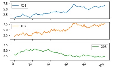
df2.plot(subplots=True, sharey=True)#
import os #
import pandas as pd #
os.chdir("C:\\PyTest")#
df= pd.read_csv("Data.csv" , engine='python')#
df2 = pd.get_dummies(df)#
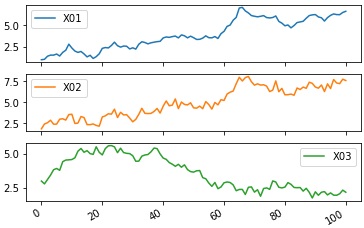
df2.plot(subplots=True)#
import os #
import pandas as pd #
import matplotlib.pyplot as plt#
import seaborn as sns #
%matplotlib inline
sns.set(font='HGMaruGothicMPRO') #
os.chdir("C:\\PyTest") #
df= pd.read_csv("Data.csv" , engine='python')#
df2 = pd.get_dummies(df)#
sns.heatmap(df2) #
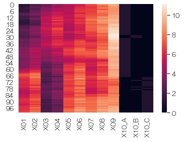
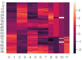
In each variable, the average 0, standard deviation 1 standardization from it, and in the graph. When variables with very different values ??are included, you can see what each variable looks like.
import os #
import pandas as pd #
import matplotlib.pyplot as plt#
import seaborn as sns #
from sklearn import preprocessing #
%matplotlib inline
sns.set(font='HGMaruGothicMPRO') #
os.chdir("C:\\PyTest") #
df= pd.read_csv("Data.csv" , engine='python')#
df2 = pd.get_dummies(df)#
df3 = preprocessing.scale(df2)#
sns.heatmap(df3) #
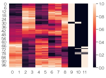
For each variable, normalize to a minimum value of 0 and a maximum value of 1, and then graph. The effect is similar to standardization. If qualitative variables are mixed, it is easier to see the appearance of 0 and 1 here.
import os #
import pandas as pd#
import matplotlib.pyplot as plt#
import seaborn as sns #
from sklearn import preprocessing #
%matplotlib inline
sns.set(font='HGMaruGothicMPRO') #
os.chdir("C:\\PyTest") #
df= pd.read_csv("Data.csv" , engine='python')#
df2 = pd.get_dummies(df)#
df3 = preprocessing.minmax_scale(df2)#
sns.heatmap(df3) #
With Plotly, you can magnify a part of it. Time-series data with many waveforms is convenient because the waveforms are crushed and difficult to understand if there are many waveforms, but you can magnify and view any place. Also, Plotly is attractive because it is very light in operation.
import os #
import pandas as pd #
import plotly.express as px#
import plotly.io as pio#
os.chdir("C:\\PyTest") #
df= pd.read_csv("Data2.csv" , engine='python')#
df['X']=df.index #
fig = px.line(x = df['X'], y = df['Y'])#
fig.show()#
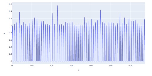
* This image is a copy of the Jupyter Notebook screen Therefore, it cannot be scaled. You can zoom in and out on the Jupyter Notebook screen.
