In recent years, Excel has a lot of graphs for viewing many variables.
If you are dealing with data for the first time, you may want to make a line graph for the time being . Excel sparklines are useful when you have a large number of columns.
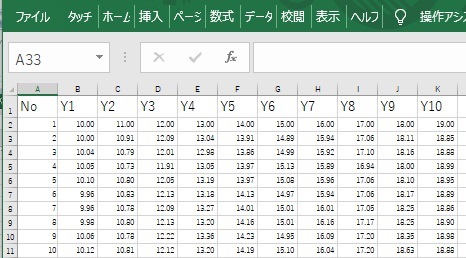
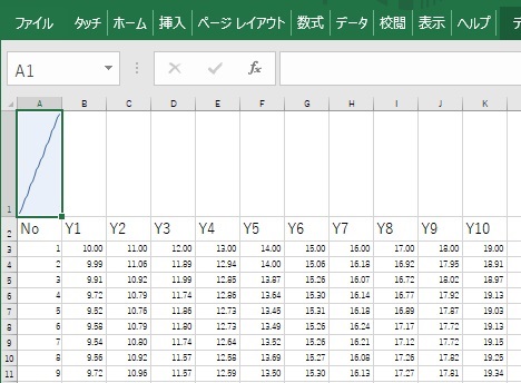
First, suppose you have this kind of data.
Create a new line on the first line. Also increase the row height a little.
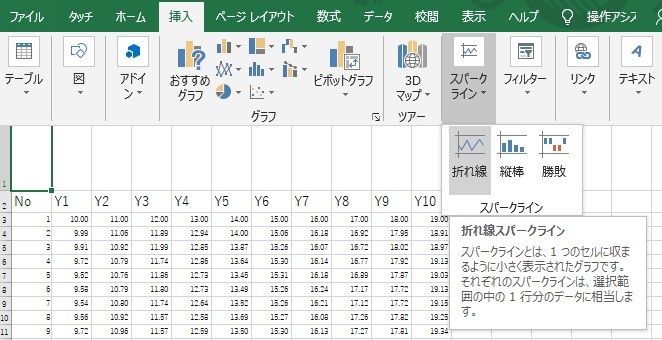
From the Insert menu, select the sparkline line.
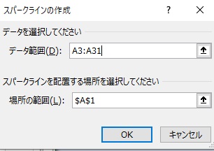
Specify the range of data and the cell to create the graph. If you want to graph the data in column A, the cell that creates the graph should be A1.
I have one graph.
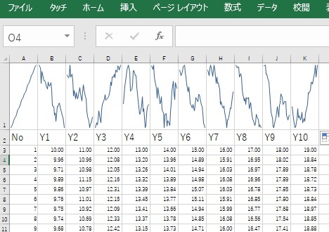
All you have to do is copy cell A1 and paste it into B1 and C1. I will omit the efficient copy-paste method.
It's just a boxplot, but it can be used as a way to see many quantitative variables at once.
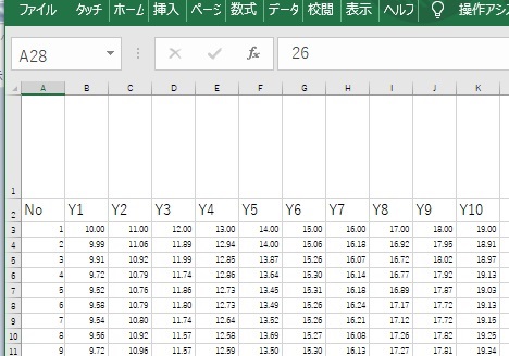
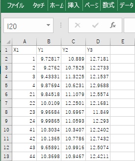
First, suppose you have this kind of data.
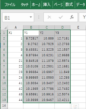
Select a range of data.
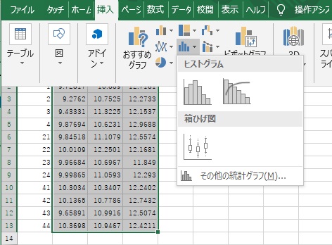
From the Insert menu, select a boxplot.
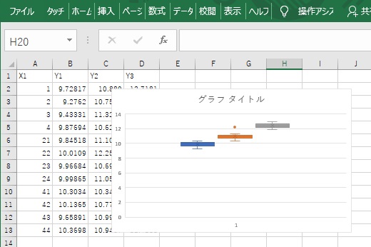
You now have a box plot with one variable in one box. Adjustment of the Y-axis range is the same as other graphs. You can also use formatting to change the way the median is output.
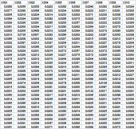
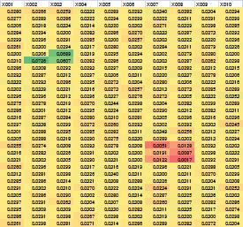
There is no graph named " Heatmap ". However, since the data is displayed in the form of a table, you can combine it with a conditional formatting "color scale" to create a heatmap.
Heatmaps look different from sparklines and allow you to see large amounts of data in Excel.
The same numbers are written in the two tables below, but in the heat map, the places where the values ??are extremely high are green, the places where the values are low are red, and the middle is yellow.